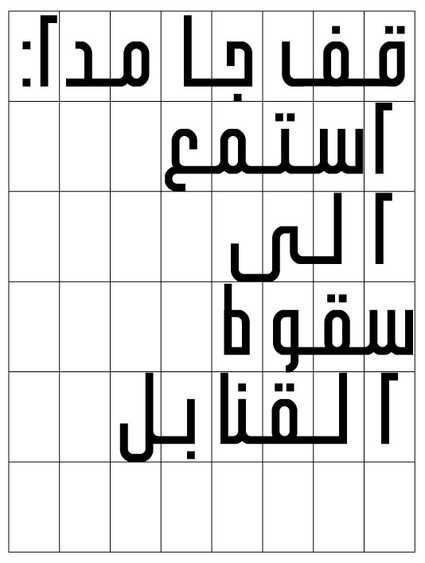
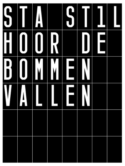
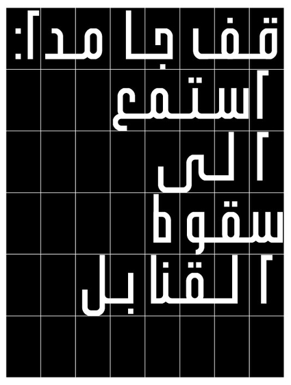
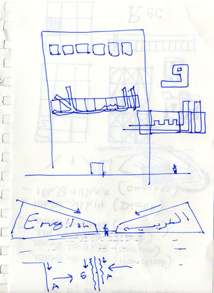
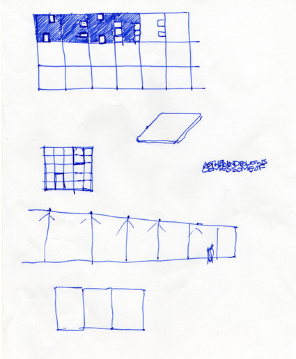
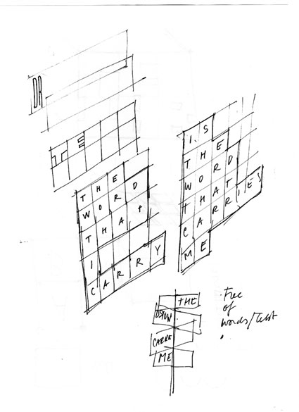
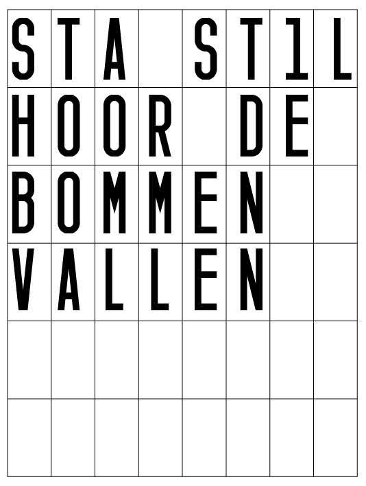
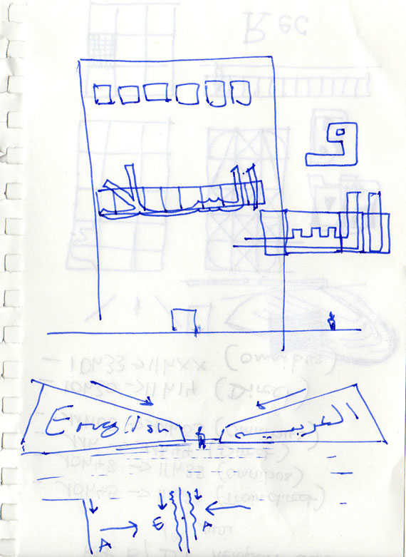
The design of STORY LINE consists of a setup of multiple TV screens (any size) in a rectangular shape (tablet, 8 wide and 6 high) or as a single line (line, 48 long). Each screen holds one glyph at a time. Based on the minimal needs in Arabic, one line in the tablet consists of 8 glyphs or screens. A total of minimal 96 screens are used for both scripts. The used Latin and Arabic scripts are monospaced fonts.
As described in our earlier CORRIDOR CONCEPT, two screen setups will mirror each other and print the same content in Arabic and Latin simultaneously. This can be the either the Line or the Tablet. The use of lined up screens, STORY LINE offers flexibility in straight or curved arrangements in height and/or length.
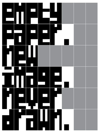
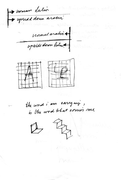
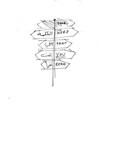
The texts for STORY LINE are input from various sources, like internet (server), text messaging (sms) or directly by keyboard. Especially written software will arrange the texts and separate each glyph to its own screen in order of writing/appearance. You can compare it with a sheet of paper in an old fashioned (monospaced) typewriter. The content appears dynamically according the writing direction of either script (the flow), and flow in the same direction.
A certain flexibility the the amount of screens used could be embedded in the software, to offer indivudial adaptations of the system.
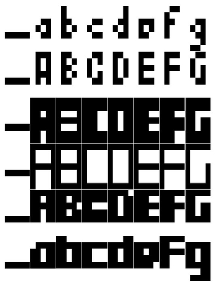
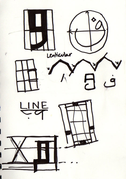
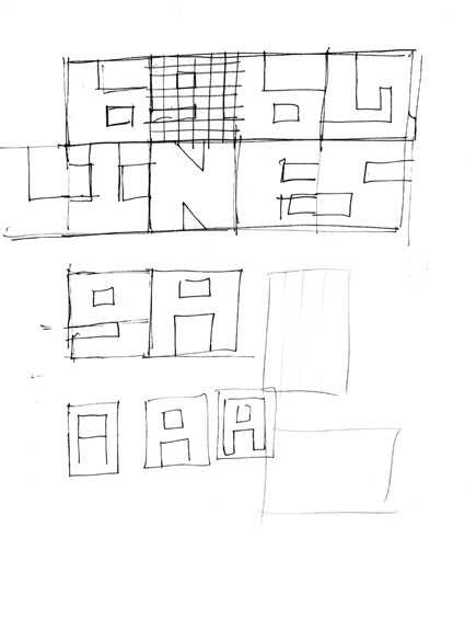
As far as the typographic aspect concerns, the fixed aspect ratio of the screens forces to design glyphs using each the same space. The Arabic as well as the Latin scripts are monospaced.
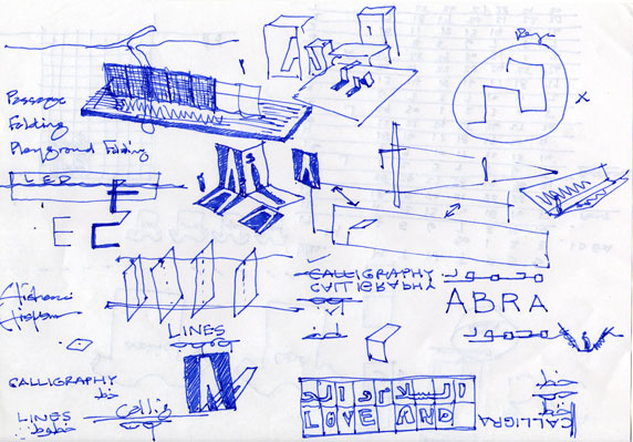
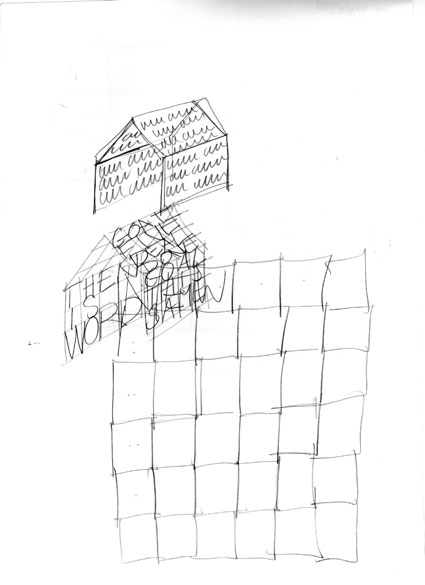
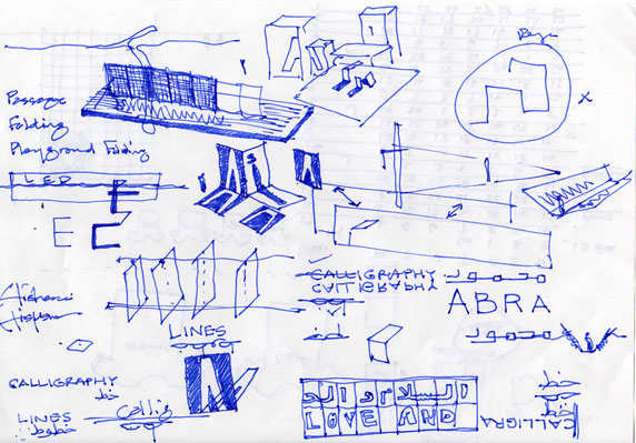
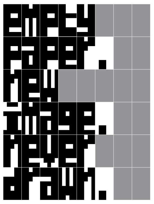
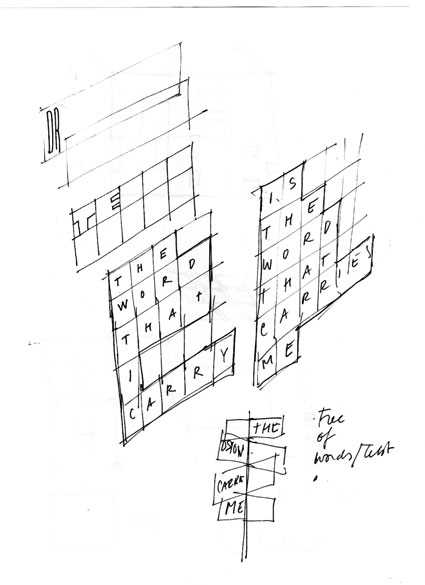
The basic glyph design fills the whole aspect ratio to create a graphic visual appearance of black shapes and white holes. E.g. enlarged and cropped letterforms that play with legibility and graphic composition. Yet, any shape of glyph can be designed to appear in any size within the aspect ration of the screen. Nevertheless, we intend focus on a specific type design approach that relates to the visual and spacial appearance of STORY LINE and its content.
The design approach consists of the minimal needs to represent a glyph in either Latin and Arabic, that is as well legible and esthetically sound and a basic grid would apply to both scripts. Derriving from that minimal grid, various refinements can be developed to generate variations on the basic design in a kind of multiple master font.
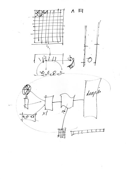
Besides the pure graphic appearance of the Latin and Arabic as (computer) fonts, the technology of STORY LINE offers other ways to write the content. By default, each glyph will appear consecutively in black and white. Alternatively, each glyph can appear animated (build up or fade) or even remain animated (loop). Also color can become a compositional aspect in the appearance and visualisation of the textual content. Editorially, content will be compiled by assignment, requests and open (monitored by editor at the hosting service or server) entrees, in order to guard the overall quality of literary content of STORY LINE.
Paris, April 2009.
Max Kisman, Naji El Mir and Hisham Youssef.

