Story Line™
Multiple screen display for textual content.
Duality.
Duality is the main aspect that connects and/or separates the Arabic and Latin in language and script, in cultures and ideals. It also is the main aspect in the core of the (editorial) content and (product and typographic) design concept of Story Line™.
This approach explores the textual communication of the dialogue between the Arabic and Latin scripts (in Arabic and English) to get either differences or similarities to surface.
Dialog.
Story Lone™ is an electronic two way, instant communication tool, using short texts in either language as input to exchange poetic thoughts and views on duality (in the broad sense).
Pre-produced (short stories) and instantly written texts are input in one location. They show up instantly in the other, remote location. Response from that other remote location will show up in the first location. And vice versa.
The pre-produced texts are pre-translated and have a literary poetic quality. Instantly written text are processed within an editorial system and edited on their content and intent quality (e.g. duality) before broadcast to the system. Story Line™ clearly distincts itself from the general idea of message boards, blogs and Twitter-like gossip environments.
Communication.
Translation is the key to communication. Translation defines how subjects that translation relate to each other. Translation is the key to understanding. Translation also is the bridge or gap that can enforces or weakens duality.
Pre-produced text and pre-translated text will match as closely possible to transmit the same image as good as possible.
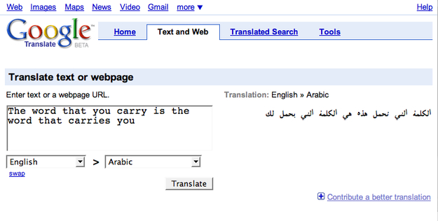
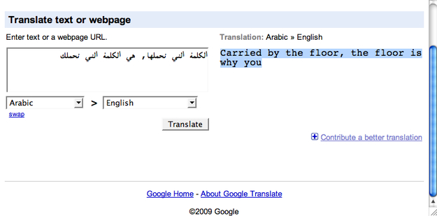
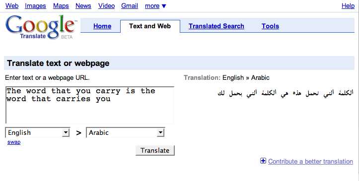
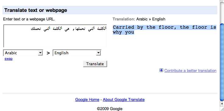
Instantly written texts need instant translation. Google Translate offers instant translation from and to any language. Using Google Translate’s output from the translation from English to Arabic immediately to translate back to English (or from Arabic to English to Arabic), will reveal the imperfectness and fragility of translation. Not so much as a technological imperfectness but as the continuous distinction between two cultures. Translation needs intense refinement and understanding, even in everyday experiences.
Using Google Translate will create an average and superficial outcome, that by itself generates a new poetic, yet misinterpreted quality.
See illustration below (or next page)
Story Line™ Display and design.
Texts are displayed on a configuration of multiple TV or LCD screens. The number of screens define the amount of glyphs to be displayed. One screen is one unit. Each unit contains space for one glyph at a time. Units are the building blocks to configure a large tablet, or a single or two lines. They can float in space, placed circular, slanted or zigzagged. They can form banners, towers or fill windows.
The setup will incorporate bilinguality is the way it displays the original and translated text in either Arabic and English.
(See also “Story Line™” article on khtt.net)
Typography basic.
Primairily Story Line™ was conceived to display text by one glyph letter forms. One unit contains one glyph. To display original and translated texts, a set up of two display configurations are nessecary. Either separted or interweaved. The typographic experiment will take place with in the fysical limitations, proportions or aspect ration of the unit, resulting in a monospaced, fixed width typeface/font.
(examples in preparation)
Alternatively, the duality in the typographic experiment is expressed by horizontally slicing both scripts and matching them during the text and translation exchange.
Additionally, top and bottom part of either script can have their specific function if they are used for sending before and receiving after translation. Instead of using one unit for one glyph (above), two vertically stacked screens display top and bottom seperately.
Using a screen for the glyph top of the one script, and a screen for the glyph bottom of the other enables simultaneous display of original and translated text into a new hybrid script. With this difference that the flow or flush directions are opposite.
In this case, two screens are one unit.
(examples in preparation)
(See also typographic exercise in “Solari Flip ssytem” and “Schematic setup corridor concept” article on khtt.net)
Typography advanced.
Besides creating and design matching fonts as static graphic symbols, the technology offers dynamic text display. Animation (controlled appearance in the course of time) of glyphs and texts might enhance or enrich Story Line™ to a visual entertaining device as well. Poetry generates the mental image, dynamic visual appearance adds value to its visual interpretation.
The typographic experiment explores static representation as well as dynamic representation of the letterform in design and in use.
(examples in preparation)
Context.
Public accessibility and interactivity defines the operational context for Story Line™ and its function signifies or dignifies its surrounding space and environment.
Three options are most appropriate:
- a dedicated or confined space (a museum or gallery environment).
- a transitional public space (an airport, train- or busstation).
- a transiential public space (a park, a square)
(detailed info in preparation)
Content.
All content is based on the concept of duality, which is transmitted through e.g. Six Word Stories or Haikus with accurate translation, or instant messaging through SMS or website with instant Google Translation.
(examples in preparation)
Configuration/shape.
Each unit (screen) is a one glyph display. Multiple units in one streched line form a sentence. A line can be straight or bended. Two lines of units can form a tunnel or cooridor. Multiple units in short lines stacked on each other form a rectangular tablet. Individual units can be spaciously arranged. See also above.
In case of the split or dual lettering, each unit consists of two screens.
(illustrations in preparation)
Data flow diagram.
(in preparation)
Max Kisman, Hisham Youssef and Naji El Mir.
Typographic Matchmaking 2.0
Amsterdam, 9 May, 2009