Max:
I have been looking for a way to match your Arabic designs. Somehow a compromise. Somehow maybe something different.
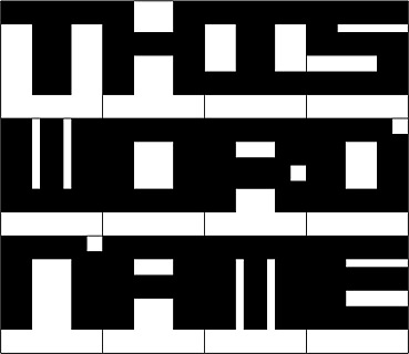
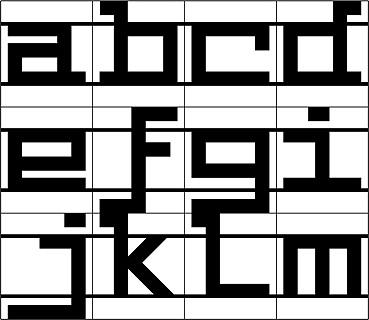
For simplicity I used a grid of 13 x 15 squares (easier in illustrator)
1.
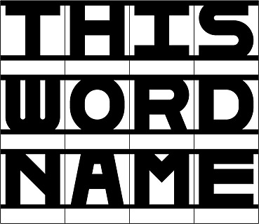
Adapted to the baseline (similar to you used in the Arabic, I think). Bold Characters, still based on previous design:
2.
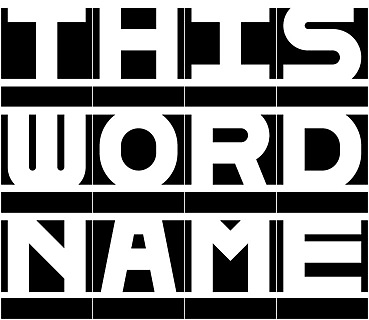
Adapted to the baseline. Less Bold characters.
3.
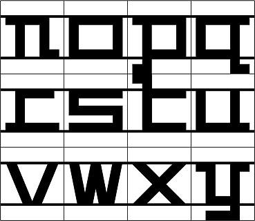
Adapted to the baseline. Less rectangular characters. Variations with curves and angles. Added connecting Caps height line and base line as a visual element.
4.
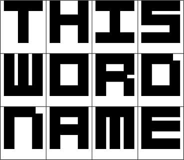
Adapted to the baseline and x height. Basic rectangular characters. Added the connecting x height line and base line as a visual element.
Characters need to be less rectangular.
5. Note:
a. I was wondering if you see possibilities in such an approach, concerning the Arabic.
b. Working on the characters, I more get inytersted in an additional use. Like cutting them in wood or die cut them in metal.
c. By adapting to more legibility, I think we loose that fascinating "monumental", somewhat abstract impact.
Naji:
c. By adapting to more legibility, I think we loose that fascinating "monumental", somewhat abstract impact.
I profoundly agree with you. I think we lost something very important and interesting even with the number 1 example. I will try to make my self as clear as possible:
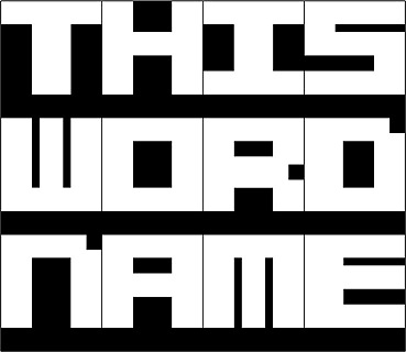
As I said before what astonished me in the first Latin design you made was this abstract feeling due to the bleeding out letters. I had the impression that each letter has a sort of interaction with the frame. And this frame itself gave the idea of the grid.
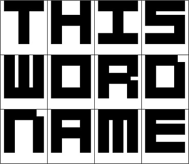
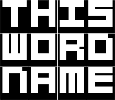
My vision is, we are type matching following a grid, we are creating a font that doesn't obey to the same rules of typography because it follows a grid and an aesthetic. That is why if we pull out the frame we will find that our mono spaced letters will all tight fit together and will create a whole different composition (an abstract illegible one, an Art piece).
Going into a classical typographic matchmaking as you tried to do in the previous example in Arabic and Latin would weaken our concept. It looks like we have a grid and we need to design something inside of this space, so the font could be any other font that fits inside of this grid.
Concerning the Arabic font, I am aware that this is a playfull, display, ornamental type design exercise. I don't want to be obliged to follow Arabic calligraphy or type design rules, all I am saying is that we set our own rules where we have a display (a frame, a screen) and it is composed of a grid and these are our only rules. So if my Arabic letter baseline is different from all the rest of Arabic fonts that would not be a problem, on the contrary it is a playful typeface and it has to be different. I understand you tried to move up the baseline for Arabic and Latin to improve matching and to give more width for the Arabic, but this makes it so simple and ordinary exercise. On the other hand what is more interesting and challenging is having to solve a fixed X hight (a block) where all Arabic and Latin letters must fit in.
One solution could be a moving baseline related for each letter in Arabic, the baseline could actually move up or down on the grid depending on the letter that comes after or before it. I think open type programing makes this possible where each letter changes its form in relation to its situation.
I don't know if I made myself clear, it would be deffinitly easier if we can talk. Tell me what do you think?
