" The Khatt Foundation has become one of the most exciting and innovative young enterprises to emerge from Europe’s fast-paced design industry. Founded eight years ago in Amsterdam, the Foundation first developed El Hema to fuse AbiFarès’ ideas on typography. It was successful in raising awareness about the role of typography in society and encouraged investigation into the underpinnings of good design."
To read more about El Hema you can visit the following links: http://www.khtt.net/page/446/en http://www.khtt.net/page/593/en http://www.khtt.net/page/1485/en
Eight years ago, an anonymous brightly lit department store vied for the attention of a few curious passers-by in Amsterdam. The price tags were in Euros and the branding not dissimilar to dozens of other department stores. The only difference was that El Hema was an art experiment, set up in a gallery and the products were associated with the Arab world. Its identity was cemented by the name and the red banners that hung above the patrons, each defined by smart white Arabic lettering. Even the labels on the bottles of olive oil, which stood in Dutch orderliness on wooden shelves, were written in the free-flowing rhythm of Arabic script.
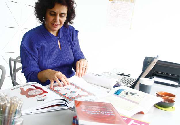
The mock-store was under the umbrella of Amsterdam-based Arabic typography and design institute the Khatt Foundation and functioned as an interactive art exhibition to familiarise the city’s multi-ethnic population with Arabic script and culture. The Lebanese-Dutch designer Huda Smitshuijzen AbiFarès who established the Khatt Foundation explains more about the concept: ‘The idea was to Arabise a typical Dutch department store,’ she says. ‘It was not meant to be an exhibition but to place Arabic font on recognisable products that people could purchase. We manufactured these products so that people could take them away and it would bring Arabic to people’s homes.’
The Khatt Foundation has become one of the most exciting and innovative young enterprises to emerge from Europe’s fast-paced design industry. Founded eight years ago in Amsterdam, the Foundation first developed El Hema to fuse AbiFarès’ ideas on typography. It was successful in raising awareness about the role of typography in society and encouraged investigation into the underpinnings of good design. It also had another goal: ‘At the time there was this anti-Islamic, super right-wing, movement in Holland so it was politically the right moment to do something like this.’ She laughs in disbelief as she remembers how, ‘it made the news, it made TV. It was really unbelievable and fitted with the idea of spreading tolerance and cultural understanding.’ The concept was awarded the Dutch Design Prize in 2007 as well as the support of thousands in the Netherlands.
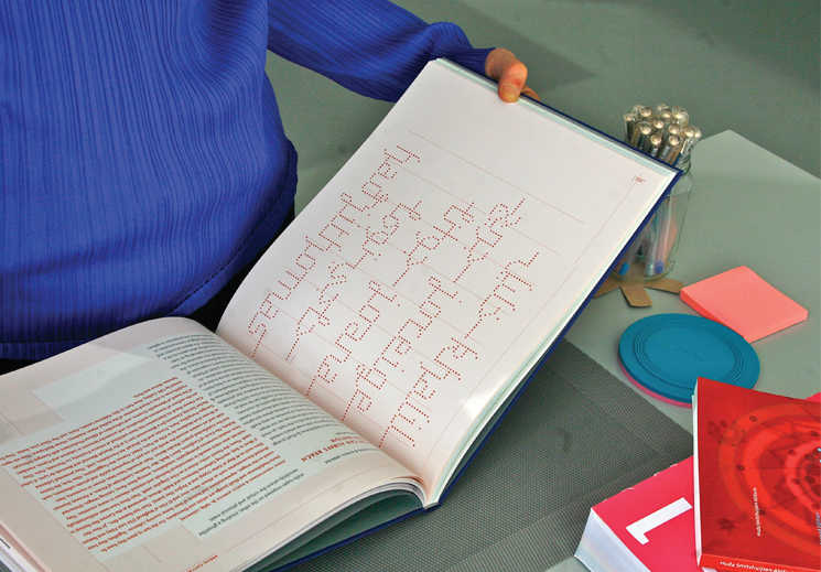
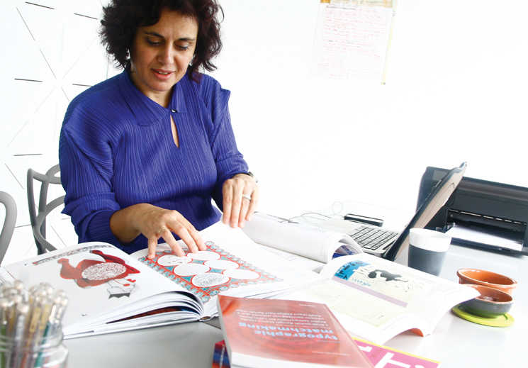
Since 1985, AbiFarès has split her time between the Netherlands and the Middle East after graduating from some of the world’s most prestigious graphic design colleges – Yale University School of Art and Rhode Island School of Design. Now she is back in the lowland state embarking on a PhD at Leiden University on Arabic book design, in addition to directing the Khatt Foundation. The Netherlands has everything needed for a creative designer – diversity, freedom and innovation. ‘Dutch design was hot,’ she says about her first move to Europe, ‘so I thought it might be good to do an internship in Holland.’ She remained in the country for five years before returning to Lebanon to teach a newly established design programme created by a friend at the American University of Beirut. Looking for a fresh break, the designer spent a eight year spell in Dubai where the multilingual environment, in-your-face advertising and giddy pace became a living experiment for any designer interested in typography. ‘It was the kind of the city you never get bored of, every month it was changing. It was a really exciting time to be in Dubai,’ remembers AbiFarès.
This experience in Dubai helped shape AbiFarès’ belief that typography is a woefully misunderstood science and its impact on society cannot be understated, particularly when residents in any global metropolis can expect a heavy daily dose of advertising and public information announcements on a daily basis. ‘If you were in a train station for example and there was no text around, you would have no idea where you were, where to get your train or what the schedule was. So, it is not just reading information it is also about recognising design and knowing what type of information one can expect to receive,’ she explains.
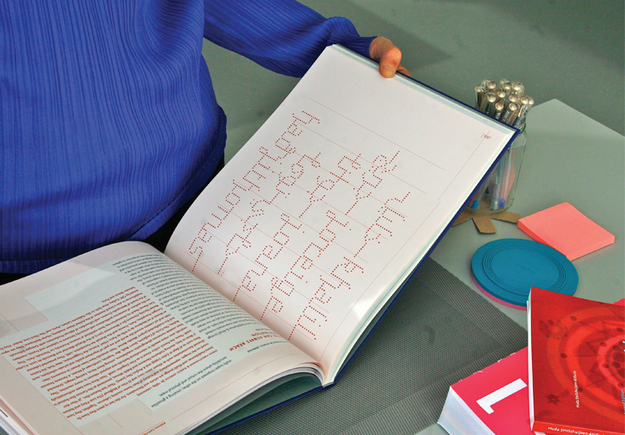
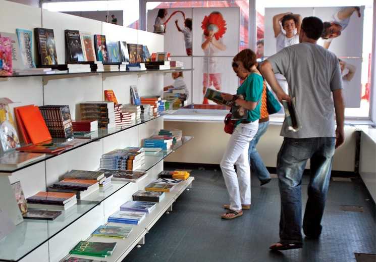
One of the Khatt Foundation’s most recent projects, Typographic Matchmaking in the City, is a practical explanation of how the layman might understand typography. Investigating the function of lettering in public spaces, the team found new and exciting ways to form bilingual lettering, in this case fusing Latin and Arabic fonts. Developed as a documentary and a book, that was widely distributed in Europe, the United States and the Middle East, it was an ambitious project that took three years to realise. ‘We ended up with a bigger group and it brought about interesting conversations about what typography can bring to a city,’ says AbiFarès. ‘It was a more ambitious project than El Hema because we had a bigger budget to work with. We ended up doing the design for Arabic and Latin fonts at the same time; they were specifically made for 3D applications and inspired by urban language.’
In the context of multicultural states, such as the Netherlands, the designer believes the matchmaking of fonts could be a way for Arabic immigrants to better understand their host country and encourage dialogue between them and longer established communities. ‘The project was about how we could bring conversation between cultures through writing. People react to typography in different ways. Of course writing carries information but there’s also the visual aspect that carries a message,’ the designer says. ‘When you see something you kind of expect to know what the sign will be selling or what type of company it is. The style of font also plays a role, you will know instantly from its design if the product is classical, for example. Typography is everywhere and always talking to you so it is impossible to avoid.’
Since typography is such an encompassing and often commercial art form, the way in which the Arabic language might progress is one of the design community’s current hottest topics. To cater for this discourse, the Khatt Foundation’s website is a professional online society, or as AbiFarès describes it, a Facebook for Arabic designers. ‘We tried to move away from traditional styles,’ she says. ‘The Arabic fonts we design are intentionally modern, as traditional Arabic typography has always been connected with religion. So the first challenge is how far can we can go with people still accepting it? Some might say it’s becoming too Western and too much of a break with tradition.’ With over 3000 members in the group, not only is the Khatt Foundation an important platform for discussions on Arabic typography, but it acts as a portal for designers to showcase their work and share ideas.
AbiFarès remains optimistic about the future of Arabic despite the contemporary challenges, that include the inevitable shortage of funds, especially in the field of telecommunications technology. Leading Arabic typography into a new digital age is an exciting and daunting task, but AbiFarès believes that putting Arabic calligraphy into a historical context is the best way for the font to meet modern expectations. ‘It’s beautiful, it’s poetic, it’s the most flexible script I know. You can do so many different things with it. I think in some ways we don’t explore it enough. There are so many possibilities, but what really interests me most is that there is still so much work to do with it”.