Part of the Multiple Baselines series
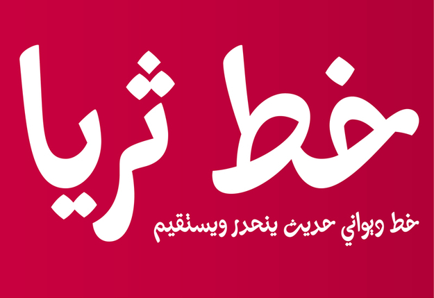
Kristyan Sarkis, was one of this year's Type Directors Club award winners for excellence in Typeface Design with his newly released and highly inventive font Thuraya. This interview will focus on this font because of its unique approach and source of inspiration.
Huda Smitshuijzen AbiFarès: Can you introduce yourself briefly; what is your educational background, professional experience?
Kristyan Sarkis: I hold a BA in Graphic Design with an emphasis on Moving Image and Typography (Notre Dame University, Lebanon) and a Master of Design in Type and Media from the The Royal Academy of Art in The Hague, The Netherlands. I have worked in the fields of graphic design and branding/advertising, and have taught at Virginia Commonwealth University (in Qatar). Currently I am an independent graphic and type designer based in The Hague, The Netherlands.
HSA: When/why did you start being interested in Arabic Type Design? Who/what inspired you?
KS: My first real experience with type was when I was working with Mohtaraf Beirut Graphics (2007), one of the leading design houses in Lebanon. Mohtaraf has a strong affinity to Arabic type and has produced several beautiful Arabic typefaces. Back then, I was given a task to start drawing a typeface. I was hesitant at first, but got very quickly into it. The design director Yara Khoury noticed that I 'have a knack for this', and encouraged me to go on with it. I was delighted to have the opportunity to understand a lot more about type under Yara's direction, and with some eye-opening sketches from Ali Assi, to research the calligraphic styles and explore the beauty of the Arabic script. I had very limited technical knowledge in font development at the time, therefore after I did the original digital drawings on Adobe Illustrator, Greta Khoury, my colleague at the time, who was and remains one of my biggest sources of inspiration, took over the project, did her magic tricks with it, and produced it into a working font in Fontlab Studio.
I owe my start in type design to Yara Khoury and Greta Khoury and to an endless fascination with the Arabic script and the ethereal art of Arabic calligraphy.
This drove me to work on self-initiated typefaces which eventually culminated in pursuing a higher education in Type Design at The Royal Academy of Art in The Hague. There, it all went to a whole new level, with countless additional inspirations: from the great teachers that we had, to all the lecturers and the amazing amount of information that was given to us.
HSA: You have started your career in type design during your MA studies at the Type & Media program at the Royal Academy of Art in The Hague (the Netherlands). Your font Thuraya was a result of this and has this year won the Type Directors Club (TDC2011) award for excellence in typeface design. How does it feel to have won this award?
KS: The journey with Thuraya was an eventful, enriching and personal one. The beginning of the process was very uncertain because of the complications involved in such an experiment. The complexity of the Diwani style and the respect I had for it created a big challenge for me to find a valid and personal interpretation into a digital typeface. With the help of all the teachers during Type and Media, especially Erik van Blokland, and with another year of work after that, it was possible to achieve it. Therefore, to have been rewarded by an esteemed organization such as the Type Directors Club meant a great deal for me. It's a good feeling when established professionals in the field acknowledge your work and appreciate it.
HSA: Can you tell us about Thuraya? What was the main idea behind this design?
KS: The main idea behind Thuraya was to study the intersection of Arabic calligraphy and type in a digital type environment, while balancing the possibilities of both. Since my fascination with Arabic calligraphy has always been my primary motivation for designing type, and modern type design has taken a whole new level of complexity, I wanted to explore the relationship between these two areas.
HSA: What are the main characteristics of Thuraya?
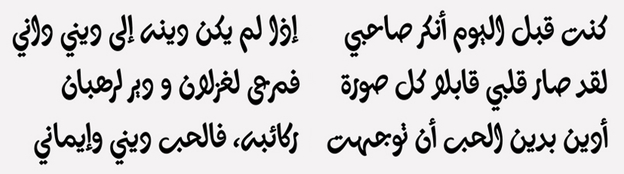
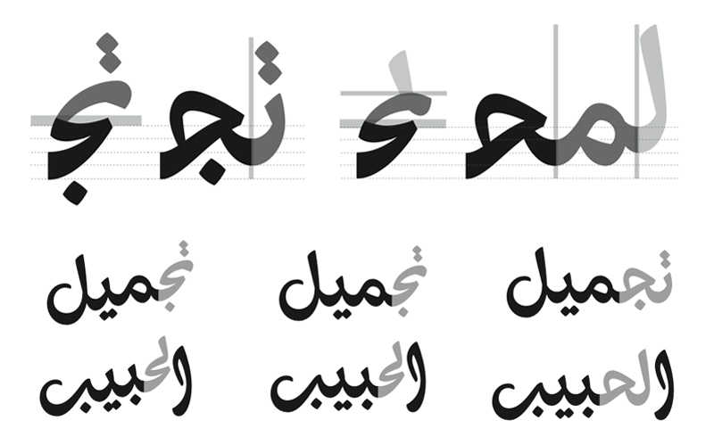
KS: Thuraya's main characteristics are its strong Diwani reference, its fluid cursiveness, its high, steep and fully curved connections, the horizontal slant of its letters, its extensive character set (including ligatures and alternates which are essential for a harmonious calligraphic flow), and the slanted baseline for Thuraya Slanted.
HSA: Why did you choose the Diwani script as a starting point?
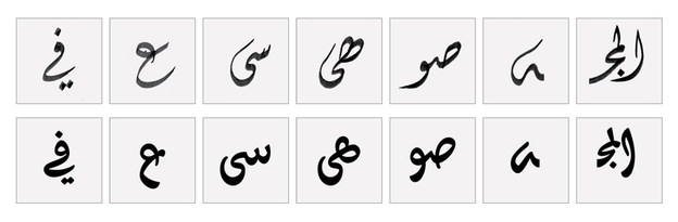
KS: The Diwani style was one of the highest calligraphic achievements of the Ottoman Empire. It was developed in the late fifteenth century by Ibrahim Munif and later modified and refined by the reputed Turkish calligrapher Shaykh Hamdulla. It is a highly cursive style and is to this day admired for its most unconventional and excessively curved letterforms and connections. The Diwani style is very compact; letters are seamlessly woven into each other and generally have no descenders. It has a slanted baseline and a horizontal angle for all the letters. It also involves a lot of rotation and usage of the tip of the pen to achieve the thinnest curved strokes. It is a very delicate and rich style, which unfortunately, had not been explored yet; perhaps its complexity is somewhat discouraging. These aspects of the Diwani style are some of the reasons I chose it as a starting point for Thuraya.
HSA: How is this design different from a plain 'revival'? How did you combine the old calligraphic style with more contemporary and inventive new traits that take into consideration the modern reader and the new technological possibilities?
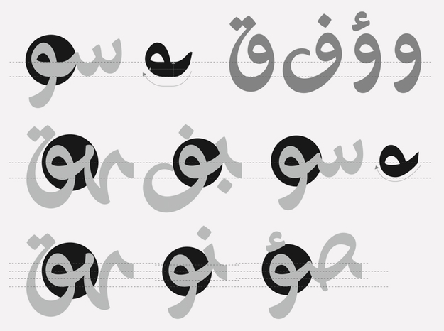
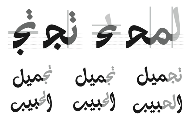
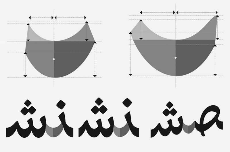
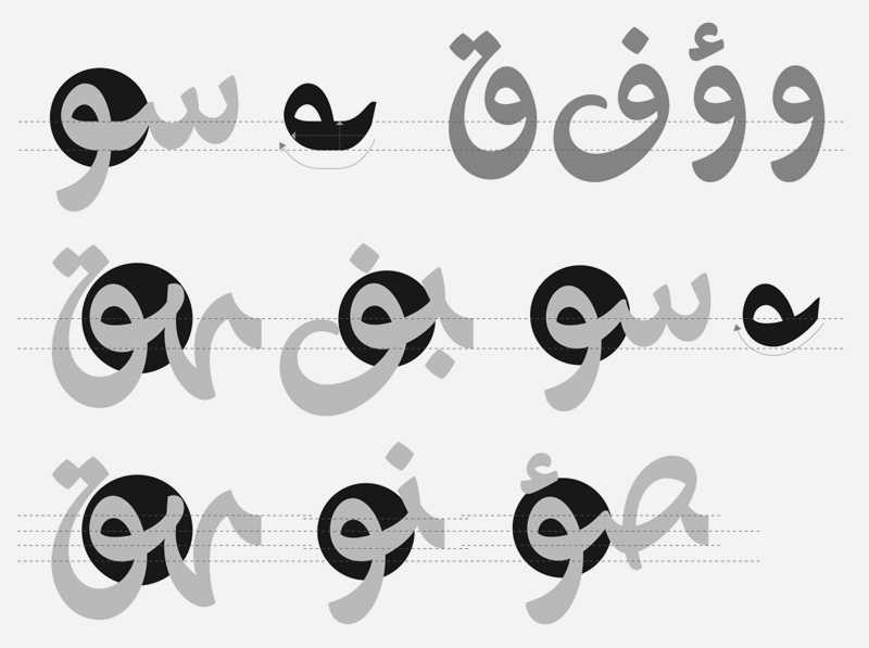
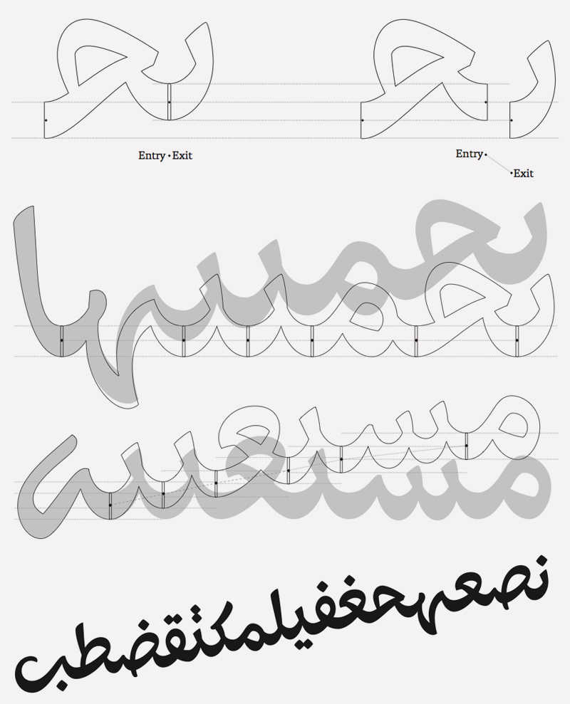
KS: Thuraya does not intend to replicate the calligraphic style. It is first and foremost a contemporary (and personal) interpretation of the latter. All the calligraphic characteristics were researched, adapted and then implemented into a typeface. The Arabic calligraphic text setting is a very complicated system that involves multiple baselines, countless alternative shapes and ligatures, and strict rules. Rather that imitating this aspect, Thuraya is a calligraphic display typeface that benefits from the current technologies to have new and innovative features. The angle of the stroke, the letterforms, the slanted baseline, the endings and the unconventional connections were all carefully studied and adapted in a typographic set of rules that draws its primary inspiration from the Diwani style. Therefore several interventions were necessary to fit the requirements of the modern reader, such as taming down some calligraphic features, devising a new system for leveling (number of levels that one letter occupies and how it affects the preceding letter combinations), modifying certain letterforms to make them more accessible, and a personal treatment for the curves meticulously inspired by the hand and the pen.
HSA: What is the most innovative aspect of the Thuraya font? When will this font be available commercially and which foundry will be publishing it (where can we buy a copy of it)?
KS: From a design perspective, it would be the steep and fully curved connections on the baseline which required a lot of experiments on the speed, height and width of the connections. That is why an extended set of ligatures (660) was designed to keep the calligraphic fluidity throughout the whole typeface. From a technical perspective, Thuraya's most innovative aspects are the slanted baseline connections, the mark positioning, and the kerning. While normally the mark positioning and kerning for Arabic typefaces are done in Microsoft Volt, I have been working with Erik van Blokland, who developed special tools for that outside the realm of Microsoft Volt by commission from Typotheque.
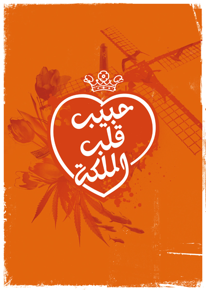
Thuraya has been released by Typotheque in the beginning of May and will hopefully be available for sale very soon. (http://www.typotheque.com/fonts/thuraya)
HSA: Since you have been involved with other type design commissions. Can you tell something about this work?
KS: I have been commissioned by Peter Bilak to work on an Arabic newspaper text typeface as a companion for one of Typotheque's typefaces. I am also currently involved in two other type design projects with designers that I highly admire. Both are text typefaces, inspired by different calligraphic styles, but intended for different uses. Each tackles different aspects of Arabic type, from designing a companion to an already existing Latin typeface to conceiving a family with different writing systems simultaneously, to exploring different calligraphic styles and bringing them into a contemporary interpretation.
HSA: What are your future aspirations and plans?
KS: I would like to research more about the Arabic script, study the evolution of its calligraphic styles and understand the silent rules that lie behind this perfectly constructed system. Hopefully this would lead to a more academic research that I have in mind, which would be beneficial to my personal development as a designer and to the Arab world in general; and certainly I hope to push even further the boundaries of contemporary Arabic type.
HSA: What is your advice to young Arab type designers and where do you feel the Arabic type design field could be heading in the future?
KS: My main advice is to get well informed about the massive history of the Arabic script. Arabic calligraphy has had long years of evolution and perfection, and every genius mind behind any development has given countless possibilities and unlimited paths to explore. Having this heritage in mind, benefiting from technologies or even creating technological developments to fit new requirements, and observing the need, all would lead to more successful experiments.
Needless to say, these are very exciting times for Arabic type. There's a possibility around every corner. There's a rising in awareness and interest in Arabic type from all around the world, both among designers and users/clients. Very clear signs of a major step forward in the Arabic type field are all around...
To read more in detail about the design process of the Thuraya font please visit the website of Typotheque by clicking here

