The few knowledgeable people in the field have produced practically nothing to make their knowledge accessibly to others, keeping Arabic typography in general on an extremely low level. Obviously, this result was to be expected following this bizarre strategy of keeping knowledge in a dark vault. But the tide is rapidly changing. There are more and more publications about Arabic typography around and young Arab type designers (notably Pascal Zoghbi) make their knowledge widely available. That is the only proper way forward. Spreading knowledge is essential for progress. This attitude will speed up the rise of professionalism resulting in a higher general interest and appreciation for Arabic type. Finally, things are moving in the right direction.
Yet, there is still a lot of clarification to do. Silly secrecy remains the preferred attitude in the outskirts of Arabic publishing software and font design. It appears that software developers do not want to inform users about how the 'Kashida' functions for justified Arabic text in their software. We have to figure that out ourselves.
Justification is the typographic variation whereby the text in a column is aligned on both the right and the left side. In the Latin script adjusting the size of the wordspacing is used to make this happen. Each space between words within one sentence gets equal extra space to give all sentences the same length. A general accepted aesthetic rule for type quality is that wordspace should never be too wide, creating so called 'white rivers' in the text. Also using variation in letterspacing as means for justification is not considered good practice. In Latin, 'hyphenation' (breaking up words) is very helpful to avoid too wide wordspacing. In Arabic matters are slightly different. First, Arabic words cannot be broken up in parts. Hyphens are not used in Arabic. But, there is an extra feature that the Latin script does not have: the kashida also called tatweel. Specific Arabic characters can be elongated to make words wider. So in Arabic a combination of wordspacing variation and character elongations (kashida) can be used to justify text. In classic Arabic calligraphy there were a lot of different ways to apply the kashida. It was often used to embellish the text. Giving the elongated letter connection a slight curve when it was stretched is an elegant solution. The calligraphers had elaborate rules for using specific letters in specific positions. Today, most Arabic fonts have a kashida in only one fixed length and one position on the keyboard. Longer kashidas are created by putting more kashidas behind each other.
The way kashidas are put between the text seems to be mysterious or random in the Adobe ME software. There must be some logic in the positioning system but it is not obvious. Microsoft in contrast has made a publication about the rules of priorities that govern the addition of kashidas in Arabic text made with their software and in the cascading style sheets produced for their Explorer 5.5 browser.
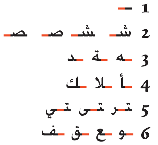
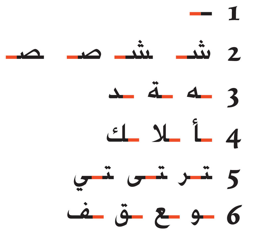
The kashida justification is based on a connection priority scheme that decides where kashidas are put automatically.
This is how the software decides on kashida-inserting priorities:
1. First it looks for characters with the highest priority in each word, which means kashida-extensions will only been used in one position in each word. Not more.
2. The kashida will be connected to the character with the highest priority.
3. If kashida connection opportunities are found with an equal level of priority in one word, the kashida will be placed towards the end of the word.
The priority list of characters and the positioning is as follows:
1. after a kashida that is manually placed in the text by the user,
2. after a Seen or Sad (initial and medial form),
3. before the final form of Taa Marbutah, Haa, Dal,
4. before the final form of Alef, Tah Lam, Kaf and Gaf,
5. before the preceding medial Baa of Ra, Ya and Alef Maqsurah,
6. before the final form of Waw, Ain, Qaf and Fa,
7. before the final form of other characters that can be connected.
One can also choose from different variations to use the kashida justification:
A. The 'text-justify' instruction will not put kashidas in the text but expands only the wordspacing as it does in Latin.
B. the 'newspaper' instruction will put kashidas in the text but also expands the wordspacing.
C. The 'kashida' instruction will only use kashidas to justify the text. The wordspacing remains the same. There is a proposed system that can control the amount of justification given to wordspacing and to kashidas.
The use of kashidas and methods of justification are not satisfactory in the Adobe ME software. First, one should never select the 'optical' possibility in the wordspacing selection, because it breaks the letter connections apart. Second, wordspacing cannot be adjusted separately in the software. A plus and minus selection will affect letterspacing as well. That is ugly and it should be changed. Third, the current priority scheme of kashida additions does not deliver satisfactory results. There is a lot of room for improvement. Fourth, the selection between 'Arabic' and 'Naskh' deliver unclear differences.