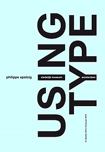
See more at: http://www.stedelijk.nl/en/exhibitions/philippe-apeloig--using-type#sthash.or8jAKB1.dpuf
Each one of us is confronted by typography every day: from the digits on our alarm clock, to the price ticket on a loaf of bread and the label in our clothing. Philippe Apeloig’s mastery of typography is such that he is able to play a subtle and well-chosen game with characters and fonts.
For Apeloig, letters are never autonomous images; even when distorted, they always serve as carriers of a clear message.
Apeloig trained briefly at the Amsterdam graphic design agency Total Design, where Wim Crouwel was director. Here, he became fascinated by the Dutch modernist, streamlined approach to typography.
The Paris-based designer works for both the cultural sector as well as commercial clients. He makes regular excursions from the printed page to create digital typographic animations. He composes with typography for logos, books, folders, moving images and posters.