All rights reserved
2592 x 1944
Download
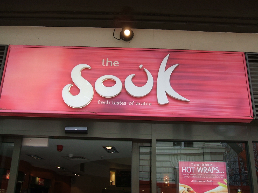
It always makes me feel uneasy when I see Arabic letters masquerading as roman ones, or vice versa. Here we find a nun, complete with dot, pretending to be a U. Of course, they want to attract customers by presenting an "exotic" or "Oriental" appearance. But would it not be better to have just "The Souk", or better, "The Market" (which is all it means) in plain English, with السوق in Arabic script alongside? I should be interested to know what members of the design community think.