The Khatt Foundation's design installation (curated by Huda Smitshuijzen AbiFares) at the Haus der Kunst in Munich, Germany, was part of the larger exhibition Future of Tradition – Tradition of Future, 100 years after the exhibition ‘Masterpieces of Muhammadan Art’ in Munich. This design installation is a manifestation of the role of Arabic typography in contemporary design and visual culture from the Arab World. The Khatt Foundation exhibit focuses on the ubiquitous nature of text and letters. The space acts as an open book, taking letters off the page and assigning them a tangible presence.
click here for the reportage on Arte TV for more information about the exhibition
Click here to read excerpt from the Arab Press: http://www.khtt.net/page/27684/en
In 1910, the exhibition ‘Masterpieces of Muhammadan Art‘ was held on the Theresienhöhe in Munich. With almost 3,600 exhibits, it was the largest display of art from the Islamic cultural sphere ever shown, even to this day. It gave the western observer a comprehensive historical view of the arts in countries influenced by islam. It also paved the way for deeper, scientific research. Objects that were thought of as quaintly folkloric or as being applied arts were suddenly elevated to the rank of ‘masterpieces‘. Seen from our standpoint, the exhibition of 1910 undoubtedly represents a turning point: it replaced the conventional and dominant idea of Orientalism and exotic fantasy and led to an objective consideration of the visual culture of the Islamic world. Exactly one hundred years later the exhibition Future of Tradition, Tradition of Future, 100 years after the exhibition ‘Masterpieces of Muhammadan Art‘ in Munich Curated by Chris Dercon, Leon Krempel and Avinoam Shalem, at the Haus der Kunst will be remembering this epoch-making show and will carry out an important change of viewpoint: it includes, among others, contemporary art, design, photography and fashion and offers artists and institutions the possibility of participating in the exhibition with their own concepts.
The Khatt Foundation exhibit focuses on the ubiquitous nature of text and letters. The space acts as an open book, taking letters off the page and assigning them a tangible presence. The text is subtle, poetic, subversive and political. A carpet becomes an oversized concrete outdoor tatami-mat with engraved concrete Arabic poetry. A large Plexiglas curtain is turned into a plea for change in the Arab world with “a thousand Nos (lam-alephs)” creating a semi-transparent wall of resistance. Letters turn into dresses, then into twirling beautiful women, reflected in a mirror of ornamental Arabesques. And tableware becomes a reflection on Arab social interactions while marrying contemporary design to traditional crafts. New letterforms are presented in stark black and white purity to reclaim their place in contemporary applied arts from the Middle East. This room presents diverse design approaches and individual voices in a way that challenges the applied arts traditions from the region and engages with the questions of contemporary Arab identity. The featured seven Arab (women) designers were selected based on their diverse design specializations, and were commissioned to produce a new work for this exhibit using Arabic letters as a central element in the design. The space focuses on the collaborative nature of design and the need to keep the traditional crafts alive by innovating from within these traditions and by introducing new techniques and a contemporary visual language that speaks to Arab youth and young designers from the region.
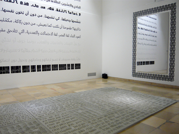
Huda Smitshuijzen AbiFares. Wall of Poetry. 2010.
(Khatt Foundation Collection of Fonts. www.khtt.net)
The mural uses a text by Pierre Abi Saab that express the vision and goals of the Khatt Foundation.
This text is translated in the small exhibit booklet (in English and German).
Fonts used were commissioned by the Khatt Foundation for the Typographic Matchmaking 1.0 and Typographic Matchmaking in the City projects (curated by Huda Smitshuijzen AbiFares)
Fonts, from top to bottom:
TheMix Arabic, by Lucas de Groot & Mouneer El Shaarani,
Fresco Arabic, by Fred Smeijers & Lara Assouad Khoury,
- Kufam, by Artur Schmal & Wael Morcos,
- BigVesta Arabic, by Nadine Chahine & Gerard Unger,
- StoryLine, by Max Kisman & Naji El Mir,
- Fedra Arabic, by Peter Bilak & Tarek Atrissi,
- Sada (Seria Arabic), by Martin Majoor & Pascal Zoghbi,
- Nuqat, by René Knip & Khajag Apelian,
- Hamsa, by Erik van Blokland & Pascal Zoghbi.
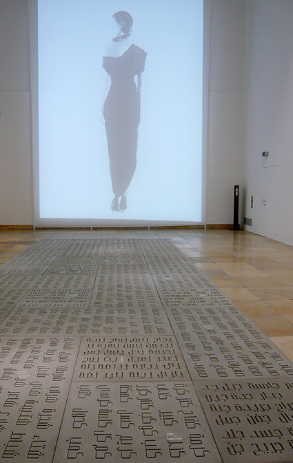
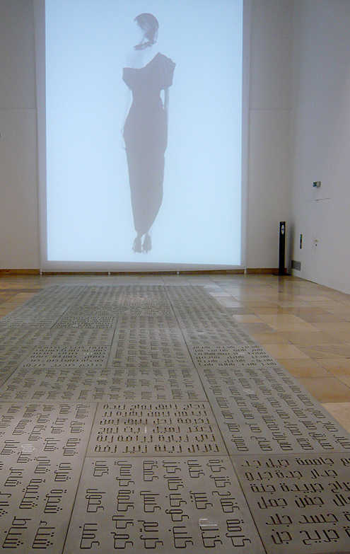
Milia Maroun. Letter Dresses. 2010.
Fashion design: Milia Maroun. Calligraphy: Samir Sayegh.
Video installation directed by Huda Smitshuijzen AbiFares and filmed by Marino Solokhof.
(Dresses: Collection of MiliaM, Video: collection of Haus der Kunst)
This series of dresses were designed with the Arabic letterforms as central to the work. It is an homage to the Arab-Muslim cultures that puts the word at the centre of artistic creation. Instead of printing the text on the garments (as has been done many times before), the designer chooses to make the letters themselves into garments. Cut from black stretch material, the sensual Arabic calligraphic forms are transformed by the body of their wearer into a sensual human figure. In this sense this project challenges the notion of the non-figurative islamic arts in a provocative and playful manner. The letters veil and unveil the female figure in a seductive manner while putting the Arabic letters at the centre of contemporary Arabic fashion design.
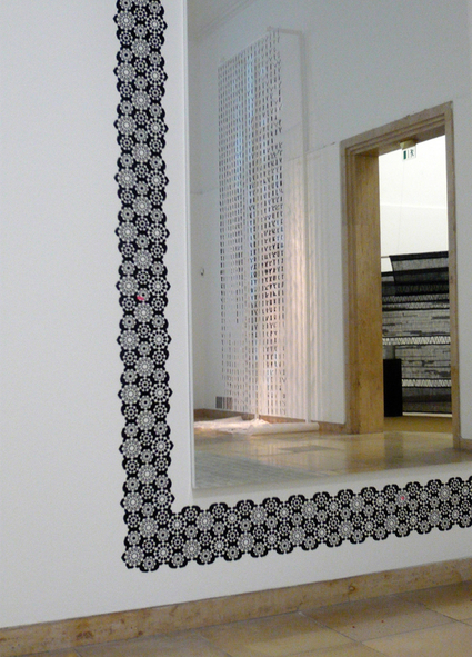
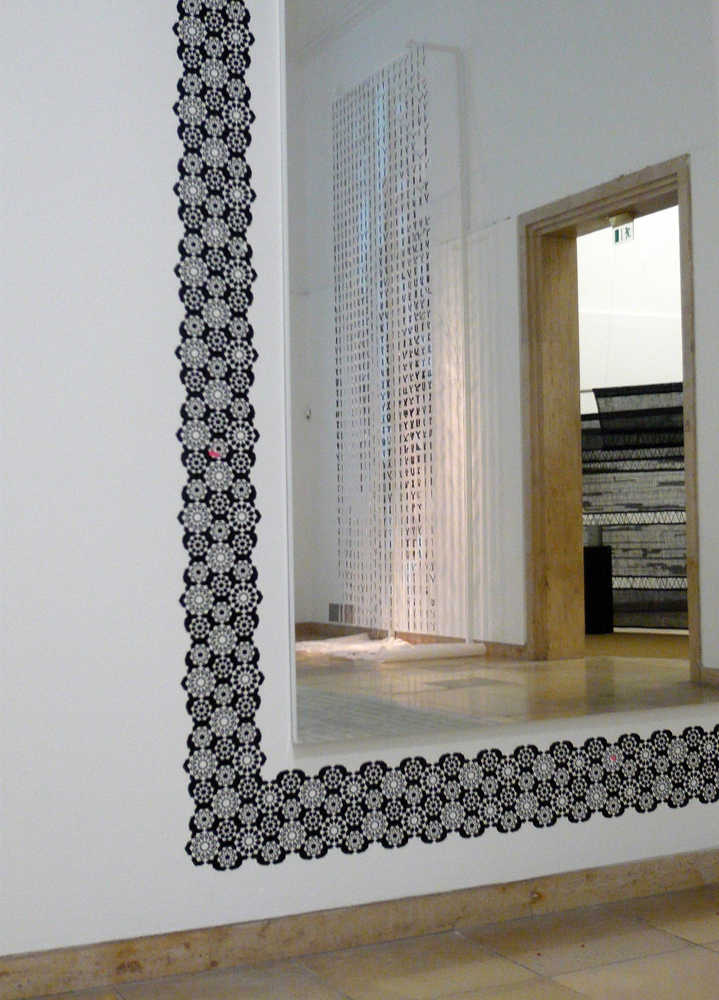
Farah Behbehani. Fann Mirror Frame. 2010.
(Khatt Foundation Collection of Wall Stickers)
This mirror frame is designed as a wink and a contemporary interpretation of decorative Islamic applied arts. The pattern incorporates the word Fann (art) which is made up of the two letters Fa (f) and Noon (n), that are used as part of the ornament. Originally designed for the Khatt Collection of Wall stickers, this work has been readapted for this exhibition and used to ‘frame’ the facing ‘letter dresses’ by MiliaM. The two works engage in a dialogue amongst themselves (also incorporating the passersby and viewers reflected in the mirror), while paying tribute to traditional islamic arts aesthetics.
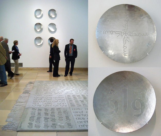
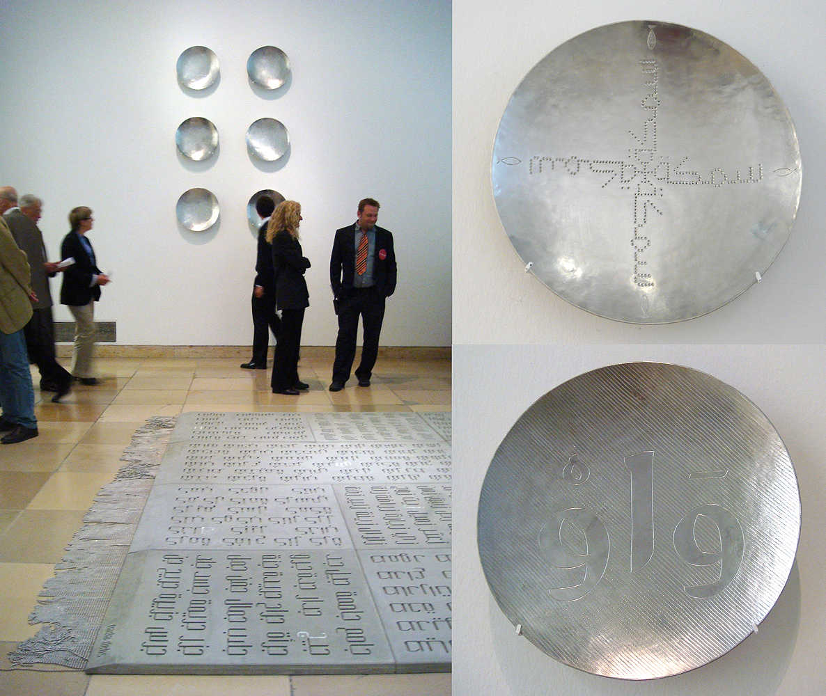
Karen Checkerdjian & Raya Khalaf. Letters & Words. 2010.
Series of 6 plates: Asfour (Bird), Ya’, Nijmeh (Star), Aleph, Samka (Fish), Waw.
50 cm x 50 cm tinned brass, limited edition, 2010.
(Collection of the designers)
This series of six plates pays a very subtle tribute to the islamic applied arts while affirming its contemporary and minimalist design language. The plates have used the traditional techniques of metal engraving (in collaboration with local artisans from Beirut), but have replaced the visual language by using contemporary fonts (from the Khatt Foundation’s collection of fonts) and minimal illustrative elements. In this series, the images gives way to words: the common motifs of fish, star and bird found on traditional Islamic dishes, are replaced by the word naming these objects, and repeated in geometrical arrangements. The Arabic long vowels (waw, yeh, and aleph) are transformed into words forcing the readers to spell them out as sound. Combined these two series intend to bring the language at the center of social interactions; which in the Arab world often involves sharing a good meal.
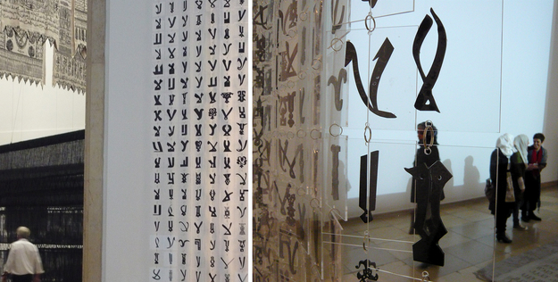
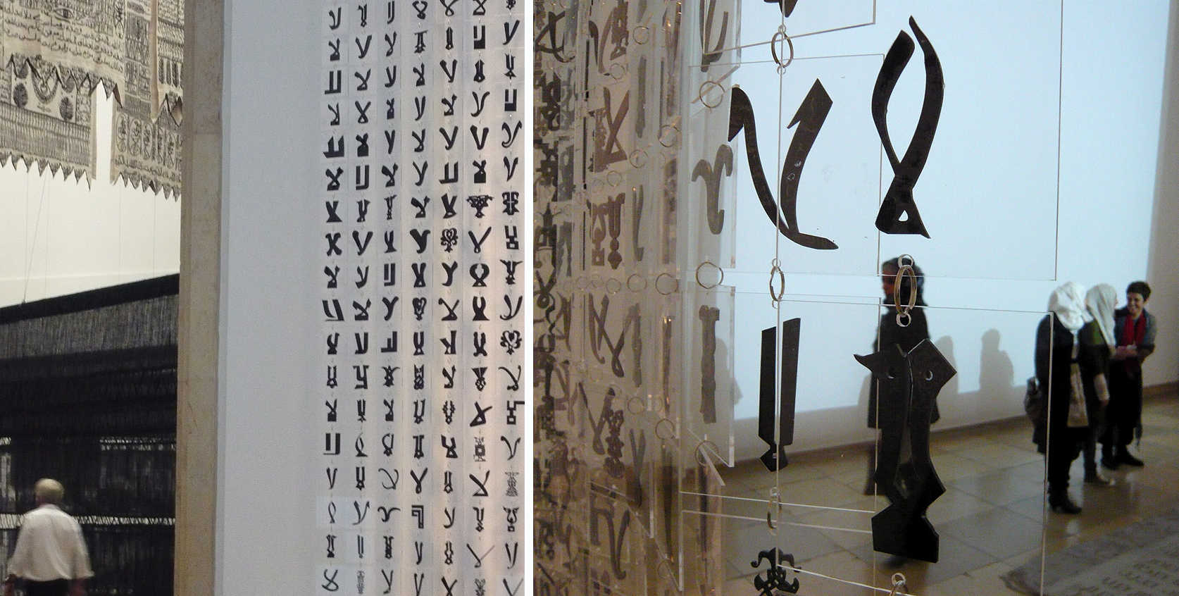
Bahia Shehab. A Thousand Times No. 2010.
Plexiglass curtain. 2.5 m x 6 m, and 1016 page book documenting the research.
(Collection of the designer)
This work is a research-based tribute to the wealth, diversity and freedom of expression in the islamic art. It is a rejection of conformity and repression that often plagues the Arab and Islamic cultures. It traces the history of one letterform the Lamaleph (which is also the word NO), and repeats it a thousand times to illustrate the common Arabic expression: “No, and a thousand times no!”. Bahia explains what she wishes to rejects in the foreword of her book by the same title and also designed for this exhibition, and published by Khatt Books in Amsterdam.
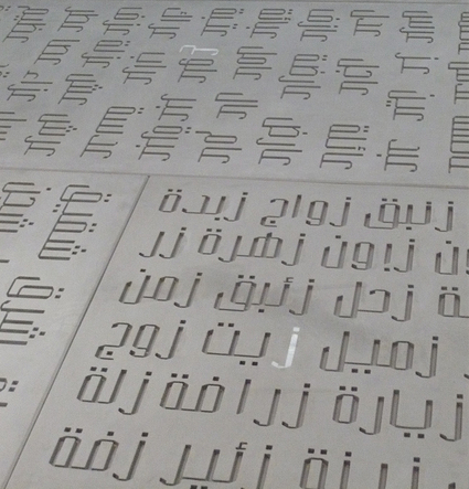
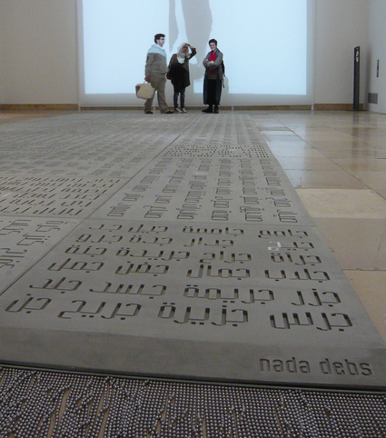
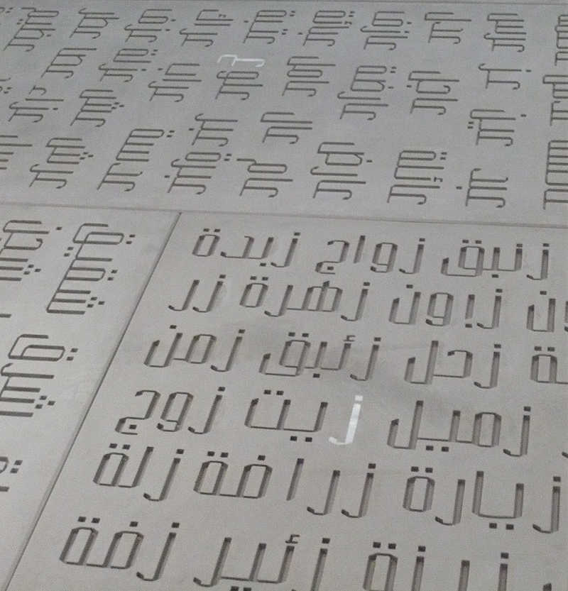
Nada Debs. Concrete Poetry on Concrete Carpet. 2010.
9m x 3m concrete slabs with mother of pearl.
(Collection of the artist)
This piece was created specially for this exhibition. It challenges our perception of delicate Islamic carpets. Following the trademark signature of Nada Debs, it combines elements of the Middle and Far East. Like tatami mats, it is composed of modular elements that combine to form a long Islamic carpet. It combines old and new techniques: concrete inlaid with mother-of-pearl. It uses the Arabic script to create Haiku-like ‘concrete’ poetry, dedicating each of the 28 panels to one letter of the Arabic alphabet where all words starting with that letter are arranged to create a visual and musical rhythm. The meaning of the carpet lies in its negation of a didactic meaning, and in Nada’s words: ‘it is what it is, it is grounded in the present moment’. The font used in the design was developed in collaboration with Pascal Zoghbi as a corporate font for Nada Debs, and is presented for the first time in this design piece. It mixes the calligraphic tradition of Kanji and Arabic calligraphy in a contemporary geometric design, and in this sense is a true signature of Nada Debs.
click here for the reportage on Arte TV for more information about the exhibition