This past summer the producers of the award-winning television series ‘‘Homeland’’ had a problem. Principal photography for the fifth season was planned for Berlin but critical scenes were set in a Syrian refugee camp. The set designers contracted three Arab street artists — Heba Amin, Caram Kapp and Don Karl (a.k.a. Stone) — to provide a touch of Middle Eastern authenticity to the Western European backgrounds by way of some generic Arabic graffiti. In the frenzied final days leading up to the filming, it seems no one bothered to check the work. Only after the fact did the artists reveal they had bombed what some call ‘‘the most bigoted show on television.’’ Their tags were indeed political, just not in the way their employers had intended: They provided critiques of the program itself, such as ‘‘ ‘Homeland’ is a joke, and it didn’t make us laugh,’’ and, more bluntly, ‘‘ ‘Homeland’ is racist.’’ The artists asserted that their subversion was possible because in the eyes of the Western crew, ‘‘Arabic script is merely a supplementary visual that completes the horror-fantasy of the Middle East.’’
Perhaps it’s not so surprising that in this moment of extreme anti-cosmopolitanism, where every form of other — from whatever perspective that other is rendered — is subject to suspicion, the mere presence of foreign writing is enough to evoke menace. Indecipherable texts are often metonymies for unknowable threats and unintelligible ideologies. Think of countless summer blockbusters where crates or tanks or missiles emblazoned with unreadable Cyrillic or Chinese characters portend certain doom. We tend to feel safe in our familiar alphabets. In turn, they link us to powerful traditions and communities. The origins of the little serifs on the corners of the letters you are reading here stretch back through the centuries, beyond revolutions, technological and intellectual, to the chiseled inscriptions on the monuments of ancient Greece and Rome. (Renaissance type designers, reviving Roman letterforms, prized the inscriptions on Trajan’s Column as the most perfect model.) Like all design objects, letters too are inherently ideological.
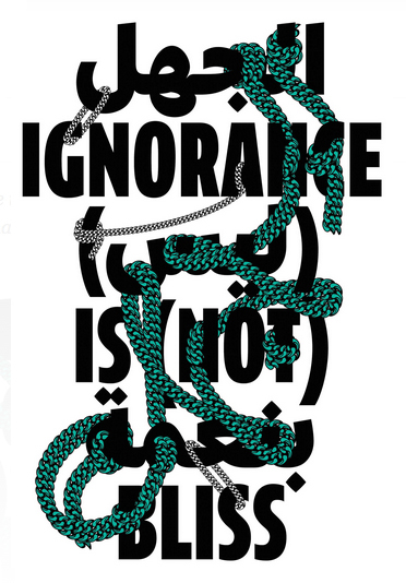
If the Roman letter recalls the chisel, Arabic is borne of the brush. Arabic calligraphy links back to ancient scripture and the origins of Islam. The Koran was revealed to Muhammad in Arabic, and the distinctively fluid form of writing is intertwined with the religion and culture of more than a billion people worldwide. That a writing system as lyrical and visually poetic as Arabic has come to signify something insidious — at least to Western eyes — is not just a little ironic. It speaks to the limitations of a technology-driven global community.
While the first printing presses arrived in the Middle East within decades of Gutenberg’s prototype — the quintessential disruptive technology — Ottoman bureaucrats allegedly outlawed any printing of Arabic text, by penalty of death. The mechanization of sacred writing bordered on blasphemy or at least cultural capitulation. By the time the draconian restrictions against printing were allayed in the 18th century — at least for secular texts such as mathematics and medicine — typographers faced a new challenge: the inherent complexity of Arabic. With 29 letters, each with two or four different contextual shapes, and thousands of possible unique letterform combinations, calligraphic Arabic simply wouldn’t fit the limited matrices of Western machinery that, in the intervening centuries, had developed to accommodate a limited system of Roman upper- and lowercase letters.
For centuries, traditional Arabic calligraphers had steadfastly refused to apply their skills to the creation of movable type, so the calligraphic never became fully typographic in the way, say, the handwriting of Medieval monks was transformed into standardized letters used on printing presses. It wasn’t until the mid-20th century that several versions of a simplified Arabic alphabet were developed in collaboration with local calligraphers — underwritten by Western tech giants like IBM and Linotype angling to open up new markets — to work efficiently within the restrictions of Roman-based systems. Simplified Arabic was wildly successful, and is still used throughout the world, but in pruning and standardizing the alphabet, most of the elegant gestures of hand-brushed script were necessarily filtered out. Within the last decade, however, a cadre of highly skilled, mostly Middle Eastern designers, many of them autodidacts retrofitting Roman-based digital font authoring tools, are creating a fully typographic Arabic: one that merges the dizzying eclecticism of original writing systems with contemporary font production.
Prominent among them is Huda Abi Fares. Born in Beirut, she studied graphic design at RISD and Yale in the 1980s at the height of the Swiss modern influence. In 2004, she started the nonprofit Khatt Foundation in Amsterdam as a way of addressing the problem of cross-cultural type design and building a community of like-minded Arabic typographers. Today, the Khatt website showcases the work of more than 1,700 designers around the world. She has also started a project, ‘‘Typographic Matchmaking,’’ which pairs Dutch and Arabic designers together. Two alumni, the Slovakian Peter Bilak from the Netherlands, a world-renowned designer of Roman alphabets, and a Lebanese designer, Kristyan Sarkis, have since established TPTQ Arabic, a new type foundry focusing on the development of high-quality unified Arabic/Roman font families designed for global digital distribution. Think of bilingual contexts, such as the concourse of an international airport or signs on a highway, where an aesthetic coherence between writing systems is essential.
These nascent efforts point to a global modernization that doesn’t come at the cost of cultural specificity or aesthetic homogenization, but synthesizes calligraphic traditions to create new forms. Type designers spend their lives deep in the minutiae of reading and the hidden visual codes that permeate the fabric of our language. There is no form of design that is less noticed or more prevalent: Type touches everyone. Perhaps, just perhaps, these young designers can find a way to cross whatever chasm is dividing us. The task is increasingly urgent. We literally cannot read each other.
A version of this article appears in print on March 20, 2016, on page M2120 of T Magazine with the headline: Graphic Content.