کتاب تحلیل و بررسی حروف فارسی با نگاهی اجمالی به پیشینه الفبا به نحوه ی شکل گیری حروف و قلم های فارسی (فونت های فارسی) می پردازد.
سپس با دسته بندی انواع قلم های فارسی از لحاظ کاربرد به معرفی ساختار، ویژگی ها، مراحل طراحی و آناتومی حروف فارسی پرداخته و با تحلیل و بررسی قلم های پرکاربرد فارسی سعی به ارائه راهکارهای اصولی و کاربردی جهت طراحی فونت فارسی را دارد.
کتاب تحلیل و بررسی حروف فارسی | مسعود نیکو مرام، امید هامونی | براساس طرح پیشنهادی از مهدی سعیدی |
Analysis and Study of Persian Letters | Masoud Nikoomaram & Omid Hamooni | According to the suggestion of Mehdi Saeedi
برخود میدانیم از تمامی عزیزان و اساتید هنرمندی که در به ثمر رسیدن این کتاب ما را یاری کردند کمال تشکر و قدردانی را داشته باشیم. اساتید محترم آقایان: اسدالله چهره پرداز، مصطفی اوجی، صداقت جباری، مهدی سعیدی و سپاس و قدردانی فراوان از استاد گرانقدر مسعود سپهر که بدون رهنمودهای ایشان قطعا کتاب حاضر به ثمر نمی رسید.
| Acknowledgments |
We are indebted to, thank and appreciate all of our professors and advisors who have helped us complete this book, including our esteemed professors Asad-Allah Chehreh-Pardaz, Mostafa Owji, Sedaghat Jabbari and Mehdi Saeedi. We offer special thanks to our venerable professor Masoud Sepehr, without whose guidance this book could never have come into existence.
Selling at:
آدرس فروشگاه: تهران، خیابان انقلاب، روبروی اداره کل تربیت بدنی دانشگاه تهران، سازمان چاپ و انشارات دانشگاه آزاد
فروش اینترنی، مستقیم، تلفنی (فقط از طریق انتشارات رسم
http://www.rasm.ir/default.asp?base=3&view=book&bid=531
ISBN: 9789641001874
Publisher: Islamic Azad University Press
Website: http://facebook.com/persianletters
Authors: Masoud Nikoomaram & Omid Hamooni
Preface | پیشگفتار
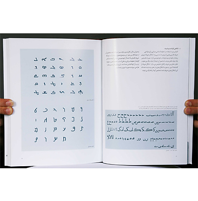
ت، قلم، یا تایپ فارسی همگی اشاره به آن مجموعۀ الفبایی خاصی دارند که در انواع سیستم های حروف چینی، یا واژه پردازی یا تایپ کردن، با ویژگی هایی – گاه محدود کننده – طراحی و ساخته شده اند. در هر صورت امکانات خاصی که حروف چینی با فونت در اختیار صنعت چاپ و نشر، مخابره و تکثیر الکترونیک و دیجیتال امروزی می گذاشه اند، دیر بازی است، دیر بازی است که مورد استفاده وسیع دارند و استفاده از آن به جای نوشتن با دست یا خوشنویسی، به سرعت در حال گسترش است، بسیاری از خصوصیات موجود در این نوع نوشتار به دلیل محدودیت ماشین آلات و تکنولوژی مورد استفاده آن است، و قطعاً پاره ای از این محدودیت ها پاسخگوی ریزه کاری ها و ظرایف هنری الفبای فارسی ما نیست، ولی ما آن را به خاطر امکانات فراوانش روز به روز بیشتر مورد استفاده قرار می دهیم. برای مثال نگاه کنید به زیبایی نوشتاری یک نامه که پنجاه سال پیش می نوشتند و ای – میل فعلی خودمان.
فونت های فارسی موجود بعضی سابقه ای بیش از پنجاه سال دارند و برخی متعلق به سنوات اخیرند، ولی همگی آنها طراحانی داشته اند که به ندرت آنها را می شناسیم، اصولی در طراحی آن استفاده شده که به درستی و به طور مستند نمی دانیم، نسخه اول آن از کجا آمده است نمی دانیم، اصول اندازه گیره و فاصله گذاری و تناسبات در آنها چه بوده یا ساختار یا ریخت آنها بر اساس کدام ضابطه یا سند فرهنگی بوده است نمی دانیم، و ده ها سوال دیگر از این دست را هم نمی دانیم، دلیل آن این است که تقریباً هیچ سند جدی درباره حروف ماشینی یا فونت فارسی از طرف طراحان، معلمها و علاقه مندان فونت فارسی در دست نیست، هر چند بسیاری حرفها برای گفتن در این زمینه دارند. این کمبود ها در سالهای اخیر به آهستگی در محافل طراحان گرافیک ایران در حال شناسایی است؛ و به تدریج مشاهدات ، آموخته ها و تجربیات از هر نوع در این زمینه از چشم انداز های مختلف در حال نوشته شدن و انتشار است.کتاب حاضر یکی از این نوع تلاش های با ارزش است. آقای نیکومرام و آقای هامونی طی چند مرحله آموخته ها و مشاهدات خود را از زمان تحصیلات دانشگاهی تا کنون به اتفاق حمع بندی و دسته بندی کرده اند و در این کتاب مهمترین آنها را در کنار هم قرار داده اند و با حوصله ای تحسیت انگیز مهمترین آنها را از نو به صورتی موجز و قابل فهم طراحی کرده و به نمایش در آورده اند. شاید اگر کوشش و همکاری مشترک در کار نبود این کتاب با مثال های تصویری بیشمار، خلاصه شده و قابل توجه آن در شرایط فعلی حاصل نمی آمد.
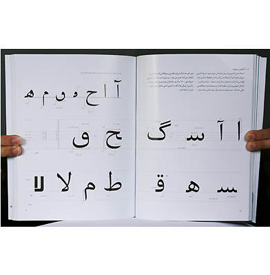
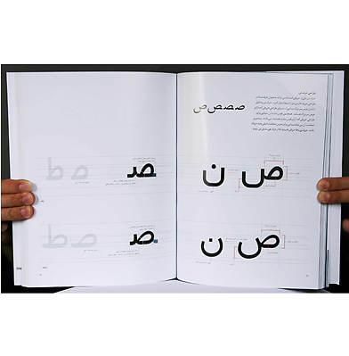
بیشترین بخش کتاب به مثال های تصویری و قابل فهم اختصاص داده شده است و متن نسبتاً کمی آن را همراهی می کند ولی این خود اسبابی است که به خواننده استقلال و فرصت بیشتری برای تامل کردن و فکر کردن از دریچه های دیگر می دهد. باشد که این کوشش موجب انگیزه نگارش و انتشار مطالب تاریخی، علمی و نظری گسترده ای در زمینه حروف ماشینی یا فونت فارسی توسط نویسندگان این کتاب و نیز علاقه مندان دیگر شود.
مسعود سپهر
دی ماه 1388
...........................................................................................................................................
“Font,” “letters” and “Persian type” all refer to special alphabetical sets that have been designed or constructed for use in a variety of type settings and word processing. At any rate, the capabilities that the modern press and publication industry have provided through typesetting, as well as those provided by electronic and digital dispatch and copy, have long had extensive applications, and their use in the place of handwriting or calligraphy is rapidly growing. Many of the features of this kind of writing grew out of the limitations of machines and the technology they use. One effect of these limitations is that fonts often do not meet artistic standards existing in our Persian alphabet. For example, compare written calligraphy in a letter from 50 years ago to the text in our current e-mails and it is easy to see the dramatic loss of aesthetic quality in favor of functionality. Nevertheless, we increasingly use machines and technology because of the abundant potential they offer.
Some Persian fonts are as many as 50 years old, and some are even older. But all of them had designers, whose identities are rarely known. The designers created Persian and Arabic fonts using principles with which we are unfamiliar, and we have no documents explaining these principles. We don’t know where the initial versions of these fonts came from; what measuring, spacing and proportioning methods were used; or on what cultural rule or document their structure or shape was based. We can pose—but cannot answer—tens of other questions of this nature. The reason for this is that there is almost no serious document about Persian typesetting or font available for designers and professors interested in Persian fonts, although they have much to say on the subject. In recent years, Iranian graphic designers have identified shortcomings in the available fonts and lack of reference materials and they are writing and publishing observations, findings, and experiences. Mr. Nikoomaram and Mr. Hamooni, through several stages, have together collected and classified their learning and observations since the beginning of their university education. They have carefully observed school and empirical examples in professional environments and, with a praiseworthy patience, have presented the most important typographic examples and analyses in an intelligible form. Without their collaboration, this book, with its numerous illustrative and concise examples, might not have been written. A major part of the book is dedicated to illustrations and graphics, which are accompanied by a relatively short text. But this allows the reader more independence and room for contemplation and reflection from other perspectives. I hope this effort will inspire the writing and publication of historical, scientific and theoretical texts on typesetting of Persian fonts by the authors of this book and other interested groups.
Masoud Sepehr
December 2009
...........................................................................................................................................
Authors’ Note | یادداشت مولفین
نوشتار تمام لحظات و ساعات کاری ما را احاطه کرده است، روی تمام چیز های که ما پرداخت می کنیم از جمله قبض ها، رسید ها، اوراق بانکی، روی لیبل های اجناس، پوستر ها و بیلبورد ها ، تابلوهای راهنمایی و رانندگی، تابلو های داخل مترو و فرودگاه ها، صفحات اینترنت، تلویزیون و حتی پیام های کوتاه تلفتن های همراه را شامل می شود.
مهمتری عامل موفقیت در ارتباطات، برقراری ارتباطی سریع و گیرا و منطقی است، و در این بین یک نوشتار خوب نقش مهمی را در برقراری این ارتباط ایفا می کند چرا که امروزه نوشتار یکی از مهمترین و پرکاربرد ترین ابزار جهت برقراری ارتباط بشمار می رود. اما چگونه می توانیم کیفیت نوشتاری که می بینیم را ارزیابی کنیم؟ به عنوان مثال می خواهیم به سفر برویم چه فرقی می کند که ما با یک ماشین ارزان قیمت رانندگی کنیم یا با یک ماشین لوکس اسپورت؛ یقیناً ماشین اسپورت ما را سریع تر و با آسودگی خاطر بیشتر به مقصد می رساند. همانقدر که یک نوشتار خوب می تواند باعث برقراری ارتباطی سریع و گیرا شود یک نوشتار بد می تواند تاثیری کاملاً معکوس داشته باشد. وقتی به یک نوشتار خوب نگاه می کنیم زیباست و به راحتی خوانده می شود و اطلاعات را سریع و مرتب به مخطب انتقال می دهد. هدف از نوشتار خواندن است و نوشتاری که خوانا نباشد یک نوشتار مناسب نیست.
با نگاهی به کشور های توسعه یافته و بررسی کیفیت ارتباطات آنها به ضرورت و اهمیت نوشتار ذر برقراری ارتباط پی می بریم. حال روند ارتباطات نوشتاری را در کشور خودمان بررسی می کنیم. به عنوان مثال هنگامی که یک کتاب ، روزنامه ، یا متنی را در اینترنت را مطالعه می کنیم ، پس از دقایقی چشمانمان خسته شده و مطالعه را رها می کنیم. و یا هنگامی که می خواهیم زیر نویس فیلم های انگلیسی زبان را و یا زیر نویس شبکه های خبری را بخوانیم، به مشکل بر می خوریم و اگر هم موفق شویم طی مدت طولانی و با تمرکز شدید آن را بخوانیم اصل موضوع فیلم یا تصویر خبر را از دست می دهیم. از این دست مثال ها زیاد است، استفاده کردن از فونتهای نا مناسب در قبوض آب و برق، کتابهای درسی پیامهای کوتاه تلفن همراه، تیزر های تبلیغاتی، تبلیغات شهری و... که همه نشان دهنده وضع آشفته و نا بسامان موجود در نوشتار می باشد. در نتیجه این نابسامانی باعث اتلاف وقت، هدر رفتن هزینه، از بین رفتن اطلاعات مفید، جلو گیری از برقراری یک ارتباط سریع و سالم میان رسانه ها و مخاطبین می شود.
با یک نگاه کلی و بررسی غفونت های مورد استفاده در کشورمان پی می بریم که این نابسامانی به این دلیل است که تعداد محدودی فونت که هرکدام برای کاربردی طراحی شده است، برای تمامی مصارف و کاربردها استفاده می شود. به عنوان مثال یک فونت که برای متن روزنامه طراحی شده هم برای کتابهای بزرگسالان، کودکان، کتابهای درسی، دایرة المعارف ها، لغت نامه ها و مجلات استفاده میشود. از طرفی این فونتها خود دستخوش تغییراتی توسط شرکتهای طراحی حروف مختلف شده اند که بعضاً این تغیرات باعث به وجود آمدن ایرادات فراوانی از لحاظ خوانایی و اصول طراحی حروف در آنها شده است.
با بررسی این اوضاع یقیناً سوالاتی در ذهن ما شکل می گیرد. چرا فونت های مناسب و اصولی جهت مصارف گوناگون و کاربردهای متفاوت در دست نیست؟ چرا سفارش دهنده و سرمایه گذار جهت تولید فونت و انگیزه طراحی یک فونت جدید و اصولی توسط طراحان حروف وجود ندارد؟ و سوالات متعدد دیگری که در ابتدا در ذهن همه ما شکل می گیرد. امّا سوال مهم تر این است که چه باید کرد تا از این اوضاع آشفته رها شویم؟
یقیناً می دانیم که برای رسیدن به این مهم نیازمند تالیف منابع آموزشی در زمینه طراحی حروف فارسی، سرمایه گذاری و صرف وقت می باشیم که متاسفانه در چند دهه اخیر به هیچ کدام از این مهم ها پرداخته نشده است. البته ریشه همه این مسائل نا آگاهی ما در این زمینه می باشد. زمینه این آگاهی ابتدا شناخت ریشه ها و پایه های شکل گیری حروف فارسی به صورت اصولی و بررسی فونت های درست و نادرست امروزی و تمیز دادن این دو از هم می باشد؛ تا بتوانیم به یک سیر منطقی جهت طراحی یک فونت اصولی و با کیفیت با توجه به معیار های کاربردی آن دست یابیم.
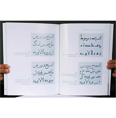
کتاب حاضر، با طبقه بندی فونت های فارسی بر اساس کاربرد سعی در بررسی ساختار هندسی و بصری حروف دارد. با تحلیل و بررسی تعدادی فونت فارسی به بیان ویژگی های آنها و دسته بندی مراحل طراحی حروف می پردازد و سعی به ارائه روشی ساده و اصولی جهت طراحی حروف فارسی ازابتدا تا انتها را دارد.
انتخاب و بررسی فونت های یکان، ترافیک، نازنین، لوتوس و تیتر در بخش تحلیل و بررسی صرفاً به دلیل پر مصرف بودن آنها و ذکر نمونه ها طبق دسته بندی فونت ها بر اساس کاربرد های ارائه شده در کتاب می باشند. اگر چه فونت های پرکاربرد دیگری نیز وجود دارد اما به همین تعداد جهت تفهیم کامل مطالب بسنده شده است. مطالب این کتاب به دلیل نبود منابع کافی و صحیح در زمینه طراحی حروف فارسی بصورت تخصصی، حاصل پژوهش و بررسی و استفاده از بیانات و تجربیات اساتید این فن و مشورت با آنها می باشد.
یقیناً کتاب حاضر نمی تواند کتابی جامع که بیان کننده تمامی مطالب در زمینه طراحی حروف فارسی را باشدو صرفاً به بیان کلی مطالب در این زمینه نیازمند سالها تحقیق و پژوهش می باشد.
هدف از تالیف این کتاب بالا بردن سطح آگاهی و شناخت ما نسبت به طراحی حروف و بهبود وضعیت طراحی حروف فارسی و ایجاد انگیزه برای پژوهش های بیشتر در این زمینه می باشد.
مسعود نیکومرام
امید هامونی
آذر 1388
...........................................................................................................................................
We all encounter written language constantly, and it is present in bills, receipts, and bank papers; on labels of goods; and on posters, billboards, traffic signs, subway and airport signs, Internet pages, television and even text messages. The most important success factor in communication is the quick establishment of attractive and logical relationships. Well-designed text is one of the most important and useful tools for establishing these relationships. But how can we evaluate the quality of writing we see? For example, suppose we want to go on a trip. Now, what is the difference between traveling in a cheap car and traveling in a luxurious sports car? Certainly, a sports car brings us more quickly and more conveniently to our destination. As good writing can quickly establish an attractive relationship, bad writing can have a completely opposite effect. When we look at good writing, it is beautiful and easily legible, and it quickly and neatly transfers information to the reader. The purpose of writing is to be read, and writing that is not legible is not suitable writing.
Studying developed countries’ communication quality shows us the necessity and importance of writing in establishing relationships. Now, we study trends in written communications in our own country. For instance, when we read a book, a newspaper or text on the Internet, after a few minutes our eyes get tired and we abandon our study. Or when we want to read subtitles of English-language films or of news networks, we find it difficult, and even if we succeed in reading and concentrating on them, we lose the film’s main theme or the visuals accompanying the news. Plenty of these kinds of examples exist because of the use of inappropriate fonts. The appearance of inappropriate fonts in such diverse products as water and electricity bills, schoolbooks, mobile text messages, and advertisements demonstrates the chaos of the present situation. These fonts hinder the establishment of quick and sound communications between writers and addressees, and the resulting confusion leads to loss of time, money and useful information. With a general study of the fonts used in our country, we find that this confusion exists because a limited number of fonts, each of which is designed for a particular application, are used for all kinds of consumption and applications. For instance, a font that is designed for newspaper text is used in materials for children, such as schoolbooks, novels, encyclopedias, dictionaries and magazines. In addition, these fonts themselves have undergone various changes by design companies, and sometimes these changes have caused problems with legibility and violations of principles of letter design.
When we study this situation, some questions arise in our minds. Why are appropriate fonts based on the principles of letter design not available? Why are there no companies, such as those involved with the media and news, commissioning or investing in font production, and why are letter designers not motivated to design new and material fonts? However, the most important question is how to free ourselves from this chaotic situation. We know that to achieve this goal, we need to compile educational sources regarding the design of Persian letters, and we need to invest time. Unfortunately, in the last few decades, neither of these steps has been taken. However, both the failure to take these steps and the lack of appropriate fonts are due to our lack of knowledge. We can build this knowledge by learning roots and bases of Persian letter formation, studying present-day fonts that are appropriate, and distinguishing such fonts from each other to achieve a logical path for the design of a good-quality font for a specific application.
In this book, which attempts to classify Persian fonts based on their application, we study the letters’ geometrical and visual structure. Studying and investigating a number of Persian fonts allows us to explain their features and the letters’ design stages and classification, and the book tries to offer a simple method and principles for designing Persian letters from beginning to end. The selection and study of Yekan, Traffic, Nazanin, Lotus and Titr fonts in the analysis and study section is merely due to their frequent use, and the provided examples are based on the applications presented in the book. Although there are other frequently used fonts, we believe this number of examples suffices for the explanation of points relating to structure and design principles. Due to a lack of sufficient and reliable specialized sources regarding Persian letter design, the contents of this book are a result of extensive studies, comments and experiences of masters in this field, and consultations with them. This book could not explain all subjects with regard to Persian letter design and has merely explained the subjects in general. A comprehensive book of this kind would require many more years of research and investigation. Our purpose for compiling this book is to enhance our awareness and knowledge about letter design, to improve the situation of Persian letter design, and to inspire further research in this field.
Masoud Nikoomaram
Omid Hamooni
November 2009
................................................
Selling at:
فروش اینترنی، مستقیم، تلفنی (فقط از طریق انتشارات رسم):
http://www.rasm.ir/default.asp?base=3&view=book&bid=531
Facebook:
http://facebook.com/persianletters
