
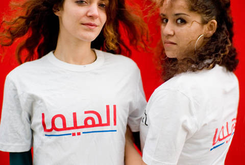
The small Dutch cultural foundation Mediamatic thought it would be effective and revealing to show an Arabic version of the well known typically Dutch supermarket chain called HEMA at an exhibition that is part of the Khatt symposium about cultural exchange. They did not consult with this company in advance about their initiative and it was therefore in considered a provocative action by the HEMA. The HEMA instructed a top law firm to send a threatening letter to Mediamatic immediately after they learned about this exhibition through a press release that showed two girls with the Arabic reference to their name printed on t-shirts. After HEMA refused to discuss the matter in person, Mediamatic published the threatening letter and made a press release that was taken on by many Dutch newspapers, broadcast as national news on local radio and TV stations.
Obviously, the initial response of HEMA was entirely disproportionate. A small art exhibition could not possibly harm the company in a commercial sense, and infringements of IP rights, if any, were far from obvious. Not surprisingly, the HEMA decided later to refrain from taken any further legal action against Mediamatic and have even publicly endorsed the project. Why did the top management in consultation with a well respected IP law firm misjudged the situation in such an almost silly way? There is likely only one plausible reason for this: the quality of the presented designs. Highly skilled designers were involved in the creation of the typeface, the logo and the photograph. The result looked very professional. Top managers and top lawyers decided solely on the basis of the first glance. Apparently they were enthralled by the designs and mistakenly thought this implied serious competition.
Designers should feel quite comforted by these events; it shows that even a combination of top managers and top lawyers stop to think straight when confronted with excellent design. They at least need some time to digest their first impression.
For more stories about the El-Hema exhibition and opinions about the Typographic Matchmaking project your check the following interesting articles/links:
page on this site
Dude, lay off my ubiquitous Dutch weener
Fedra Arabic: The Typographic Matchmaking experience.