"Jonathan Barnbrook’s new book, Barnbrook Bible, ranks amongst the most ambitious personal projects undertaken by any graphic designer. It is a 330-page monograph bursting with dazzling refinement. Throughout the entire book there isn’t a clumsy or unrefined typographic gesture — not a line that hasn’t been weighted to perfection. The effect is like being in a Parisian patisserie — everywhere you turn there are mouth-watering options." — quoted from the Design Observer.
book
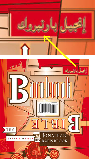
Arabic in the Barnbrook Bible
a graphic manifesto and autobiography
Now if that isn't praise to highest level then I don't know what is.
What caught my attention though is that the cover has a very nicely hidden translation of the title in Arabic at the top right-hand corner, and it looks like the road signs commonly used in most Arab countries....
It is interesting that the 'enfant terrible' designer, who liked during his career to shake up things in typographic design. Questioning aesthetic values and design approaches, he constantly designed and redesigned Latin alphabets to prove his case, and yet when it came to using Arabic text - like on the cover of his recent book - all his experimental spirit seems to have evaporated. He just goes with the flow and like most Arabs chooses the most conservative script.
I am confident that had he been aware of the recent developments in Arabic type design, his pick of Arabic font for his book cover would have been quite different. I am sure if Jonathan can see our newly developed Khatt set of Arabic fonts, his mouth would be indeed watering and he would've liked to use them for his cover.
Maybe for his next book.
Read more about this book and article at the Design Observer site