All rights reserved
409 x 357
Download
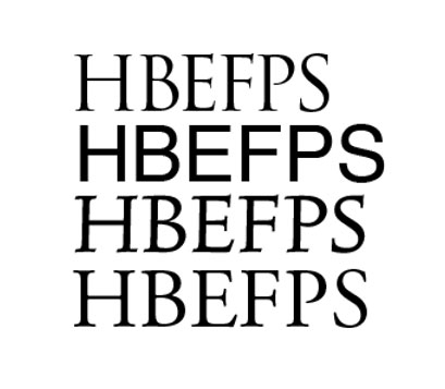
On top, the 5 letters of the Roman ‘Trajan’ that have clearly different proportions than practically all of todays fonts. The Helvetica -right under the Trajan- attempts to give equal proportions to all uppercase letters. Even the more classical typefaces thereunder never make such deviant proportions for these specific five capital letters.