If we passed by the cassette store next door back in the day we probably wouldn't notice it or admire it as much as we'd do nowadays. It's really interesting to look on how aesthetic standards in the music industry changed.
With the horrid sightings we see everyday today, of the mass-designed album covers that slap on some 5 minute-Photoshop filter, our eyes are seriously feeling reminiscent and want to see an effort done regarding the designs of CD cover arts or promotional posters in general.
Arabic type is -unfortunately- diminishing from this certain area, people are still believing that in order to progress well and better design-wise you have to use full English transliteration of both Artist name and track listing (which are 90% of the times greatly misspelled).
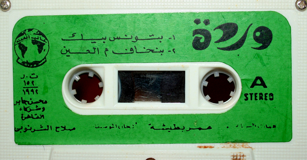
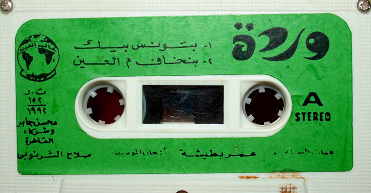
As you see from the example above, the minimalism of the design really shows and seems to work like magic. Probably not regarding the colour choice, but this colour might have been "in" back then, and also used in order to fit to the chlorophyll-ish name of the singer, "Warda" which literally translates into "Rose".
I'm personally extremely in love with the Artist's logo, the modern shaping of the letters, especially the 'ra' that comes second and the little dots on the 'ta' that came in shape of two little flowers - but the shapes were vague enough for you to perceive them as dots. Yet the most interesting part is that, the record company "Alam El Phan" has maintained this logo that as far as I remember even used before. This shows great respect to branding, and the fact that you don't need to copy a mobile-phone company's logo and use Captain Podd in order to modernise your company's look.
After all, I plead and moreover demand the return of traditional approaches in branding and logos in the music industry in order to remain an identity and to please the eyes of Arabic type lovers too!