
Damoon Khanjanzadeh
“My background in type design originates from my learning calligraphy in childhood and at later ages. I studied graphic design at the Fine Arts University of Tehran and learned the basic skills from great masters like [graphic designer] Morteza Momayez (1935–2005) and [calligraphy artist] Mohammed Ehsaei (b. 1939). After finishing university, I began designing type on my own. I took a very long road, with a lot of trial and error. Nevertheless, I taught myself enough to be able to teach type design now to my students. So my type design skills are for the most part self-taught.
Mohammad Ehsaei, my teacher at university, was a kind of role model for me. I learned a lot from him on how to create well shaped letterforms. He is not a type designer but an artist who creates calligraphic paintings. I was fascinated and inspired by the shapes he creates in his work”.
![]()
![]()
![]()
![]()
Working situation
“My working situation now is different than it was in previous years. Today, I have clients that ask me for quite varied types of commissions. My clients include publishers, educational institutions, banks, fashion houses, architectural offices, museums and more. I do type design as a major activity, but I also do graphic design and work as a visual artist creating monumental works.
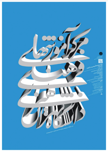
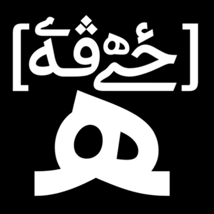
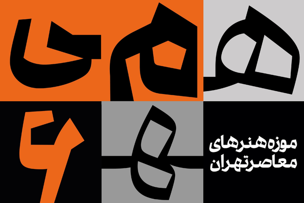
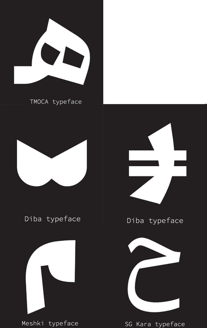
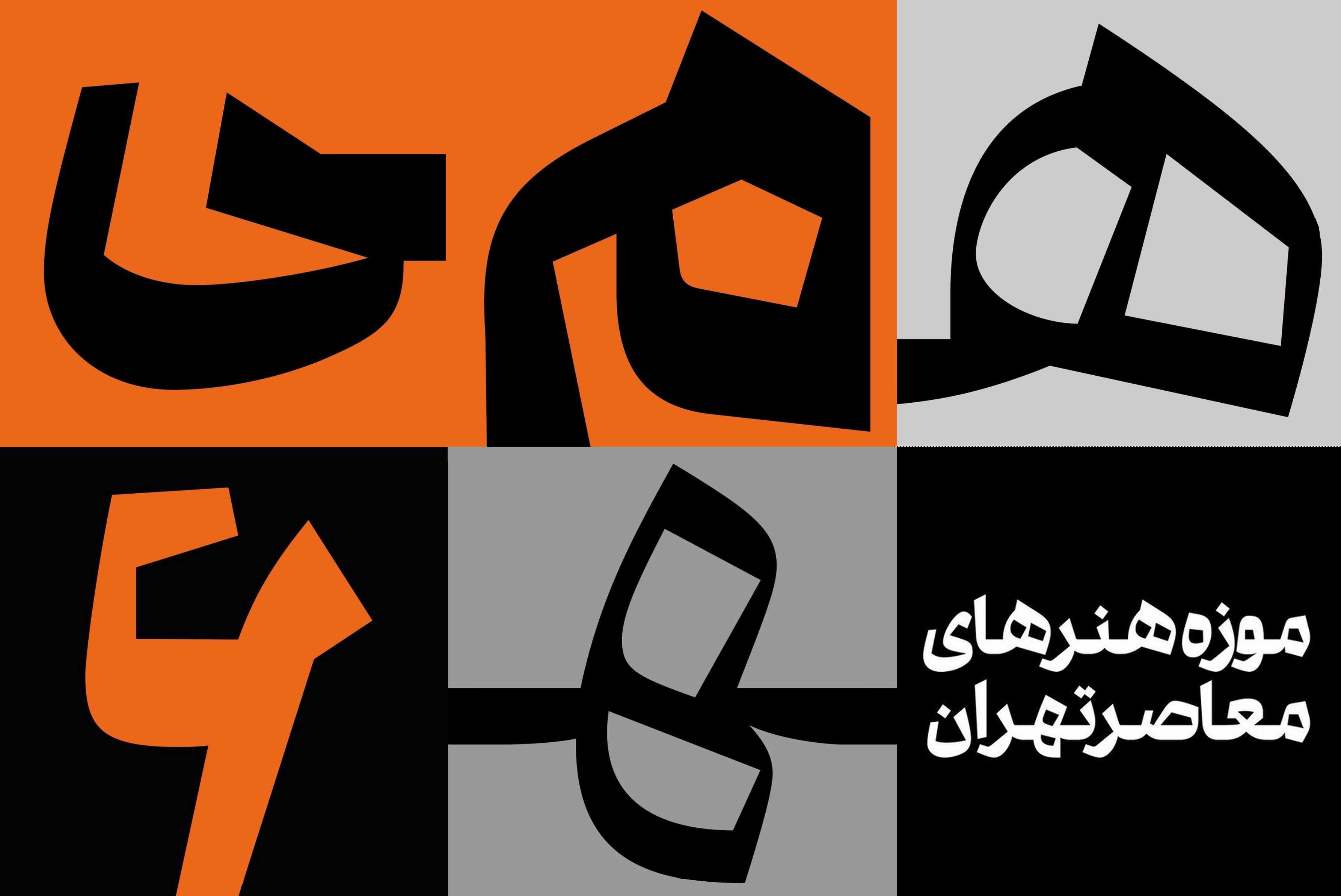
My style has not changed much over the years. It has always been a playful way of creating. For instance, you cannot separate my fonts into the classical divisions of text and display fonts. My fonts can be used for both purposes, text as well as display. I do not limit myself to a specific aspect of type design. I have designed all sorts of type, including geometrical, official, unofficial, and display. I attempt to be playful also in my type design work; I am always experimenting with form and looking for new letter shapes. I achieve new forms through deformation and exaggeration. My fonts all have a strong and unique character of their own that start from new shapes of individual letters”.
Sources of inspiration
‘My sources of inspiration are every day documents people create, such as hand lettering on walls I find on the street, shop signs in the urban environment (I specially like the old ones). I get inspiration from pictures taken from urban life, mostly scripts posted or drawn by people who are not professional type designers. I find inspiration in nature and everything else that can excite me to think of new letter shapes. I do research on people’s handwriting. I also get inspiration from my own six years old daughter’s handwriting. Today there is so much imagery on the internet, so I’m also interested in studying samples of old calligraphy I find there. Traditional calligraphy does not dictate my type design process”.
Working method
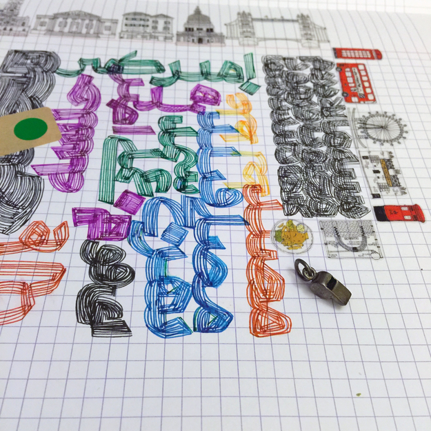
“On a daily basis, I make sketches of letterforms or combination of letters. I keep those sketches, to look at them later. My sketches are for the most part not related to a commission. They are just my daily research to find new and unexpected letter shapes or combinations of shapes. Sooner or later these sketches will be used in one or more of my projects.
I do not follow a specific standard working procedure for my designs. My procedure depends on both my mood and on the kind of commission. I do things differently for different type of work. My typeface designs are all based on the sketches I make on paper and I do not bring software features into the creative process. I do the whole designing part all by myself, but I do not create the final font file on my own. For the more technical parts, like kerning and spacing, I get help from a developer assistant who works under my supervision. When developing a font, I usually start with more general components such as the connections between letters. For the production of a multi-script font, I prefer to collaborate with other type designers because latin type for instance, has its own culture and traditions which I am less versed in”.
My software tools
“I use only the Glyphs software beacuse I am most comfortable with it. For me, the whole package of Glyphs’ features are all interesting, but my favorite is its smart path-drawing tool. In the beginning I got help using the software but eventually I could manage everything on my own. I trust my own eye and feelings more than the numbers on the screen.
I only make font families of multiple-masters if the commission requires it. Some of my ideas require single fonts and not a family for instance like my Diba and Meshki fonts. I have designed both single fonts and font families.
Despite the technical advances in font edititing software, I fear that the output of Persian and Arabic type design so far has not resulted on average in more professional designs. I sometimes have the feeling that the more technology advances the more likely it will lead to weaker instead of better type design”.
How to become a great type designer
“In my opinion the most important for becoming a great type designer is developing the skill of making new letter shapes that also take into account the traditional calligraphic rules. A type designer must have the capacity to think of new forms, understand calligraphy and its history, be mindful of readability, and master the geometry that can be applied to the proportions and shapes of letters”.