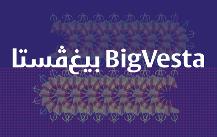
The design concept.
The Latin Capitolium typeface was originally intended as a sign-age typeface designed for the information system of the city of Rome to mark the jubilee of the Roman Catholic Church in 2000. According to Nadine Chahine, Capitolium’s monumental proportions, with minimal ascender and descender heights and large x-height, lend themselves to being translated quite naturally into the Arabic Kufi style, especially since Kufi is often traditionally used for architectural lettering. In late March of 2006, she decided to change the direction of the design from a simplified Naskh style font to a simplified Kufi style, working towards developing a signage typeface rather than a newspaper textface. In Nadine Chahine words, the concept changed following ‘a frenzied weekend’s work’ after which she showed the design to Gerard Unger at the ‘Kitabat, Arabic Calligraphy and Typography Conference’ in Dubai, in April 2006. She says: ‘We were quite happy with the way the new design direction was going... Gerard suggested that I look at the BigVesta, since a sans serif might work better with Arabic, and it actually did.’ From this point onwards, Nadine Chahine worked on developing the Arabic companion for the BigVesta type family. The result was ‘quite a fortunate outcome’; the Arabic BigVesta not only matched its sans serif Latin counterpart but also worked well with the Capitolium family.
The design characteristics.
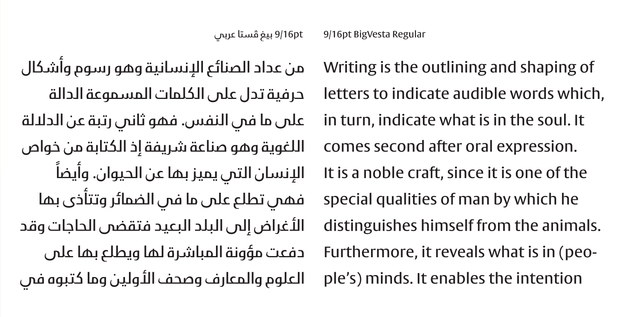
The design idea for BigVesta came to Gerard Unger while he was sketching the Capitolium typeface, early in 1998. He considered suggesting the design of a sans serif font based on lettering from the Roman republican era that preceded the imperial Roman capitals. Gerard Unger describes these republican styles as being ‘partly geometric, with circular O’s and having very little variation in thickness and with very small serifs’. This sans serif was not accepted for the Rome design commission, on the grounds that the serif Capitolium would be more appropriate for this occasion. However, Gerard Unger continued working on this design and named it Vesta after the temple of Vesta at Tivoli, which according to James Mosley (who has revealed the source of all sans serif printing types in his book The Nymph and the Grot) is ‘the ancestral home of all sans serifs’. Vesta became less geometric than its Roman model, with a significant difference between thick and thin strokes, and with narrower letter-width. Vesta was further developed into the BigVesta family in 2003. BigVesta has a much higher x-height than Vesta, and shorter ascenders and descenders. The letterforms of BigVesta are more open than those of most sans serif typefaces, and can easily be condensed without distortions. This makes it possible to create a large number of proportional variations than the standard fourteen. BigVesta is a good headline font which can work well in newspaper and magazine layouts, as well as for corporate identities.* The design of BigVesta Arabic carries through the feel of the original BigVesta typeface without copying the curves of the Latin script. If seen alone, the design passes off as a modern Kufi typeface that is ideal for both setting at small sizes and use as a display or signage font.
* Text paraphrased from Gerard Unger’s website; www.gerardunger.com
BigVesta Arabic’s design characteristics can be summed up as follows:
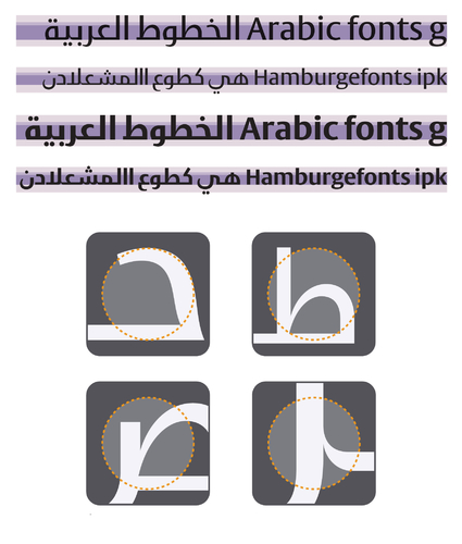
1. Contrast: BigVesta Arabic is a sturdy and simple Kufi typeface, with monolinear strokes (minimal modulation between thick and thins) that give the typeface a
contemporary and functional look.
2. Openness and overall color: BigVesta Arabic has generous open counters that match the color and overall effect of its Latin counterpart.
3. Proportions: In order to achieve the characteristic large x-height of the Latin without compromising the integrity of the Arabic script, the body height in the Arabic version was pushed as high as possible within the acceptable level of normality for Kufi design conventions. The ascenders and descenders are short and match the proportions of the Latin version, making the typeface quite economical in typesetting.
4. Strokes and details: The thinning of the strokes before they meet the vertical stems; this is not a common practice in Arabic typefaces, where little optical adjustment work is done to the majority of available designs. This feature helps in achieving an even grey tone and in avoiding dark ink traps. It is an aspect of type design that is not often applied to Arabic, though it is strongly needed.
5. Baseline and rhythm: Some of the horizontal strokes curl up in connections between certain characters; a characteristic inspired by the more rounded Arabic scripts. This feature of the design helps in creating a better rhythm and in breaking the rigidity of the traditional Kufi typefaces, making BigVesta Arabic more appropriate for continuous reading as textface.
These last two characteristics are unique to BigVesta Arabic and set it apart from the Arabic fonts available on the market.
The designers’ final remarks on the project.
Gerard Unger: This was a good project; it served my interest in communicating more with designers from the Arab world (or from the Muslim part of the world). I feel enriched with a better understanding of what design is in the Arab/Muslim world—though you can hardly call what I’ve seen and experienced more than a glimpse. But before my participation it was an uncharted territory for me. The basic concepts of Arabic and Latin are quite different, but I think that Nadine did a nice job. She came very close in translating Capitolium and BigVesta’s characteristic elegance, openness, playfulness and sturdiness into the resulting Arabic BigVesta.
Nadine Chahine: The course of this project took place, not over a few months, but over three years. The actual design phase came later on, but the initial stage was quite a formative one. Having studied and admired Gerard’s work as a student, the stage was already set and it was quite a learning experience to go through the project together. The most challenging part was the treatment of the outlines, as the Arabic is drawn from scratch but should feel like it is sculpted by the same hand as the Latin, without actually copying any of the curves. The happiest moment was looking at the light condensed version. Most inspiring was Gerard’s description of the ‘secret’ of his outlines, which I will keep to myself. Most interesting was this: how can a design concept be translated into a different script? How does one get two inherently different scripts to engage in dialogue, a two-sided conversation rather than a screaming match? It’s not a simple process, but definitely lots of fun! I was very happy to be on board, as the entire team consisted of really talented designers. It was quite interesting to attend the workshop where we all sat together and discussed our ideas. I am very grateful for Gerard’s input and his feedback and advice, and I think the project is a very important one with a long-term impact. However, it becomes quite clear that there still is a lot to be done. Much more work is needed, and a lot of experimentation and time. Type design is a private endeavor with a very public appearance. We need time to see how the public reacts to our work. The most important thing is to be careful with the essence of the script. An Arabic typeface is not a Latin one, and we shouldn’t try to make it into one. The key is to understand that they are different, and not to try to clone them into each other. The final result is like any relationship: it always needs more work, and it’ll never be perfect. Many have said this before: type design never finishes, and the question of the relationship between Latin and Arabic is not something that can be answered in one step, but rather in a series of experiments and collaborative work. This project has surely served as the right step in the right direction.