The Typographic Matchmaking project (Arabic fonts and book), the Khatt online community (www.khtt.net), the Khatt Kufi and Kaffiya | Symposium on Arabic Visual Culture, and the El Hema exhibition and cultural project, have all had such a tremendous press coverage and unprecedented publicity in the Dutch media this past summer. They have been discussed reviewed in a variety of media from mainstream newspapers to design professional magazines, and from radio stations to local news programs, and from design/cultural websites to news websites (and even personal blogs). The spread of the ‘Typographic Matchmaking’ Arabic fonts will most likely create a new trend in contemporary graphic design and typography in the Arab region.
Article: Report
A turning point for Arabic typography and design
Report on the Khatt Kufi & Kaffiya symposium and the Typographic Matchmaking project presentations.

With all these activities and products that were generated as a result of this project, the project in its totality has overshot and exceeded its original goals. It was an infectious viral idea that attracted many, and brought about a very heart-warming spirit of collaboration between roughly 50 people from different cultural backgrounds, origins, and professional interests. This project, and its presentation though the symposium in Amsterdam, has marked the turning of a page in the history of Arabic type design.
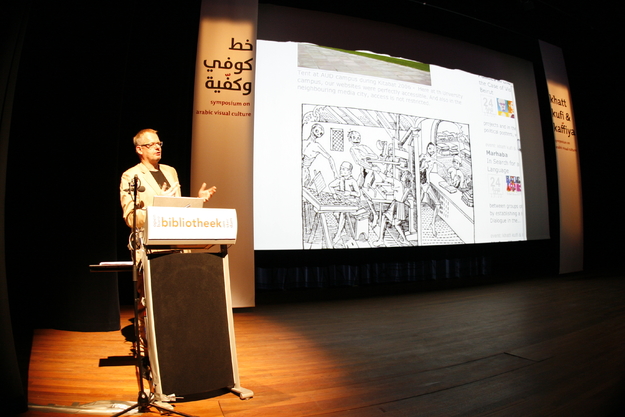
The Khatt Kufi & Kaffiya | Symposium on Arabic Visual Culture
The symposium aimed at presenting the five new Arabic typefaces developed within the framework of the Typographic Matchmaking project, and to set them within the bigger context of Arabic visual culture. The symposium wanted to present a ‘real’ and non-stereotypical image of the contemporary Arab world that is rarely portrayed in current western media. The lectures indirectly and/or directly discussed the positive role that design and typography can play in changing perspective— especially in contemporary Arabic youth culture— and in generating productive collaborations and mutual respect between Arab and Western societies.
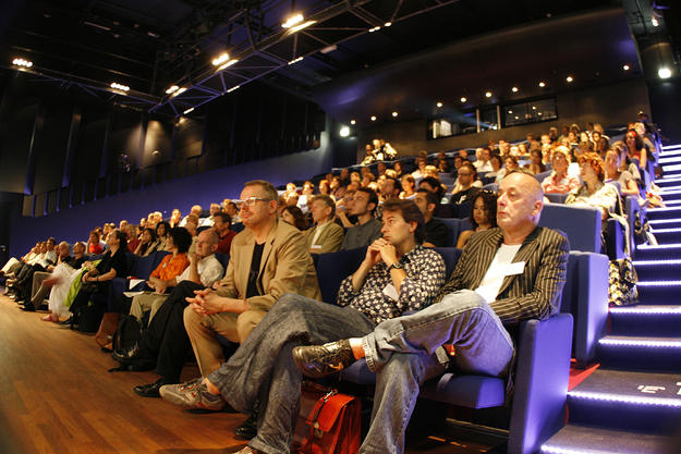
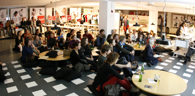
The program was dense and comprehensive, with 17 speakers and 15 concise presentations and short films that barely did fit within the planned one-day symposium. The participating scholars and designers from the Netherlands, the Middle East, the US and Europe discussed the impact of historical and contemporary visual culture on today’s Arab identity. The symposium introduced the Khatt Foundation's collaborative 'Typographic Matchmaking' pilot design project. It also marked the launch of this online community. It covered topics that varied from the history of European printing of Arabic books, to expressive calligraphy, to the relation of typography and dance, to the relation between culture and technological advancement in the printing arts, to political activism through visual communication in the Middle East, to case studies of inter-cultural design projects between Dutch designers and Arab institutions (or designers), and statistical information about the visual arts, design, new media and typographic expression in the Arab world. The symposium was well attended with around 175 local and international participants, in a mix of students, professors and professionals (some coming from abroad specially to attend this event, such as designers from Saudi Arabia, Egypt, Lebanon, Denmark, Switzerland, the UK, Belgium, France and Spain), and it was followed by the opening of the El Hema exhibition and fashion show.
Below is a concise overview of the symposium’s presentations.
The symposium was introduced by a welcoming word from the Amsterdam Public Library’s Director, Mr. Hans van Velzen. The presentations then resumed from there on as follows:
Cultural Survival Kit and Other Practical Ideas.
Huda Smitshuijzen AbiFarès explained in her opening speech that coming up with strategies for sustainable growth and development of cultures, their identities, and their cultural production, is not a simple task. One has to start by asking the right questions in order to reach specific and suitable strategies on developing projects for an area as geographically wide and as diverse as the ‘Arab World’. She proposed certain possibilities giving the projects developed by the Khatt Foundation as possible scenarios and case studies.
Google in Arabia, the launch and introduction of the Khatt Network for Arabic Typography.
Willem Velthoven spoke about his first experiences in the Arab world during the Kitabat conference in Dubai. In his hotel room he was shocked to learn that his company's website was blocked, and relieved to discover later that on the American University campus web accessibility was like it is at home. This confirmed his basic belief that rulers can never effectively block the flow of information in a selective way. The most advanced part of society will always find ways to circumvent the blockage. The only type of restriction that may work is to ban a type of media entirely on one’s territory. But this has the disadvantage that progress in all aspects of society will be stalled as well. Effective adaptation to modern media stands for general progress, and people should be inclined to find strategies for embracing change.
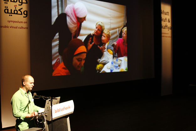
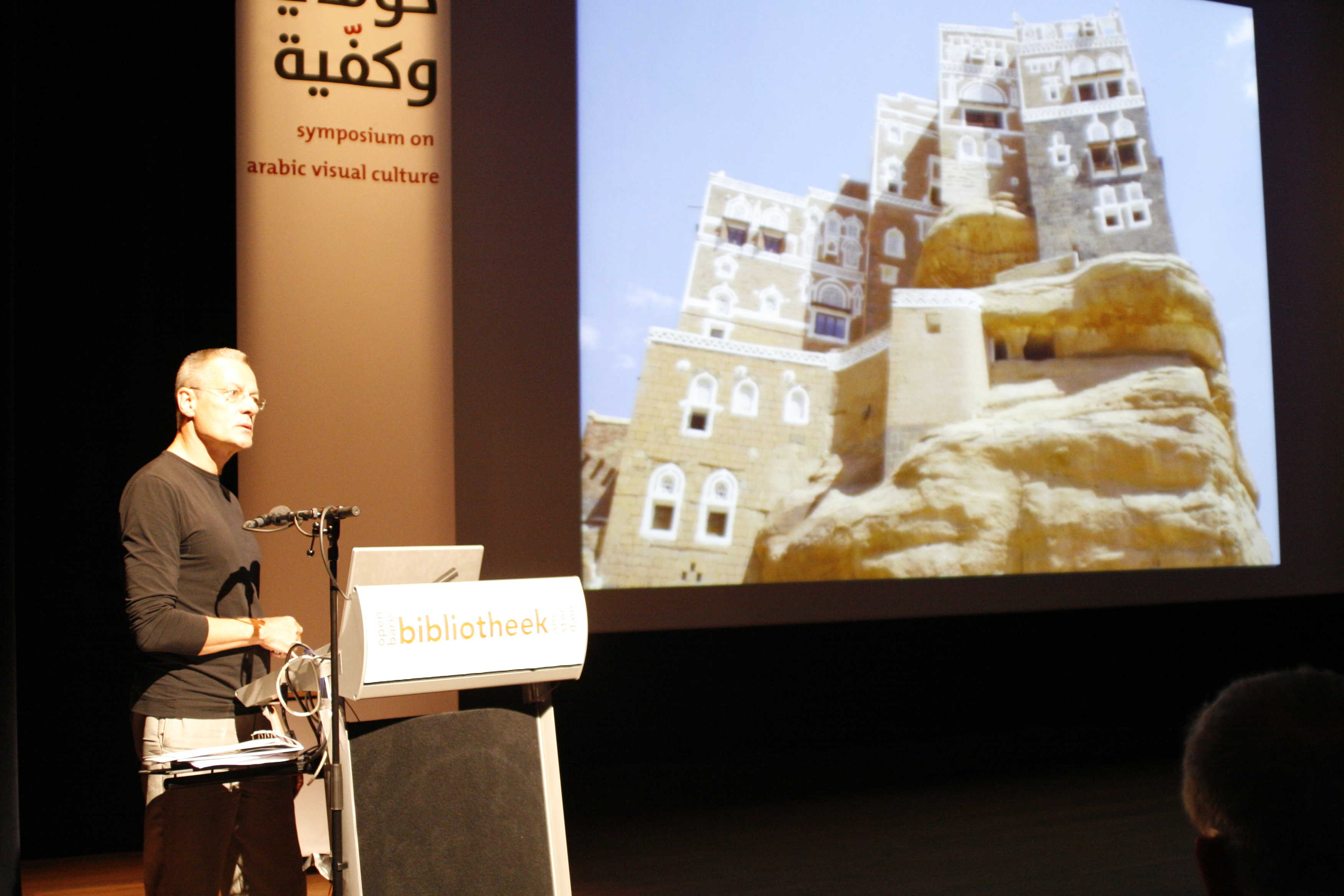
Visiting Shiba, the National Museum of Yemen in Sanaa.
Jelle van der Toorn was design director in a four-year project to restore the National Museum in the capital city Sanaa. The Dutch government funded this project. Jelle showed the development of the site and all improvements that were made over the years. Spending four years in a fundamentally different society has been a moving experience for Jelle. He was deeply impressed by the splendor of the Yemeni landscape, the traditional architecture and centuries old construction methods. There was often an emotional nostalgic tone during his recollections of participating in a society where kalashnikovs, Qat and tribal gatherings play such an important role.
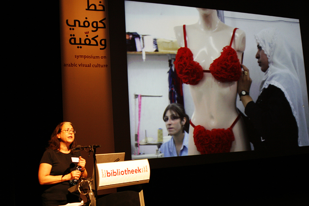
Dangerous Lingerie and Other Mid East Street Stories that Spook the West.
Malu Halasa would very much like to publish more about cultural and political aspects of the Middle East, but she does not seem to have an easy time finding publishers interested in her projects. She finds this a bit upsetting and invites publishers to show more courage when showing unknown aspects of Middle Eastern culture that would bring the current mostly one sided image slightly more in balance. Moreover, the cultural development in the region should highly benefit from these kinds of publications.
She showed pictures taken from a recent publication about the lingerie culture in Syria. Nobody would expect this kind of frivolities coming from this Muslim country. However, the Syrian lingerie culture is not meant to stimulate sexual desires as is the case in the West. Its aim is to create delicate attractive beauty as a rite of passage to young girls on the way to adult womanhood.
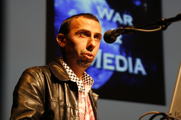
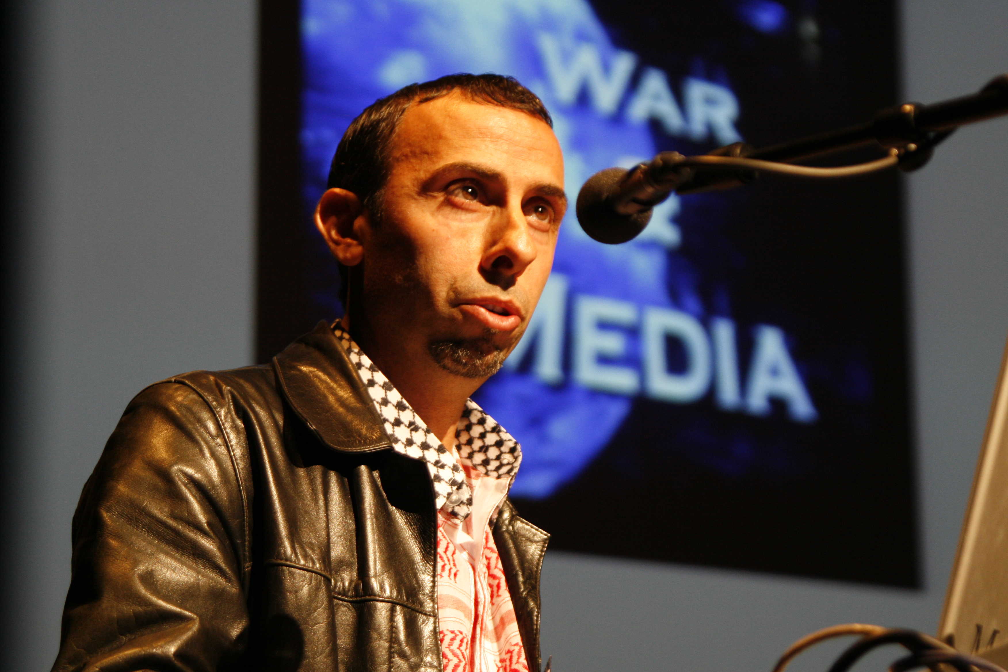
The Clash of Motion Picture, a Concise Look Back, typecasting the Arabs.
Khaled Ramadan talked about the stereotypical way the Arabs are shown in western media. He showed the impressive short video, Planet of the Arabs made by video maker Jacki Salloum. The video is a compilation of mostly American movies. It shows a frighteningly skewed portrait of Arabic culture. The strong visual tradition in the Arabic culture has made this stereotype immensely powerful. The negative stereotype has lead to a point where wearing a simple t-shirt with a printed text in the Arabic script could lead to an official refusal to board the airplane. The whole Arab world is in fact effectively typecast. The shocking power of the media!
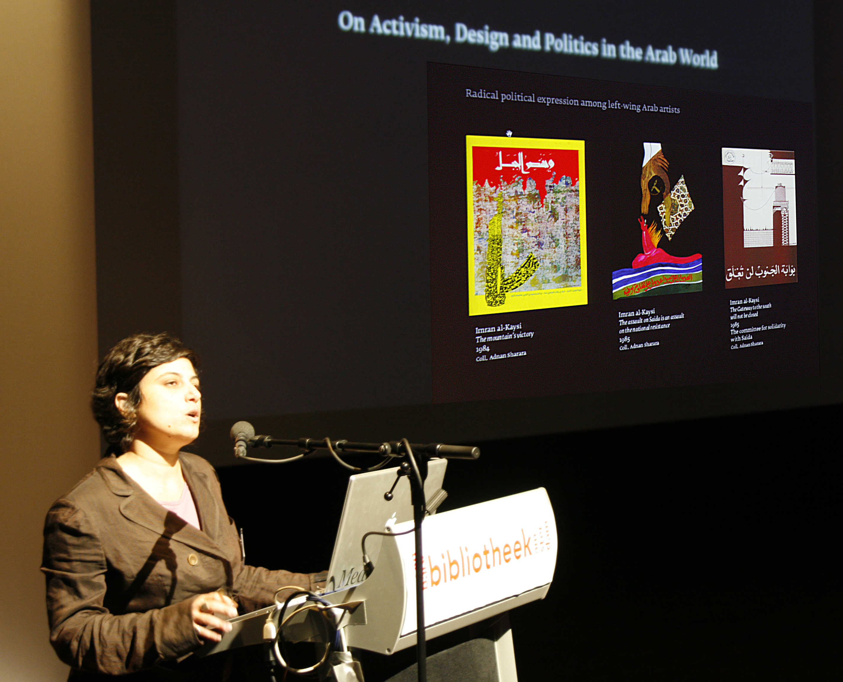
On Activism Design and Politics in the Arab World, the Arab political poster.
Zeina Maasri has collected a large number of political posters in the Arab world. Most Arabic countries have a very strong tradition for one type of poster: printed portraits of rulers or important religious or political leaders. One sees them everywhere. This is not the type of poster Zeina is interested in. She collects the designs of artist and poster designers that convey more engaged messages. Her collection seems to be very well organized and categorized. It would be a contribution to Arabic visual culture if her collection would become more widely available through a publication or book.
Marhaba: In Search for a Hybrid Visual Language, a Dutch view.
Eddy Wegman from the Dutch studio Koeweiden Postma showed examples of work his studio has produced for a 'Marhaba, House of Culture' in Amsterdam. The Dutch government established these houses in big cities to stimulate intercultural contact within the Dutch society. The Houses of Culture organize events, exhibitions, performances, meetings, and so forth. Koeweiden Postma takes elements from traditional Arabic and Islamic visual culture and uses these elements as source of inspiration to create strong colorful contemporary images. Their work is fresh, bold and convincing. It will no doubt stimulate a more contemporary version of traditional Arabic decorative patterns.
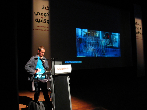
Unfamiliar Territories: Arabic Type and Modern Dance, on rhythm in dance and script.
Peter Bilak was one of the Dutch designers involved in the Typographic Matchmaking project. In his study to understand the differences between the Latin and the Arabic script, he has made diagrams that reveal fundamental differences. It has helped him in his designs. Peter believes that modern technology cannot only influence typography in a meaningful way but also other art forms like dance. He made 'repertoires' of dance positions as if it where individual characters in a font. He also showed videos where one single dancer could 'dance with himself' through projection or image manipulation. He made comparisons between designing type for a foreign script (like Arabic) and choreography in the way that both processes require working with no set rules and delving into unfamiliar territories.
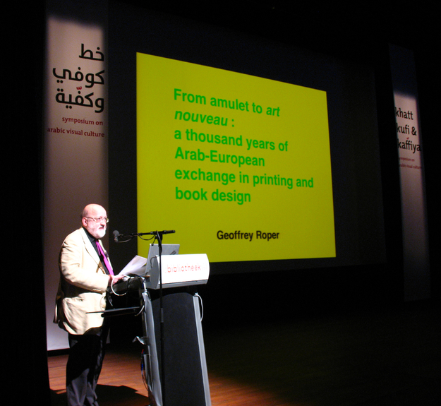
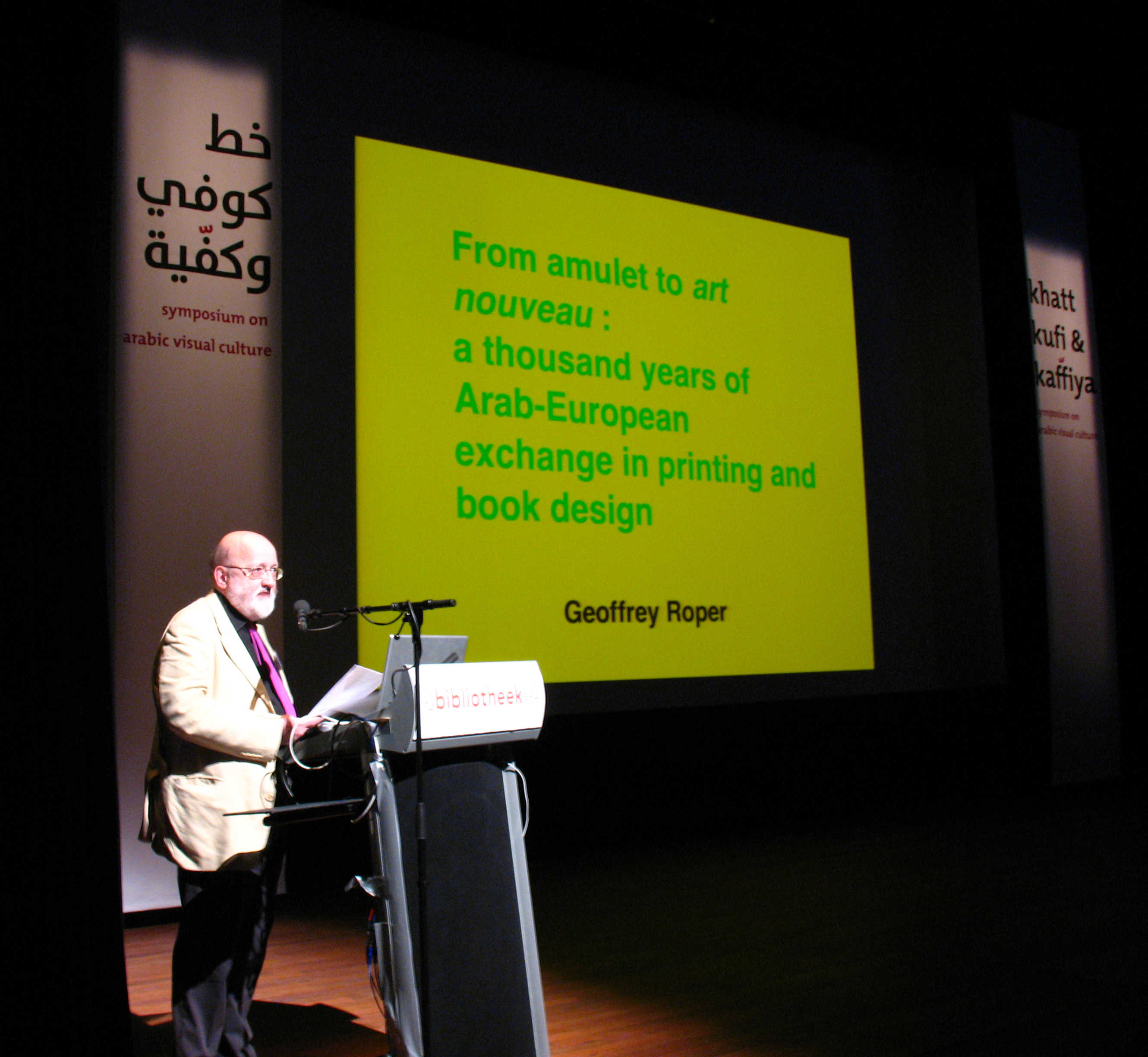
From Amulet to Art Nouveau, a Thousand Years of Arab-European Exchange in Printing and Book Design , the mystical script and the exchange of the cultural baton.
Dr Geoffrey Roper gave us some insights in the historical developments of Arab-European bookmaking and printing. Historians can provide at times sobering information. They may show us that a lot of things that seem new to us have been done already earlier in history and that real cultural innovation happens only on pretty rare occasions, contrary to our natural believe that what seems to be innovative within our own lifespan is also truly new. 'Arabesque' for instance is a form of making decorations that has traveled back and forth between the Western and Eastern civilizations over the centuries, each adding specific ingredients to its visual representation. All graphic notations, like a script for instance, have a mystical aspect: signs that represent a meaning, or describe an aspect of reality. It is an essential human tool to exercise control and make progress. Simple scribbles may contain immense power. The more exotic its form the more power is likely to be assumed. In some occasions, the Arabic script has been used in the west for its magical qualities, not to express meaning or clarify matters, but only to use the mystical power of its complicated shapes. To this day, the Arabic script is appreciated for this exotic quality and some want to preserve this aspect by keeping the complicated structure for the script.
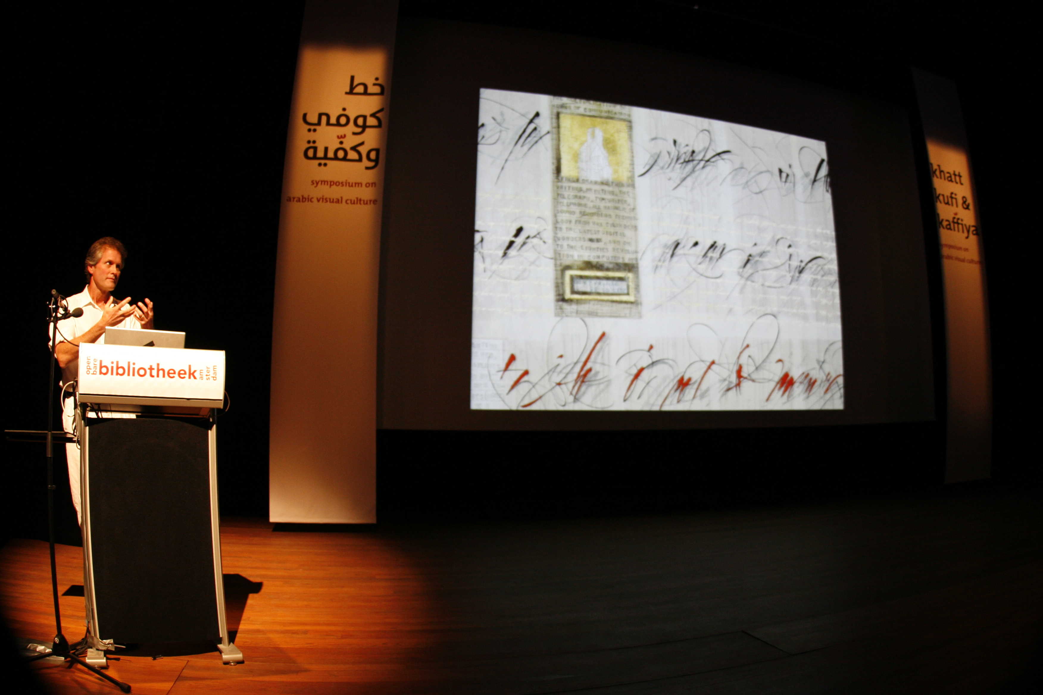
Interface, Expressive Western and Arabic Calligraphy in Dialog.
Brody Neuenschwander covers the whole spectrum of calligraphy: from the perfect execution of the traditional letterforms to the highly expressive scribbles that no one can read —except Brody himself— and everything in between. Brody has been given the opportunity through his longtime collaboration with the British filmmaker Peter Greenaway to explore calligraphy in the cinematographic media. The results are impressive: no medium is capable of producing imagery with so much direct visual impact. Brody loves Arabic calligraphy for its expressive and 'loose' nature. He believes that it can teach western typographers a lesson. Latin type design has exhausted the perfection in meeting the constrains of legibility, balanced kerning and even rhythm and spacing of the text. His message to contemporary type designers is: "relax a bit, guys, maybe it's time to explore the more Arabic tradition of uneven rhythm and visual complexity."
The Enchanted Canary, children books made in Lebanon.
Nadine Touma has an invigorating personality. She generates warmth, enthusiasm and will power all the way up to the farthest seat in the conference room. She is also generously built and wears beautiful colorful traditional Lebanese dresses. She is like an orchid in the Dutch polder. She needs all these qualities in her work. It is not easy to publish books of the quality standards she demands in Lebanon. Professional life is often a struggle, finding proper typefaces is often impossible, handwritten text is often used in her books—though after the symposium she has already started using some of the Khatt fonts for her upcoming publications. But she keeps on smiling and she is absolutely convinced that she has to stay where she is now and change the environment according to her own standards.
Writing From The Margins, Technological Narratives of Arabic Typography
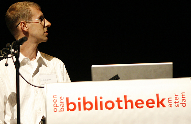
J.R. Osborn has done extensive research surrounding many aspects of the Arabic script, calligraphy and typography. He has tried to analyze what is considered most valuable in the presentation of the Arabic script for modern media. For this reason he interviewed a large number of professionals in the field. He believes that the focus is maybe too much on the letterforms and its often-complicated particularities. More emphasis should be given on the way the text is put on a page. He showed a number of examples where the so-called 'marginal writing' is a typical Arabic way of making a layout. And he wonders if this method could be preserved in representations in contemporary media.
The Current Market for Arabic Fonts, Recent Developments and Needs.
Nadine Chahine is a member of the new generation of Arab type designers that is so urgently needed in the Arab world. She works already for a number of years for Linotype and is occupied with the development and marketing of the Arabic font collection. I believe she is doing an excellent job. The Arabic font collection at Linotype she showed is starting to have a contemporary look and feel. Nadine mentioned repeatedly the rather unfortunate general disrespectful behavior towards intellectual property right in the Arab world. She feels it is a serious handicap for the normal exploitation of fonts. Nadine was extremely happy with the publication of one full page of her Arabic type design for the Typographic Matchmaking project. This type of publicity was flabbergasting first in the field of type design.
The Typographic Landscapes of the Arab World, research on aesthetic trends and legibility.
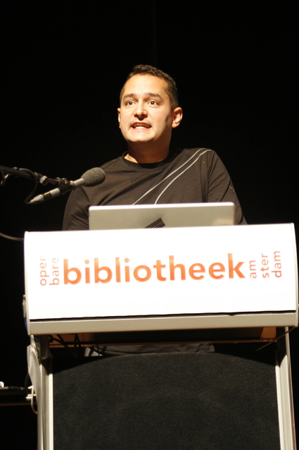
Tarek Atrissi is an entrepreneurial designer, he is residing in the Netherlands but his studio serves local and international clients (but mainly clients from all over the Arab world). The scope of his design work is quite wide: type design, designs for newspapers, brochures, logos and corporate work and signage. He gave us an impression of the commissions he has been involved in so far.
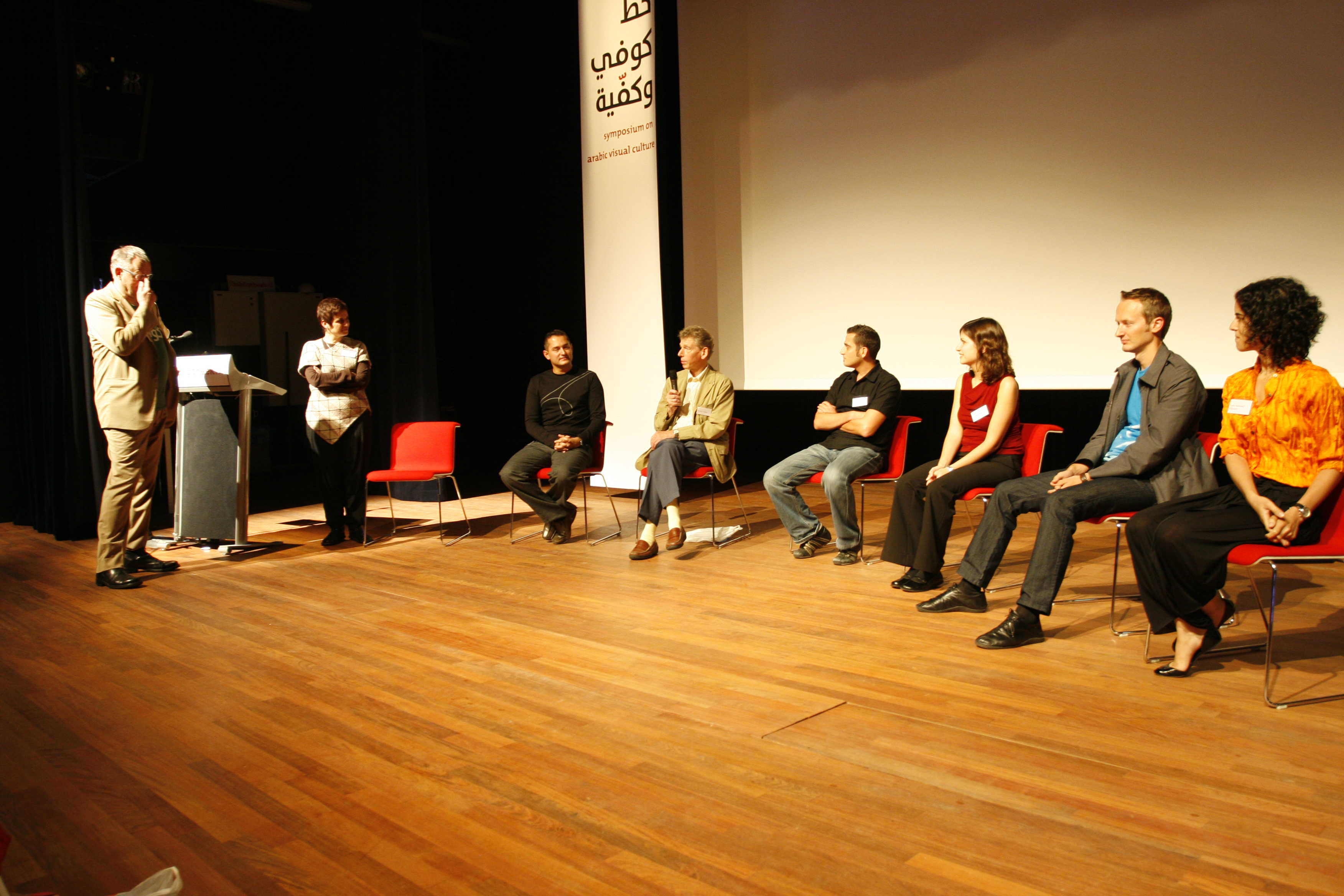
Finally the symposium’s closing session took the form of a panel discussion with the type designers from the Typographic Matchmaking project about the project and design process involved. Willem Velthoven and Huda Smitshuijzen AbiFarès moderated this closing session.
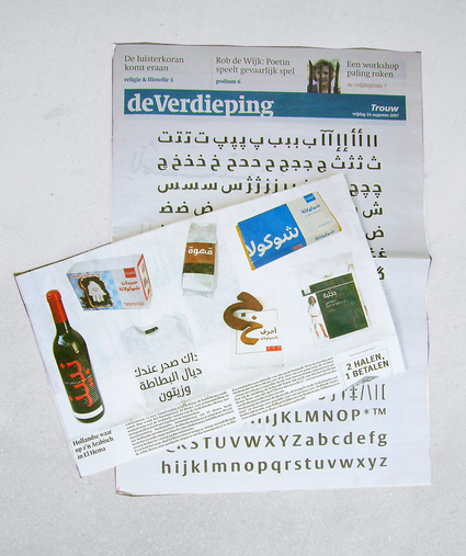
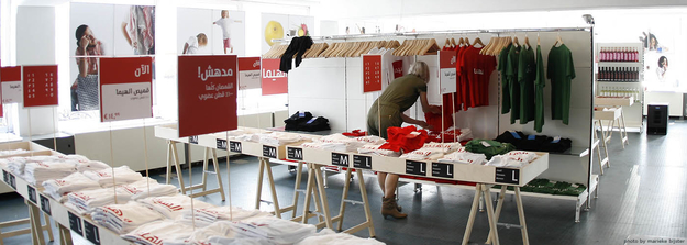
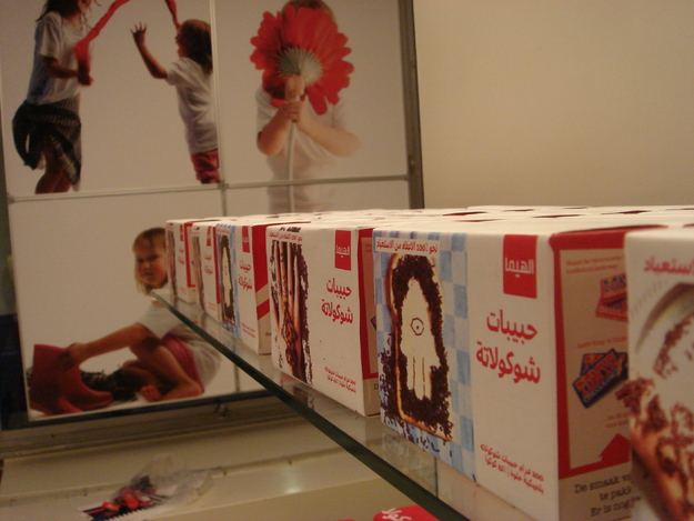
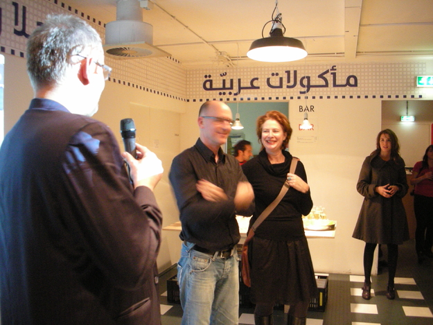
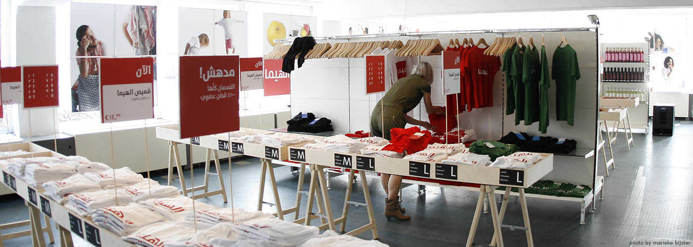
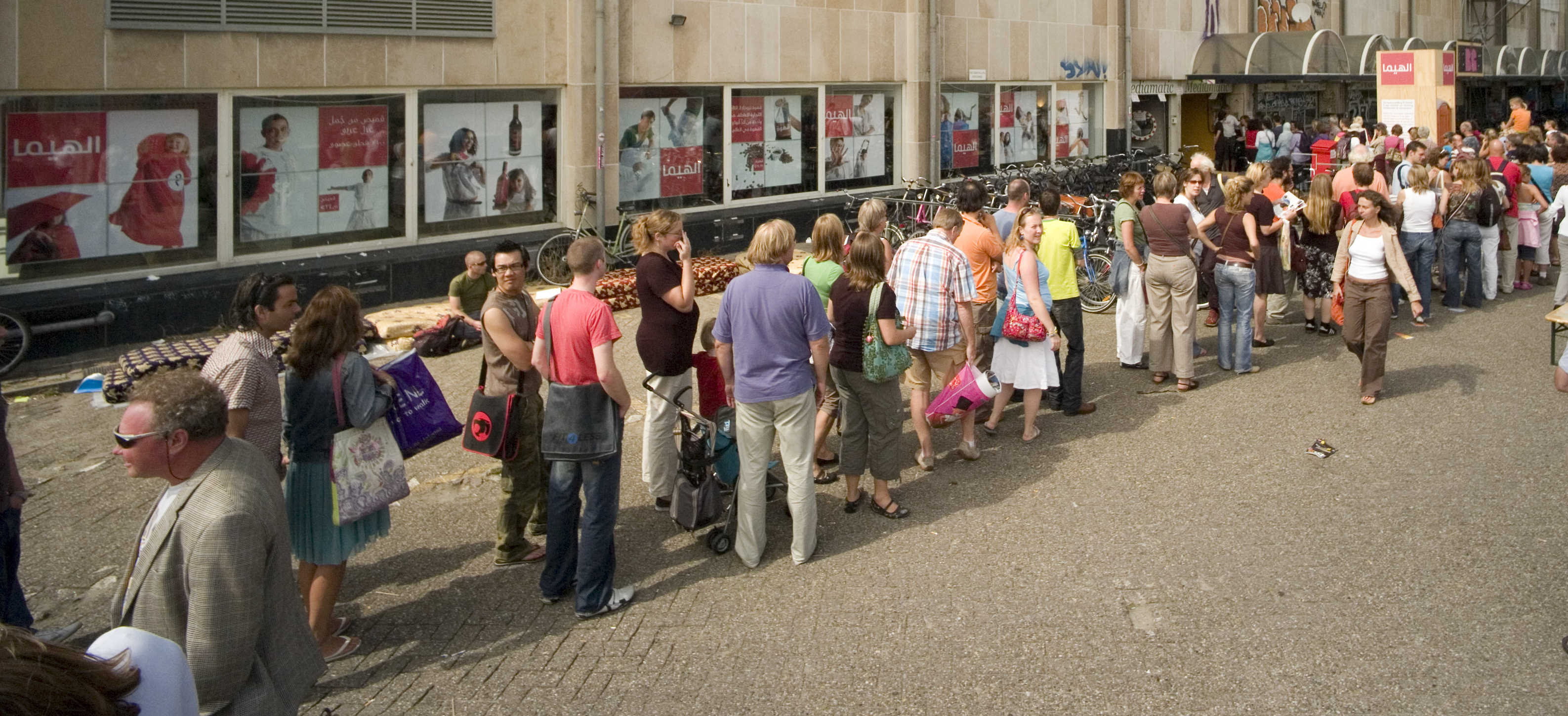
The El Hema exhibition
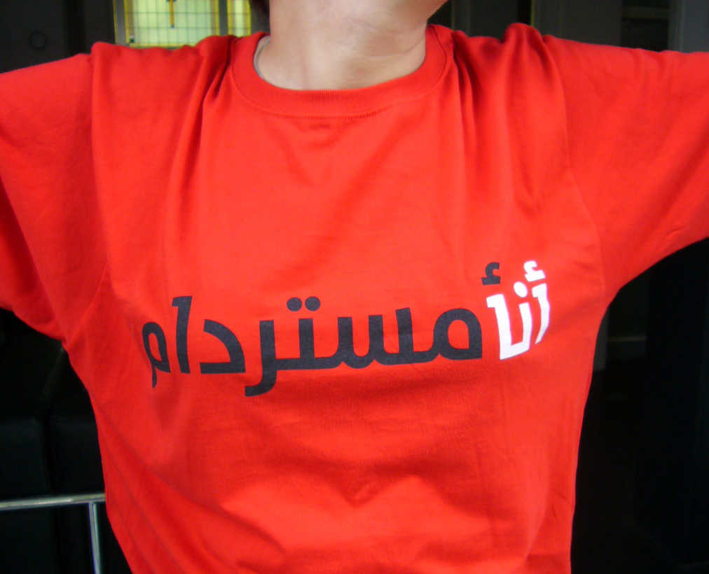
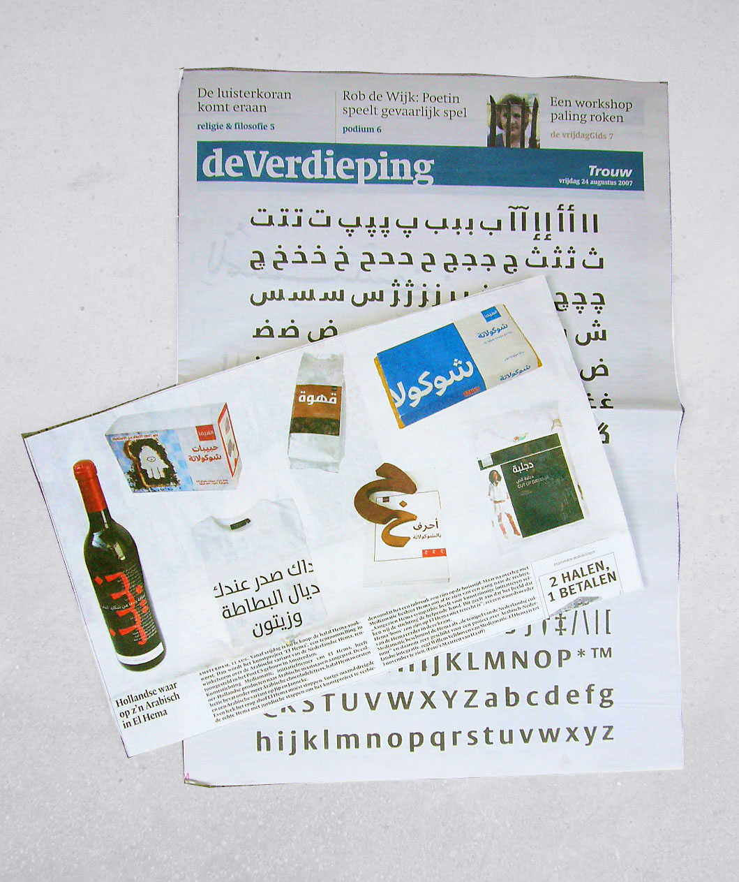
The Khatt Foundation approached Mediamatic for help in organizing and creating an exhibition that will bring the Typographic Matchmaking project and the resulting fonts to the Dutch public at large. The El Hema exhibition then developed from this to the idea of showcasing the Arabic fonts on everyday products and packaging (even on real book covers). This idea developed as an extension to the original ‘matchmaking concept’; where the iconic Dutch department store HEMA (that stands for the simplicity, quality and pragmatic attitude of Dutch design) was to be combined with the most emblematic aspect of Arabic culture that is the script (here using the Arabic fonts developed during the Typographic Matchmaking project). The conceptual development of the exhibition was a very good continuation of mixing Dutch and Arabic culture in an atmosphere of harmonious cross-cultural collaboration; where designers from western and Arab cultures worked together on producing tangible and well-designed products.
Huda Smitshuijzen AbiFarès from the Khatt Foundation, collaborated and helped in sourcing out 6 young Arab graphic designers from the Middle East that joined the exhibition’s design team. When the project was announced to design schools in the Middle East, we received about 50 applications for the 5 positions we needed. The selection was tough. Finally 5 designers were selected and arrived 6 weeks before the opening of the exhibition, to be joined two weeks later by Pascal Zoghbi (who is also one of the type designers on the Typographic Matchmaking project). The exhibition was under Willem Velthoven and Pascal Zoghbi's art direction. The Mediamatic international team of designers, with the 6 young Arab graphic designers as central to the whole project, went to work on making this ambitious event a reality. Around 50 people were ultimately engaged in the making of this project from design to final product, designing and building the exhibition.
This exhibition was a very effective way of spreading the fonts beyond the confines of the design circles and traditional exhibition conventions. It was a way to use popular means of visual expression as means for discussing serious socio-political cultural issues. The exhibition was further pushed by Mediamatic to include ongoing culture events like a fashion show, music performances, workshops, and weekly gatherings that revolved around discussing and experiencing various aspects of Arab cultures (from cuisine, to art, to music, to film and design).
The symposium and exhibition in Amsterdam have marked the turning of a page in the history of Arabic type design. The various presentations given at the conference made it evident that the much-needed professional development of Arabic typeface design has gained momentum. From this moment onwards, the Arabic script will start to be shaped by an increasing number of design professionals familiar with today's media tools and speaking today's design language. Ultimately, only skilled type designers in sufficient numbers can keep the visual representation of a script alive. They are the indispensable ingredients in all the other important contributions of technicians and scholars working within the field. It is a special moment in the history of a culture, that is using a script with such a highly iconic status, and that still struggles in so many different ways to adapt its script to modern means and needs of visual communication.
What makes this turning point so special is that the way in which it is made public is also remarkable within the broader context of the history of type design. The wheel of fortune has decided that the inauguration of the Arabic script into the realm of contemporary type design is to be celebrated in such a way that is unheard of in the development of any typographic development around the world - as far as we know.
—Never before has any government ever given a subsidy for the development of typefaces that are used by a small minority of its population (and mainly by a population outside of its territory).
—Never before has there been any governmental (or otherwise) subsidy given to the development of Arabic fonts.
—The description of the development process of any type design has never been so well documented as for these typefaces.
—The development and the distribution at no costs of fonts has never been used as a tool for integration of populations.
—Typeface design has never been subsidized as a tool for integration and cultural exchange.
—The strategy of typeface introduction with (fake) applications for a well-known supermarket outlets chain is absolutely unique.
—There has never been - nor will there ever be (most likely) - an introduction campaign for new typeface designs that has drawn such immense publicity coverage as the introduction of the five new Arabic type designs developed by this project.
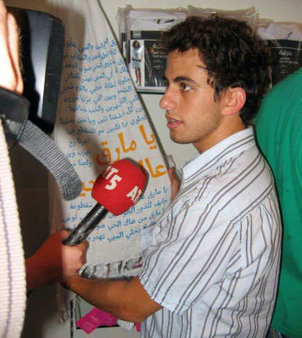
This introduction, through its unorthodox presentation, has received overwhelming media and press coverage. This kind of media attention and passionate response from the Dutch and international public testifies to the need for such projects to bring the socio-political debates into the public domain. (The 'El HEMA' exhibition was awarded this year's Best Dutch Design Awards 2007 in the visual identity category, and came second in the 'Audi(ence) prize'). It also is encouraging for creating more of such projects in the future and in further developing strategies and working models for cross-cultural collaborations and exchange in the visual arts.


