Tarek Atrissi is a Beirut born designer. He is founder and principal of Tarek Atrissi Design in the Netherlands. His studio specializes in cross-cultural design and Arabic typography. His awards include the Adobe Design Achievement Awards and the Type Directors Club. He lectures internationally and teaches in the department of Art, Media and Technology at the Utrecht School of the Arts.
Huda Smitshuijzen AbiFares: Your educational background is quite varied, from an undergraduate degree in graphic design (AUB, Beirut) to two postgraduate degrees in new media and typography (HKU, Utrecht, and SVA, New York, respectively). When did you start getting interested in Arabic typography and lettering in particular?
Tarek Atrissi: My education has been quite rounded and has set the course for my design practice. At the American University of Beirut, the focus was on print and graphic design, at the Utrecht School of the Arts the focus was on interactive new media, and at the School of Visual Arts the focus was on design entrepreneurship. I think the program at the American university of Beirut was the basis of my interest in Arabic typography and type design. The typographic focus of the design courses pushed me to understand the unique value of my surrounding visual culture and to incorporate that in my graphic work. The streets of Beirut became my main source of inspiration, particularly from a typographic point of view. The signs, lettering, calligraphy and hand painted messages combined to create a unique mix of environmental graphics. This has remained a source of inspiration for me up to this day, and I am constantly documenting the fascinating typographic street culture of different Arab cities.
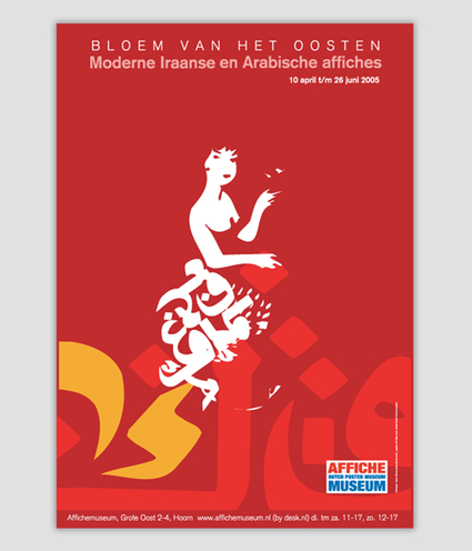
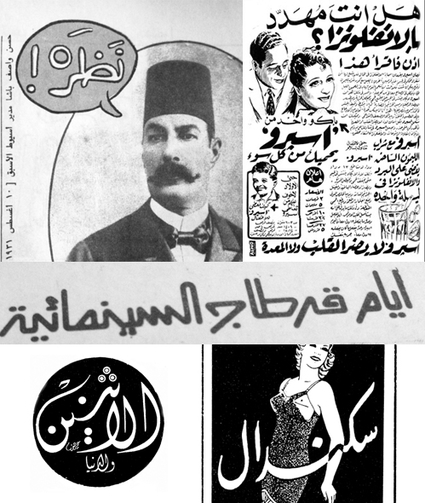
HSA: When we met a long way back you showed me your rich collection of old (hand-lettered and drawn) Egyptian advertisements. You said these were from your grandfather’s collection. They had some fascinating lettering and I remember you had used one such illustration for a poster exhibition at the Affiches Museum in the Netherlands. Can you tell me more about when exactly was the moment when you came upon this collection and what kind of change has it had on your graphic design language?
TA: My graduates studies in New York had an important focus on the study of the history of graphic design and on its influence on our practice today. This is when I realized that we have so little documentation in the Arab world about the history of our field and I started looking and collecting old graphic material in the form of advertising or visual communication (magazines, logos, posters…etc). My late grandfather Chafiq Nehme, who had a long career in journalism shared with me his amazing collection of old Arab magazines, some of which he was involved in designing himself. This rich material often contained casual Arabic lettering and creative calligraphic styles- and they remain a personal inspiration for me in my own graphic work until today. Even in type design, I sometime find ideas in this material that leads to typeface designs, In the absence of extensive use of photography, the quality of the hand drawn illustrations had a wonderful graphic style, and I find myself today borrowing some of these in my day to day design practice to interpret them in new contexts. The charm such vernacular material had challenges me to create graphic and typographic design work that is both visually engaging and truly rooted in our Arabic culture and recent visual heritage.
Studying such graphic material has been a main focus of my ongoing research and brought me to closely examine and analyze the work of some of the greatest Arab designers: such as the work of Mohieddin El Labbad (1940, 2010)- the Egyptian celebrated graphic artist- who I call the father of Arabic graphic design. I have collected a big part of his design work and his critical writing on our surrounding Arab visual culture. Funnily enough his design criticism remains relevant today, decades after it was written and despite the many changes that shaped our world since.
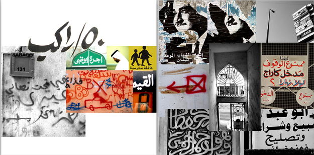
HSA: Your final year project at AUB focused on the Beirut street art and lettering. We later worked together on a book published by UNESCO in 2007, “Visual Narrative from Arabia”. In recent years the ‘visual street narratives’ in the Arab World have developed a more political agenda and have portrayed the current political uprisings. What is your personal fascination with ‘public’ lettering and why do you think it is important that we take notice of it? How does it reflect the rich Arabian text-based heritage?
TA: Public lettering reflects the visual reality of the Arab street today and the social, cultural, and political landscape of the Arab World. Arab visual culture, particularly the text-based one, is often connected to old religious calligraphic manuscripts. I think the contemporary street manifestation of the written word is equally important and is as rich as our older heritage. There are a lot of stereotypical visual representations of the Arab world around that are often wrongly associated with the culture. The street is probably the best source to collect visual elements that truly reflect the reality on the Middle Eastern environment.
HSA: Your practice as a designer is mainly focused on branding and new media, how does your lettering interest and practice fit into this mix? How does it inform your typeface designs?
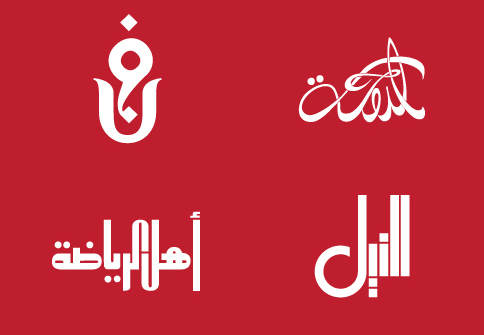
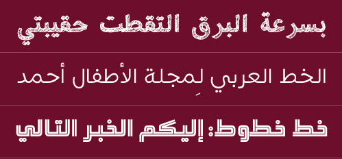
TA: My lettering/type design practice fits within my focus on branding. Despite the major developments in the field of type design in the past 10 years, there are still relatively very few fonts available to give any designer developing a visual identity the opportunity to make unpredictable type choices. This is why new brands in the Arab world are often searching for their very own "typographic voice". Designing a new Arabic font with a unique character and an appropriate personality has become a common practice in branding design in the region. Often a branding project starts with lettering for logos and some other graphic communication, and later lead to the development of non-custom typefaces. By contrast, in the context of new media, Arabic fonts are needed that meet specific on-screen requirements, namely legibility. We develop in the studio a lot of websites and interactive applications for mobile devices, and in the process we learned about the challenges of designing Arabic screen interfaces. One of the fonts we designed for the BBC Persian service was a Farsi font that successfully embodied what we learned from working with Arabic typography for TV stations: a low contrast font with open counters and short ascenders and descenders. A common knowledge for online legibility. Most important, the typeface had to be “subtle” and not visually imposing: a different approach from the ‘unique signature’ of lettering for branding projects.
HSA: You have conducted several workshop across the Arab World. Can you tell us about your workshops in Arabic lettering and word-image experiments, how has that influenced some of your real-life projects? Maybe you can discuss a particular project that you are really proud of.
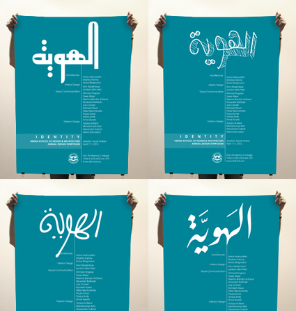
TA: Arabic lettering is a key focus in my work. I believe that Arabic lettering is a discipline that lies exactly between the discipline of classic Arabic calligraphy and the discipline of digital Arabic type design. It involves design tasks often in the hand of graphic designers in the context of branding, logo design, masthead design and other typographically driven design work. Lettering doesn’t necessary require the traditional calligraphic skills that come with long practice, and at the same time it is freer than type design where typographic letters are engineered for systematic composition and reproduction. In the workshops I give across different universities in the Arab world I try to focus with the students on the “Arabic word” and explore in theory and in practice the creative possibilities of Arabic lettering. Each word at the end of the day is an “image” that can take many different visual forms, a word could be turned into a powerful graphic image. The results that students come up with in these workshops are often unpredictable and pleasantly surprising. I personally also learn a lot from these workshops; I see many new treatments of Arabic letterforms that inspires me when working on my own projects. I recently took the “lettering” theme as a main graphic component for a series of posters I developed for the DAH Design Conference 2013, in Jeddah. The theme of the conference was ‘identity’, and so the word Huwiyya (identity in Arabic) was drawn in various lettering styles to visually convey the idea of how one word can take on different ‘identities’.
HSA: Would you say that you take a 'graphic approach' in your type design work? Can you elaborate and explain how this is different from the way traditional type designers work?
TA: My approach to type design is a very graphic one:.many of the fonts I developed started from simpler projects such as a lettering exercises for a logo design, or even a poster design. I contextualize hence every font within its usage in the graphic design discipline- and get inspired from the “lack” I notice during the process of certain projects. I often think of myself as a graphic designer and typographer designing typefaces with end usage in mind. This is why the style of the fonts I develop are varied and can be adopted to different types of graphic communication. I focus on the graphic element of lettering in type design and the freedom to experiment that comes with it. I feel this personal approach of mine adds variety to the existing Arabic fonts on the market, and I feel that this is precisely what we need as designers today. I personally try to keep an open mind to explore new creative ways to create new forms for Arabic typefaces, some based on free and playful lettering styles.
HSA: Last but not least, which of your projects are you most proud of and why?
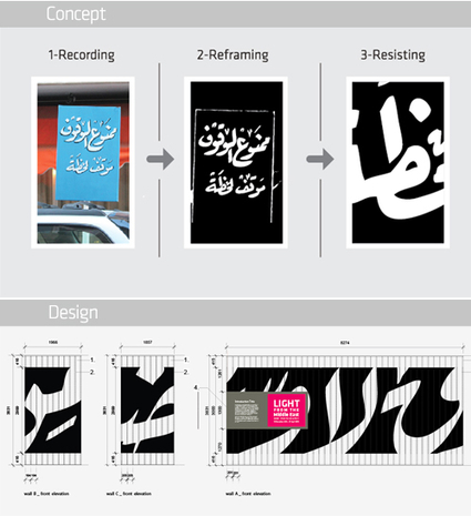
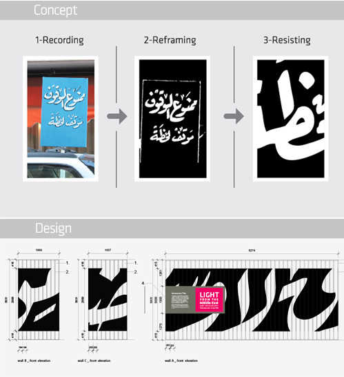
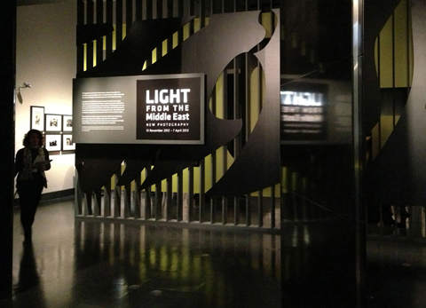
TA: That is always a difficult question! One of the projects I am most proud of is a recent exhibition design I worked on for the V&A museum in London, their first major exhibition of contemporary photography from and about the Middle East "Light from the Middle East: New Photography". I was commissioned by the museum to design the graphics to be incorporated as part of the exhibition design, and to bring an authentic flavor of the Middle East to the exhibition space that reflects the theme of the artworks on display. As a designer, I am strongly against the typical clichés often wrongly associated with the Middle East, and that is why I wanted to create a design language that truly reflects the reality of the region today. That is why I turned again to the "street" as a main source of inspiration. By applying the concept of "Recording, Reframing, Resisting" to a typographic context, I used a documented hand-lettered street sign in Beirut to deconstruct its visual typographic elements and use these as a main ingredient for the design. The calligraphic / lettering style on that sign was recreated with the exhibition title, and by cropping and reframing it, the large murals of the exhibition space were designed and produced. The final exhibition space was very typographic, using Arabic letters as forms in very large scale while remaining subtle and not overshadowing the art on display. Urban typography was brought from the street to the museum. Most important it helped reflecting an accurate visualizing of the real landscape of the Middle East today.
HSA: What is your advice for the younger generation of Arab designers.
My advice for younger designers would be to look at the unique visual language that surrounds their own specific environment and get inspired by it. This will help them creating a unique local design language. Particularly when it comes to lettering: There is a rich typographic tradition out there that is as important as the calligraphic heritage, and that is left to be explored by graphic designers and typographers. It is a point of focus that promises exciting experimental and commercial developments for the Arabic script.


