Huda Smitshuijzen AbiFarès: What is your educational background and when did you start being interested in Arabic Type Design? Was it a person or incidence that inspired you?
Pascal Zoghbi: I received my Masters of Design degree from the Type & Media program, at the Royal Academy of Arts in The Hague (KABK), in 2005. This taught me all I need to know about type design. During my studies there I concentrated on modern Arabic type design. Prior to this, I studied graphic design at Notre Dame University (NDU) in Lebanon, where I graduated with a Bachelor of Arts degree in 2002. My interest in Arabic type had already started during my studies at NDU. First, the field trips we made to the first printing presses in Lebanon triggered my initial interest. Second, lectures about iconic Arab type designs like Nasri Khattar's Unified Type, and the attempts made by him and others for simplifying the Arabic script were inspiring to me. But the strongest influence came from the renowned Lebanese philosopher and poet Saïd Akl. I was lucky to attend the Arabic language course he was conducting at NDU for the last time. During his lecture he spoke about his attempts at creating a “Lebanese Type” that will replace the current Arabic script and will be easier for the Lebanese to learn. In addition, his lectures about the Arabic script and language made me love the script and encouraged me to further pursue a type design specialization.
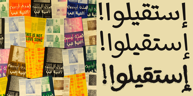
HSA: You have started your career in type design with your Massira font, during your postgraduate studies at the Royal College of Art in The Hague (The Netherlands). This typeface was inspired by informal handwritten protest banners and graffiti. Can you tell more about this project, the design process and what you learned from it?
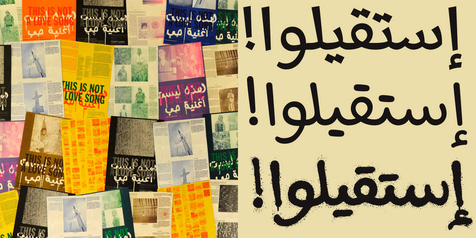
PZ: I left Beirut in 2005, in order to start my postgraduate studies at KABK, amidst the large demonstrations that were taking place in Beirut after the assassination of the Prime Minister Rafik Hariri and the withdrawal of the Syrian army from Lebanon. I was one of the thousands of Lebanese demonstrating and documenting these manifestations. I came to the Netherlands with the revolutionary spirit still within me. So when I had to work on my final type design project, the strong visuals of the demonstrations flashed before my eyes and I wanted to create an Arabic type family inspired by the writings of the demonstrators. Instead of creating one font with different weights, I decided to create several fonts based on the writing tools used for making the banners like spray cans, ballpoint pens, lipstick, brush, chalk, etc… Of course I did not have the time to create all the different fonts for my graduation project, I selected instead the most informal writing tools: the ‘spray can’ and the ‘ballpoint pen’. I studied all the different kinds of written letters from the petitions written during these demonstrations, and I asked for extra handwritten samples from my family, friends and colleagues in Lebanon. After analyzing the different kinds of writings and the different shapes of letters, I started drawing my own typeface. I started by drawing the skeletal shape of each letter (in all its positions), and then experimented with the spray can (and ballpoint pens) tracing over these skeletal shapes, to create the final designs. Each letter had to be sprayed on an A3 paper, scanned, traced, and then placed into the font file. Keeping the flow of the connection between the letters smooth was the main challenge for the design. Next to creating the display ‘Spray’ and ‘Ballpoint’ fonts, I created a textface with sharp-edged counters and strong pen strokes, which I felt also conveyed the idea of ‘revolution’ and struggle.
HSA: You have recently published a book on Arabic Graffiti and have been involved in graffiti workshops in Beirut. Is this a continuation of the activist spirit of the Massira font project (no pun intended)?
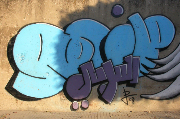
PZ: During my stay in The Netherlands, I took note of the huge amount of graffiti and was constantly photographing it. Coming back to Beirut after the 2006 Israel-Lebanon war, I continued this by taking photos of the graffiti in Beirut, especially the ones with interesting Arabic lettering. I discovered a strong street art scene and documented many of the socio-political graffiti on the walls in Beirut. I started appreciating the special assets of the city that I used to take for granted. I paid more attention to the amount and variety of Arabic calligraphy on trucks and the old hand-painted shop signs. This eventually turned into a substantial documentation of street art in Beirut and Lebanon. In November 2008, I had the chance to meet several Lebanese graffiti artists during the "Booming Beirut" workshop that was held by the German graffiti artist Don Karl. The Berlin-based Don Carl is also founder of a publishing house, ‘From Here to Fame’, that specializes in books on street art and graffiti. Ever since meeting him at the workshop in Beirut, we began planning a book about Arabic graffiti. Two years of research finally resulted in the creation of the Arabic Graffiti book (published in 2011), a compilation of articles about the artists and political Arabic street art in the Arab World and the West.
I would not say that the Arabic Graffiti book is a continuation of the Massira font project as much as a showcase of my interest in typography used for revolutionary texts, in typography that stems from the soul of the designer. I love letters with a message and a voice, that can start a revolution or stem from it, that speak about the suffering and struggle of a nation.
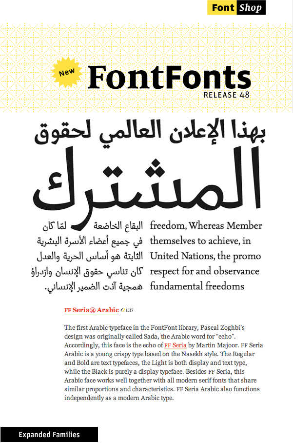
HSA: Right after your graduation, you have participated in the first Typographic Matchmaking project of the Khatt Foundation (2005-2007) and worked in collaboration with Martin Majoor on the Sada font. What were the challenges in developing a match for the Seria font? And what were the adjustments made to the font before it was later released as Seria Arabic by Font Shop international, in 2009?
PZ: Working with Martin Majoor was so pleasant and encouraging, specially since this was my first professional Arabic type design work after graduation. Martin and I discussed how to make the characteristic of the Arabic letters match as closely as possible those of the existing Latin letters of the Seria font, while at the same time remaining true to the rules and conventions of the Arabic Naskh style. What helped me in the design of Sada font was that I had tackled similar design problems with my design of the Massira font; for example the sharp-edges and angular counters of the letters. Prior to publishing Sada as Seria Arabic, I revisited the design, tweaked and fixed the problems of the original beta version of the font, and changed the overall shape, the spacing and the connections of some letters. The loop shape of the Arabic letters were modified to correspond more with the Naskh letter structure and proportions. The endings of some letters like the “reh” where tweaked to solve the problem of spacing and the overlapping of the glyphs. Additional Light and Black weights were added to the existing Regular and Bold. Finally, the Arabic opentype features were added to the fonts. FF Seria Arabic was released in 2009 by Fontshop International and was their first Arabic type-family.
HSA: You have often been commissioned to design matching Arabic fonts for existing font families. Can you tell about this process and what you have discovered doing it?
PZ: Any type designer wanting to design an Arabic typeface, regardless if it were to match an existing Latin typeface or not, needs to first master drawing the Arabic letters according to the proportions and rules of the traditional calligraphic styles. Creating a matching Arabic typeface for an existing Latin one also requires a thorough knowledge of the Latin letters and their design conventions. The type designer needs to analyze the design of the Latin before starting to design its Arabic companion. The structure of the letters, the behavior of the connections, the details of the edges and ending of the Latin letters should be applied as close as possible to the Arabic letters, but not at the expense of the correct proportions and structure of the Arabic letters. The Arabic should not be constructed out of cut-out pieces of the Latin letters. A proper Arabic font that is created as a family member of an existing Latin font should also stand alone as an Arabic font in its own right. In the end what makes the two (Latin and Arabic) work together will be their overall color, weight, proportions, and design details.
HSA: Several of your typeface designs have been designed in collaboration with other designers. Can you describe the most productive collaboration that has resulted in an innovative typeface design?
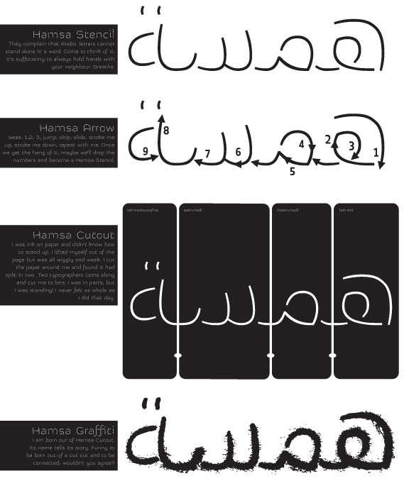
The collaboration with the renown Dutch type designer Erik van Blokland and architect Joumana al Jabri for the creation of the Hamsa type family within the framework of the Typographic Matchmaking in the City project was the most interesting in my career so far, because it differed from the usual type design collaborations. The brief of the project forced us to approach the design process differently; instead of starting with sketching and drawing letters on paper, we went out to the beach and started experimenting with water and sand. We wanted to find an idea that linked Amsterdam and Dubai (Western & Easter cities) together. We began by looking at the dredging and landfilling techniques that were at the basis of the urban design of these cities. We wanted to create letterforms using physical ‘urban’ building material rather than using the usual pens for drawing. We began pouring water into letters drawn in the sand. Then we started melting wax (as a viscous liquid that will harden in sand and not seep into it) and pouring it into the letterforms we traced in the sand. Then from the wax letters we moved on to creating sail-shaped letters from thin papers and sticks, that were 3D extrusions from the thin ‘wax letters’. Finally, from the paper and stick letters we drew ultra thin letters, each letter broken into ‘stroke’ parts. The resulting final design was an ultra light stencil type Arabic/Latin, alongside an arrow typeface for educational use (teaching people how the letters are drawn), and a cutout typeface for graffiti use. The letters were conceived for urban spaces: they can be constructed into huge structures that stand in the middle of plazas, or cut out of materials, or sprayed onto the city walls as graffiti. The end result is open-ended and provides many opportunities for future explorations from designers and typographers. The end result was never anticipated from the start of the project and that was unique in the brief of this project. To put the fonts to the test, during the Arabic language festival in Beirut (2010), Joumana and I used the Hamsa font (cut out of cardboard) to stencil slogans promoting the Arabic language and script on various walls in the city.
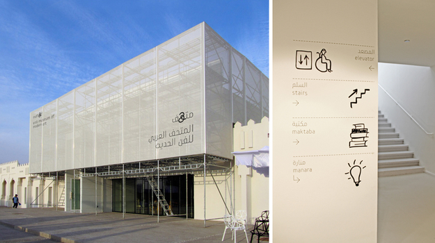
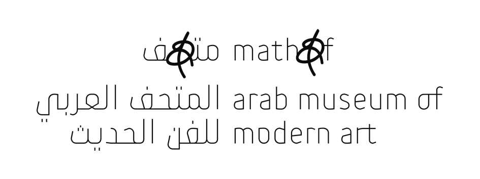
Another interesting typographic collaboration was working with Wolf Olins in New York on creating an Arabic/Latin custom font for the branding of the Mathaf, Arab Museum of Modern Art, in Qatar. The museum focuses on contemporary Arab Art. The corporate font had to reflect the contemporary work of artists from the region in an elegant and unique approach. The design brief was to have the corporate font light, elegant, and with an edgy feel. This main corporate font had to be in contrast with the bold secondary font designed by Tarek Attrisi (which had to mimic informal handwritten Arabic writing). Following this design brief, an ultra thin hybrid Kufi-Naskh font was chosen as the design direction. The design was characterized by curvy pen strokes that combine with the sharp-cut corners. The bilingual Arabic–English typeface includes not only the Arabic letterforms but also a lowercase Latin character set. We tried to bring the Latin letterforms as close as possible to the Arabic ones by creating unusual ligatures (not present in the standard Latin character set) like “rt”, “of”, “th”, that gave a distinct look to the words in the logotype of the museum (or inside a running text), and at the same, they mirrored the baseline connections of the Arabic letters, giving the English logotype a more ‘Arabian’ look. The daily work flow between myself and the New York team was intense; exploring all aspects of the letters and drawing several options for each letter, within an impossibly tight deadline. The resulting Mathaf font was ultimately incorporated in all the design applications of the museum from the logotype, to signage, publications, advertisements, website, to promotional items, etc… The opportunity to create a new font for a young museum, and collaborate with an international team of designers from across the world, was both challenging and enriching.
HSA: Which of your fonts and projects has had (or may have) a cultural influence on Arab readers and designers today and why?
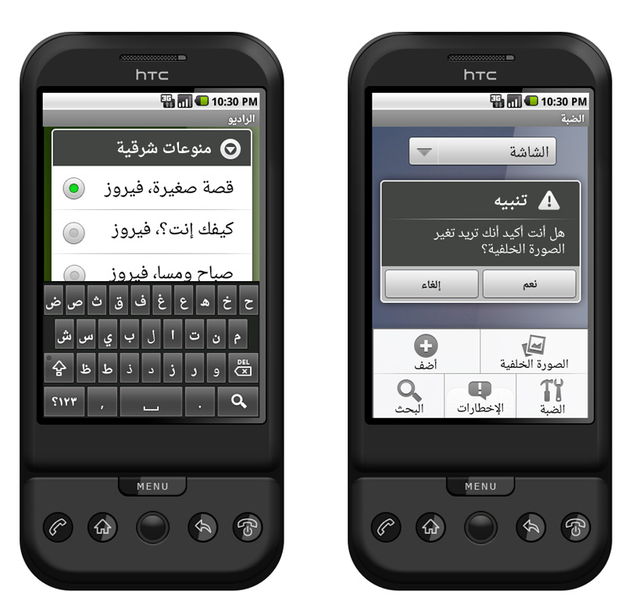
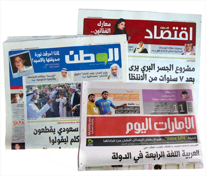
I would say the Arabic headlines fonts that I have designed for the leading newspapers in the MENA (Middle East and North Africa) region might have the most influence on Arab readers. The other fonts I have designed that are most likely to have an even wider coverage are the Droid Arabic fonts for the upcoming GoogleTM web products (such as Google Chrome™) and Android™ (smart phones).
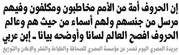
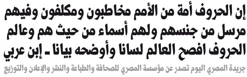
I am at the moment designing a custom headline Arabic font for Masri Al Youm newspaper in Cairo. Prior to that I have created headline Arabic fonts for Al Watan newspaper in Saudi Arabia, Emarat Al Youm newsper in Dubai (UAE) and Al Rouiya newspaper in Kuwait. The design brief for all these newspaper fonts was similar: they had to look young, strong and bold (and be based on the Naskh-mastari style). For the first headline font I created was for Emarat Al Youm, which was targeted at young readers, I was asked to create a fresh headline font with crisp and contemporary feel that differs from the traditional headline fonts used in other Arabic newspapers. I started with researching old as well as contemporary newspapers in the Arab region and analyzed the aspects of their headline fonts. I examined the old handwritten calligraphic headlines of the 70s and 80s and then moved on to the tabloid papers of the 20th century. I noticed that the move from the handwritten to the digitized Arabic headline differed mainly in the way the letters were connected to each other; the smooth and flowing handwritten headlines (in traditional Naskh and Ruqaa Styles) were replaced by the rigid and straight baseline of the Naskh-Mastari type style. My first proposal for Emarat Al Youm was a low contrast simplified Naskh fonts with curvy letter-connections at the baseline (that comes as close as possible to the handwritten Naskh) but this option was rejected. The client insisted on the generally accepted contemporary convention of the simplified Naskh-Mastari style. However, I was left with the freedom to simplify the Naskh letterforms and make them young and fresh. The result was my first Naskh Mastari headline font with simplified pen strokes, low contrast and open counters that made it easy to spot and read amongst other headlines of newspapers. After the creation of the Imarat Headlines font, I was commissioned by other newspapers in the region to create headline fonts following the same brief as that of Emarat Al Youm. This gave me the chance to challenge myself and dig deep into the construction of the Naskh letterforms to create different alternatives of outlines for new typeface designs within this genre.
The Droid Arabic (Naskh and Kufi) fonts are design to accompany Droid Serif and Droid Sans fonts, design by Steve Metteson from AscenderCorp. Besides matching the design approach of Droid Serif, Droid Naskh is purely designed according to the letterform structures and proportions of the traditional Naskh style but with a contemporary look. This Naskh style is optimized for reading on screen. The large ‘loop height’ and ‘tooth height’ help prevent readers from having to zoom into web pages to read. The traditional Naskh forms are softened for less formal documents such as periodicals and journals. Dawn Shaikh from Google performed several surveys and tests on the fonts during the design and development process to ensure the optimal legibility of the fonts on screen.
HSA: How does it feel to see your work used by other designers and can you describe such an event that surprised or pleased you?
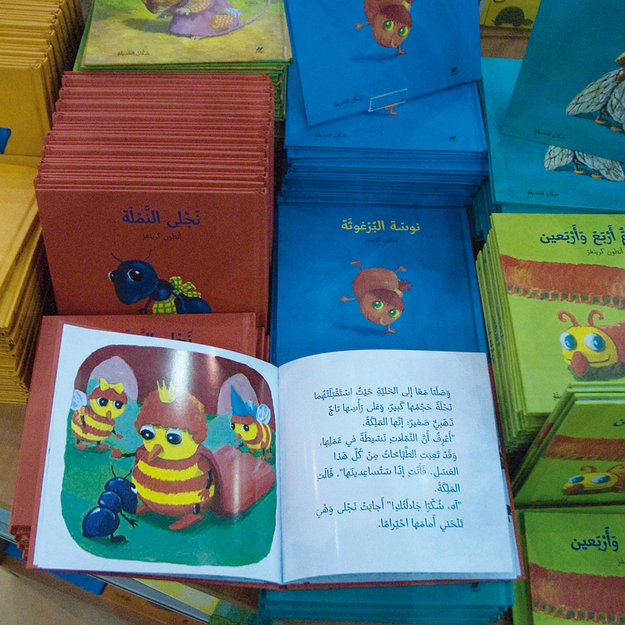
PZ: With the exception of Seria Arabic (Sada) that was commercially published by Fontshop International in 2009, all of my other fonts are custom typefaces and only used for what they were intended for. But Seria Arabic is different; I was surprised to see it used for typesetting Arabic children’s books. The font was initially designed as a book typeface but not specially for children’s books. But I guess the young and fresh look of the typeface seems to lend itself to this kind of books.
HSA: You have been teaching typography and type design at several universities, can you tell more about the places you have taught, the most inspiring experiences and what you think is important for type design education in the Arab world and Middle East in general.
PZ: Since my graduation from the Academy of Art in The Hague in 2006, I have started teaching typography courses at three of the main design programs in Lebanon. I taught first at Notre Dame University (NDU, 2006-2010), then at the Lebanese American University (LAU since 2008), and at the American University of Beirut (AUB, since 2010). I have conducted several workshops on Arabic Type design in both Europe and the Middle East. It is always inspiring for me to work with students and explore new approaches in typography. In addtion to working with students, I find it inspiring to teach alongside typographers like Reza Abedini at AUB; Randa Abed Al Baki and Alya Karami at LAU; Yara Khoury and John Kortbawi at NDU. When it comes to design education, programs in the Middle East lack advanced courses in Arabic type design and/or Arabic calligraphy. Both of these topics are introduced on a very basic level as part of a graphic design curriculum. Type design as a postgraduate study is still not available in the region though it is much needed. I wish that Arabic calligraphy classes would be reintroduced in school programs and continue to be offered later in design programs, at university level.
HSA: It is only recently that we have an emerging group of professionally-trained and dedicated Arab type designers. There is also a growing interest from western type designers in creating Arabic 'extensions' to their existing type families. How do you see the profession of type design developing in the future, and in particular, in the Middle East and North African regions?
PZ: The economic growth that took place in the Arab World has attracted many investors to the region, and with it came the need for new Arabic typefaces and visual identities. Type foundries and individual type designers became aware of this huge new market and its potential. Several other factors have encouraged Arab and non-Arab type designers to get involved in designing new Arabic typefaces. First, the fact that there is an insufficient amount of professionally produced Arabic typefaces available on the market. Second, the Arabic type design field is underdeveloped which leaves a lot of room for new experiments and explorations. Third, the global village that we are living in requires the creation of new modern fonts that include several scripts in their character set including Latin, Cyrillic, Arabic, Hindi, etc… Fourth, the current type technologies and global communications standards allow for developing advanced typefaces with multiple scripts. Nonetheless, I believe that the development of Arabic fonts is still in its primary stages and that the future will bring more advanced tools alongside more professional Arabic type designers to feed the needs of the growing market. Traditional, modern and experimental Arabic typefaces are needed and there is a demand for each category.
HSA: What is your advice for the younger generation of type designers from the region?
PZ: I still consider myself part of the young generation of Arabic type designers, but I guess your question is what would be my advice for the beginner type designers. I would say first and foremost: learn, practice and understand Arabic calligraphy. That is the most important aspect for becoming a serious type designer. Learn how to draw letters professionally using specialized type design applications rather than Adobe Illustrator. Understand the font technology, because the technical aspect of creating a professional font is as important as the creative visual design.
And lastly, love the letters you are drawing, they are your babies!


