All rights reserved
472 x 443
Download
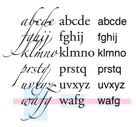
The space given to ascenders and descenders in relation to the x-height. Right to left, the ‘modern’ Helvetica, next, the classical Garamond and the calligraphic Zapfino. Fonts that give as little as possible space to the ascenders and descenders will have the widest range of applications. That is why it is the current design proportion mold for all Latin text faces. Calligraphic fonts need a lot of ascender and descender space to put their curls in. The more space given, the more exuberant the font can be.