Part of the Multiple Baselines series
Designing fonts that combine more than one script in one font file is no longer an exceptional activity. A lot of type designers are professionally challenged by designing multiple script fonts. The need of widening their horizon a bit is understandable. Type design is a very special branch on the large design tree. Most professional type designers spend their lives honing their skills of shaping and combining a very limited set of graphic characters. They are a sort of design monks, completely dedicated to one well defined subject. Digital technology has made it possible for type designers to produce and sell their own designs on a large scale. The amount of type designers and new font productions and releases concerning the Latin script is huge. It has resulted in the availability of a lot of low priced, high quality products. The downside is that unique styles is no longer easy distinguishable. Most fonts today come in an endless range of small varieties. All are well crafted but together they look like an astronomically sized family with an endless number of members. A galaxy of fonts.

The situation for type design for the Arabic script is quite different. The amount of professional Arab type designers around is still limited, although expecting to grow rapidly in the years to come. Put in a historical perspective the difference between the development of type for the Latin script and for the Arabic script cannot be bigger. If only by judging the amount of professionals involved in its development over time. And as it is the case in any profession: the amount of skilled people involved makes the difference in the final result for everyone. The skills of professionals grow by standing on each others shoulders. That is true for cancer research as well as for type design.
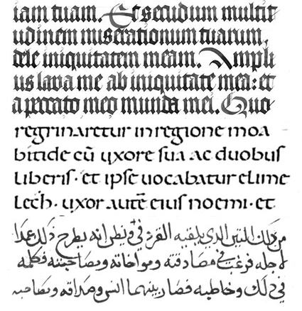
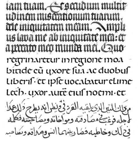
Any script has gone through the development of being once only hand drawn letters in a manuscript to evolving into designed letters for industrial text production that appear on all kinds of different media. It is important to make a distinction between calligraphy and the most simple shaped text used in manuscripts. For the first category, not only the content of the text is important but also its visual representation. A lot of effort is put in how it looks. For the second category, the content is the most important part and for the text production economic values like speed and ease of production are determining factors. For the Latin script, the last category has been amazingly coherent over a very long time. The Roman Trajan capitals are considered to have been the model for the Latin uppercase letters, and the Carolingian Minuscule and the Textura Quadrata the model for our lowercase letters. Up to this day, all type design for this category (text typefaces) still has clear traces of their hand written ancestors, especially in the proportions of letters. For the Arabic script, the development is far less coherent. The reasons are that there are not such obvious (and few) archetypes of letter forms used in manuscripts. The variety of different forms used in Arabic manuscripts is bigger, may be more important, the majority of manuscript production falls into the category of calligraphy. The priority was given to embellishment of the manuscript, not to ease and speed of production, which probably is a clear indication of a difference in type of society these manuscripts where made in.

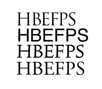
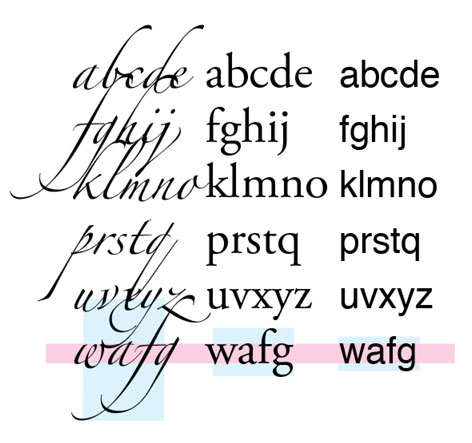
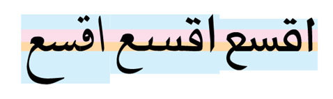
From a designer’s point of view there is a simple difference between the proportions of calligraphic letters versus letters made for the every-day-use category. It is the difference in the space given to the ascenders and descenders of letters. The reason is simple: the section of the letter shapes that determines its readability foremost is situated between the x-height (in the Latin script) and the loop-height (in the Arabic script). All letters made for economic text production will reduce the space given to ascenders and descenders as much as possible. The ancient scribes in the Latin script already knew how very little space ascenders and descenders really need without affecting readability. For all current type design in the Latin script in this category reduction of space for ascenders and descenders seems like a communal design mold. All type designers seem to conform to this mold.

The reason calligraphers need more space for ascenders and descenders is that they simply need some room for drawing their curls. Embellishment is no more than an elegant wrapping put around top and bottom of letters.

What is the relevance of all this when designing a dual Latin Arabic font? I think it will help to understand the different background of both scripts in order to make adjustments on both ends to close style gaps. Assuming that the design intent is to make one coherent style including both scripts. Obviously, stem thickness and letter details must be similar for both scripts, but also letter proportions are a major concern to make letters of both scripts match.
![]()
Arabic type still has strong traces of its predominantly calligraphic past. And there is no large warehouse of samples of excellent type design to take design inspiration from as it is the case for the Latin script. By the way, that makes designing for Arabic type such an exciting activity. There is so much uncharted territory, so much to discover. Western type designers can make only a limited contribution to the further development of Arabic type since fluency in the language using the script and being deeply embedded in its culture are of great help making type design for a script. In that sense mastering a language and designing its type have much in common.
So the challenge for the designer of the Arabic script part of the font is clear: make inventions that transforms a calligraphic tradition into type, which means make a compact version of the script that focuses on functionality and readability. That has nothing to do with ‘Westernizing’ the Arabic script unless one believes that optical constraints are not universal. For the designer of the Latin part the challenge is to break away from the functional proportions of the script that seems to be like a Latin type design mold for text typefaces and move into the direction of more classical letter proportions or even more challenging try to invent calligraphic elements in the every-day-text Latin script proportions. Create some space for embellishment. And consider making ligatures for often appearing letter combinations. Like the the combination for instance. There is still some -not easy to find- uncharted territory in Latin type design.