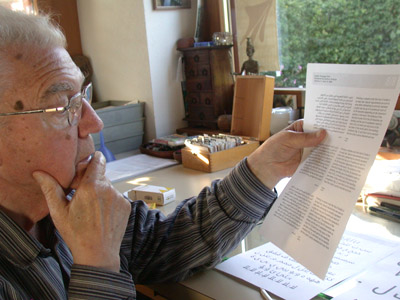
This is the year that I had spent waiting for my visa procedures for Germany to get completed. It wouldn’t be until January 2005 that I would actually move to Bad Homburg. I had already been offered a position at Linotype as of November 2003, and so, when the project started, I contact Bruno Steinert, the managing director of Linotype at the time, and told him. His recommendation was that we take this project as a starting point to develop Frutiger Arabic, with “the blessing of the master himself.” In September 2004, my design was proposed to Adrian Frutiger who instantly loved it and wrote on one of the printouts: “Congratulations to this work, has a genius touch.” This is the nicest compliment anyone every gave to my work!
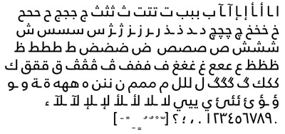
The design that I did for AUB had a somewhat stronger geometric element than Frutiger. Eventually, it served as the starting point for two typefaces: Frutiger Arabic with its more humanistic forms, and Janna which has of a more geometric feel. This sounds quite simple but it really took me 3 years to finish the design. It wasn’t that I was working on it all the time, it was just that I knew that something more was needed and I needed to find a solution that would be acceptable in text as well as in signage. This is quite difficult to achieve in the Kufi style which is more suited for display.
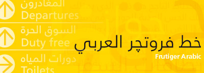
Frutiger Arabic is unique in its visual identity and this is mainly due to the fact that is plays across the boundaries of different styles. Its main structure is that of a Kufi. However, it incorporates aspects of the Nask and Ruqaa styles and it is this blend that creates its unique flavor. It presents a formal yet friendly appearance; professional but still warm. This is what one can refer to as a “humanist” Kufi, a Kufi that is written by hand. This enables Frutiger Arabic to be suitable for a wide range of applications, from signage to corporate identity projects.