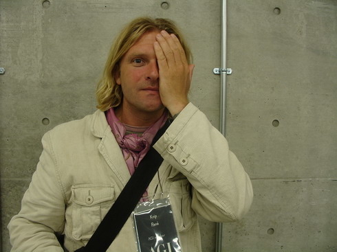
Born in the Netherlands, 1963.
René Knip graduated from the Academy of Visual Arts St. Joost, Breda, The Netherlands in 1990 after having spent time living in France and England.
In 1995 René Knip started his own graphic design company called Atelier René Knip. He
combines a craftsman’s use of materials with a personal concept of design in which he
works together with authors and poets. He has designed numerous typefaces and
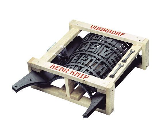
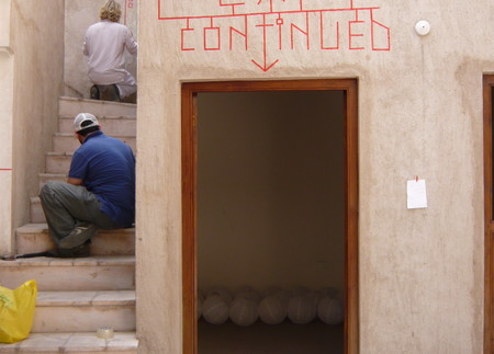
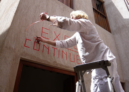
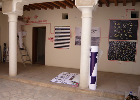
environmental graphics projects and outdoor installations, mixing vernacular with constructivist aesthetics. Gebroeders Knip was founded with his brother, Edgar Knip, who
is an industrial designer. They use two-dimensional lettering, as created by René, to give form and poetry to the three-dimensional structures that Edgar creates. This combination of talents results in graphic objects that are both decorative and functional, such as a fire basket, office clock and a letter lamp. The fire basket is structured with writing so that when the fire burns the words flare up and disappear again. The letter lamp consists of custom-stenciled words, poems or phrases that light up and can be hung on walls or stand freely.
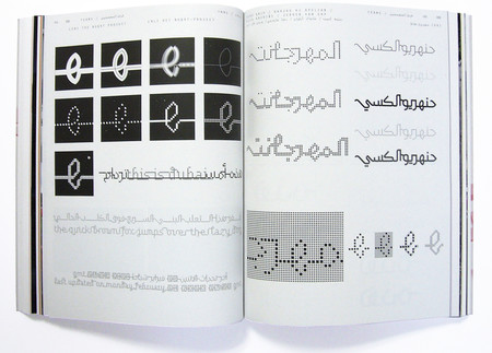
Fonts by René Knip are:
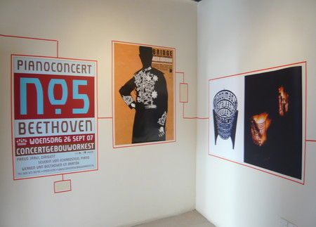
Turban Hey NF. With the exception of Turban, Knip's typefaces are designed for use in his own projects (ie. for clients like the Anna van Toor chain of fashion shops, the Hema department stores, for street signage developed for IJburg). His letters are architectural, built and constructed rather than drawn or written. And the architectonic nature lends itself very readily to use in real architecture: in buildings, on walls, as floor tiles, etc. The relationship between the letters and their surroundings isn't clearcut; it's as though the letters themselves were part of the built environment. Sometimes they are. Knip takes inspiration from various existing letterforms left over from the 1920s and '30s, especially those that he has found in the streets of Amsterdam. Others have mined this same vein; the squared-off echoes of Art Nouveau, De Stijl, and Art Moderne remind me of the lettering of cartoonist Joost Swarte, and some of the constructed shapes are reminiscent of alphabets done by Max Kisman. Knip's genius is in melding the letterforms and their immediate environment, making each a part of the other.
