The design concept.
The Seria typeface was selected by the designers to develop an Arabic companion because it is easier to match with the Arabic script. First, the wide proportions of its letterforms (its overall horizontal proportions are generally wider than conventional roman types) match quite naturally with the generally horizontally-wide Arabic letterforms. Second, its inherent calligraphic qualities are another aspect that makes it a good starting point for developing it into a new Arabic Naskh typeface (the Naskh style is conventionally used for long Arabic texts). The Sada design was then originally conceived to ‘echo’ the design of the Seria typeface; neither imitating its forms, nor forcing foreign Latin shapes onto the Arabic letterforms. The quirky classical overall design of Seria was a great inspiration for creating a fresh-looking yet traditional Arabic typeface. The design aimed at balancing the classical Naskh shapes and proportions with those of the Latin Seria. The decision was to match the baseline acsenders and descenders of the Seria, and adopt the angle, the curves and the contrast of the italic Seria. The Arabic Sada is meant to work well with both the roman and the italic of its Latin companion.
The design characteristics.
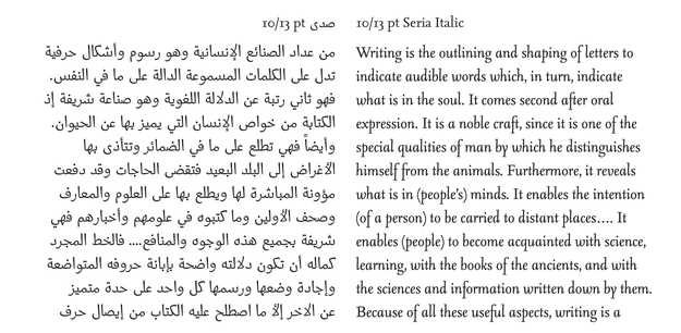
Sada is a refined and elegant Arabic companion to the quirky yet classical Seria typeface. The characteristics of Seria carried over to Sada were mainly the letter proportions (long ascenders and descenders), the overall contrast and the angle of the Seria Italic. Sada’s characteristics are described as follows:
1. Sharp curves and endings. Sada consists of two different kind of sharpness applied to the structure of the letters. When the stroke flows into a closed counter (a loop), only the sharp corner is applied to the inner part of the curve. When the stroke flows into
an open counter, the sharpness is applied to both the inner and outer part of the curve.
2. Naskh- and Kufi-based structure. Since Sada has to work with Seria, a Naskh-based structure was adopted with a high contrast structure based on the broad nib pen. On the other hand, the weight in Seria is applied on the horizontal strokes and not on the diagonals, as in traditional broad-nib based structures. Consequently, the weight in Sada had to be moved from the diagonals to the verticals, making the glyphs more upright. All the teeth and right side of looped glyphs were straightened, applying the weight to the verticals (as in the Kufi style). On the left side of the glyph, the strokes were kept more calligraphic and the weight was applied to the diagonals (as in the Naskh style).
3. Open counters. Unlike most Arabic fonts, the counters in Sada are open so as not to clog up at small type sizes. Furthermore, the open counters enable Sada to have more weights (from thin to black) adding to its legibility and friendly look.
4. Proportions of the glyphs. Usually in Arabic fonts, the ascenders and descenders are much taller than the loop and tooth height. This makes the Arabic script look like a continuous horizontal line with strokes sticking out on either side above and below it. In Sada, there is an even balance between the loop height, tooth height, ascender and descender heights, giving the font a more even overall color.
5. No straight baseline. Sada has a baseline that balances the stiff straight line of printing types with the conventional calligraphic curved one. The letters are connected by slightly curved horizontal strokes that clearly define a straight baseline without using any straight horizontal connecting lines to achieve that effect.
6. Color of the text. The overall color of a block of text (at the same type size) set in the Arabic Sada fonts is the same as that of its Latin Seria counterpart.
7. Numerals (figures). Sada offers the choice between Arabic hanging figures, Indic figures and Farsi figures. Most Arabic typefaces generally have only the Indic figures (and few new Arabic typefaces have lining Arabic figures). The problem with using lining Arabic figures in text is that they look larger than the Arabic letters, especially since there are no capitals in Arabic type. Sada borrows the hanging figures of Seria, modifying their forms and proportions in order to make them fit better within blocks of Arabic text.
Designers’ final remarks on the project.
Martin Majoor: Since you published your book Arabic Typography, I became interested in the Arabic script but there was never an opportunity to design an Arabic typeface. This project gave me that opportunity, and in a very professional way. I will always benefit from projects that can teach me something new. I learned that it is not simple to make Arabic and Latin typefaces work together harmoniously. The differences are so huge that in fact it would seem almost impossible. I say ‘almost’ because I think Pascal Zoghbi did a magnificent job and managed to create an Arabic version of Seria that looks and feels like part of the family. If you are not able to read Arabic it is very difficult to judge an Arabic typeface. On the other hand, I was not distracted by ‘known’ forms and could really concentrate on the abstract shapes. But as I said, Pascal did a very good job and there was little for me to correct. In fact my contribution to this project is Seria, which I designed from 1996 to 2000.
Pascal Zoghbi: The project is significant for Arab nations who have bilingual or trilingual publications. It makes the typographer’s work easier when he/she has to match a Latin font with an Arabic one. In addition, the project will be introducing new Arabic fonts to the market. This project’s most interesting aspect for me is that it links Arab and Dutch type designers and encourages them to collaborate together and learn from each other. When Huda contacted me while I was finalizing ‘Massira’ and presented me the opportunity to collaborate with the Dutch type designer Martin Majoor, I was at first a bit worried due to the fact that it would be my first professional type design work and that the due date was tight. However, after taking a closer look at Martin’s typeface Seria and analyzing its characteristics, I noticed that the treatment of the stroke and the structure of the letters had some similarities to my Massira typeface. In both, the use of sharp broken curves and a crisp look were visible characteristics. Consequently, I grew confident in the project and decided to use Massira as a starting point for the new Arabic companion of Seria. For me this has been a very good opportunity to create Sada, which will be my first published Arabic font available on the market. Also I have greatly learned from working with a renowned Dutch type designer, sharing experiences, and applying my ideas to designing Arabic fonts (and what I have learned during my Master’s study at ‘Type & Media’). In addition to the design knowledge I have acquired from this project, I learned how to properly generate Arabic fonts, including the different technologies involved, and how different applications and computer platforms render and display Arabic.