Part of the Multiple Baselines series
Nadine Chahine, can be considered the first woman Arab type designer. Born and raised in Beirut, Nadine has sailed from her Mediterranean city, one of the cradles of the alphabet, to chart an impressive career in type design. She has won several awards for her typeface designs, and her work has been featured in several magazines and books. Among her long list of Arabic fonts: Koufiya, Badiya, Janna, BigVesta Arabic, Frutiger Arabic, Palatino Arabic, Univers Next Arabic, Neu Helvetica Arabic and the custom typefaces for An Nahar newspaper (Beirut) are testimony to her super productivity. Her interview for this Multiple Baselines series reveals her travails and successes.
Huda Smitshuijzen AbiFarès: What is your educational background and when did you start being interested in Arabic type design? Was it a person or incidence that inspired you?
Nadine Chahine: I studied Graphic Design at the American University of Beirut, and it was during the Arabic typography class with Samir Sayegh that I got to be interested in this field. This inspired me to go deeper into the world of letterforms and so I joined the MA in Typeface Design course at the University of Reading, UK. Other than the practical implementation of type design, I also became interested in research and so I am now a PhD student at Leiden University in the Netherlands.
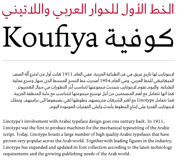
HSA: You have started your career in type design with Arabic/Latin Koufiya font, during with your MA work at Reading University. Can you tell more about this project and how it has set a direction in your career as an Arab type designer?
NC: Koufiya was as much a political statement as a typeface family. It was the first typeface with a matching Latin and Arabic designed at the same time by the same designer with the full intent of creating harmony between the 2 scripts. Koufiya is about creating dialogue between opposing entities and a quest for equality. It is about understanding that being different is not a detriment against being able to coexist.
Koufiya propelled me in the direction of further exploration of the relationship between Latin and Arabic, and this caught the eye of Bruno Steinert who offered me a job at Linotype. This has become a defining characteristic of my work though I expect that will change once my PhD studies are done.
HSA: You have worked with several type design icons such as Gerard Unger, Adrian Frutiger and Herman Zapf, can you tell more about these experiences and how they have influenced and inspired you?
NC: It's every designer's dream and a true honor... But it brings with it great responsibility. The bar is set really high, and you have to push yourself to give your very best. Each of the 3 is a living legend and a joy to know and work with. Gerard had been my teacher at Reading so I had already been heavily influenced by his work. Gerard draws characters that push dynamic tension to the max. It's a skill I'm still trying to learn... Gerard is also my PhD supervisor so he is more of a mentor than a co-designer.
The first typography book that I read was Type, Sign, Symbol by Adrian Frutiger. My mental image of an "a" is the Frutiger "a". He is a designer of the highest caliber and is a continuous source of inspiration. I especially admire the way he explains the relationship of black and white. I've tried to carry over his ideas into the world of Arabic type design, and he has been very pleased with the results.
Working alongside Hermann Zapf was the equivalent of another MA degree. I have learned so much from observing how he looks at type, how he draws letterforms, and the amount of detail that he goes into. A master calligrapher and revered type designer, he is one of the defining figures of our times.
There is no way I can express how grateful I am for these amazing collaborations. It is more than I dreamt of when I packed my bags to go to Reading. I knew doors would open, but I didn't expect the leap to be this big.
HSA: Several of your typeface designs have received awards and recognition, which of those are the most interesting for you and why?
NC: Koufiya is very special, and has more "me" than all the other typefaces. Univers Next Arabic is close to my heart, not just because of the design, but the circumstances in which I was working. The An-Nahar project also means a lot to me and I love the end result. It will be hard to top that.
HSA: You have participated in the first Typographic Matchmaking project of the Khatt Foundation (2005-2007) and worked in collaboration with Gerard Unger on the BigVesta Arabic. What were the challenges in developing a match for BigVesta?
NC: BigVesta has a very large x-height and this is a very big challenge to take over into Arabic. So the proportion of body characters and ascenders in the Arabic version are somewhat unconventional. What I tried to do is to get as close as possible to the optical size of the Latin, maintain the same inscriptional reference, without affecting legibility. Still, BigVesta Arabic works best in signage where there are very short runs of text.
HSA: Your work at Linotype as the Arabic specialist has been crucial in the further development of Linotype's Arabic font collection. This has had a positive influence on the fields of Visual Communication in the Arab world. Can you describe your role in the original type design competition you launched in 2005 and which was publicly presented at the Kitabat conference in Dubai?
NC: I joined Linotype in February 2005 and my first task was to assess the quality of the existing typefaces in the library, and make recommendations to expand it. My assessment at the time was that the library had a good amount of traditional text faces but very few modern designs. Linotype had already organized several type design contests before so it was a natural conclusion that we would organize the first international Arabic type design contest. I was responsible for the full organization and marketing of the contest, as well as the development of the winning typefaces.
The idea for the contest was born during a conversation with Bruno Steinert who deserves a lot of credit for many of the developments in Arabic typography. Bruno saw my talk at ATypI in Vancouver in 2003 and offered me a job at Linotype. When my work permit was refused, he was insistent that we apply for the visa again so I can come to Germany. One month after I arrived here he offered me a permanent job and hired a lawyer to make sure that my work permit goes through. He supported the Arabic Type Design Contest, and was fully behind the Kitabat conference.
Bruno was the first person in the type design world to recognize the commercial potential for Arabic type design and for that I am eternally grateful. Other foundries have followed Linotype’s lead and started to expand their Arabic offering and this has created a wave of new designs.
HSA: Later you have developed several matching Arabic fonts for some of Linotype's icon font families. Can you tell about this process and what you have discovered doing it?
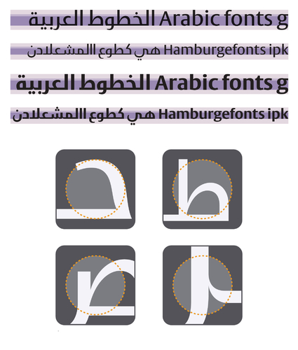
NC: Every person has a body and a soul. Same for typefaces. Each has an overarching concept, and the visual translation of that concept into curves and outlines. When we try to match typefaces across different scripts, we start with the concept. That would be heavily tied to the function of the typeface as well as intended personality, mood, and general atmosphere that it creates. In some cases, usually in Sans Serifs, the translation of that concept into Arabic can be achieved with a visual treatment that is very similar to the Latin. Frutiger Arabic is a good example. In other cases, the function defies such similarity. For example, in Palatino Arabic, the concept of being a traditional text face is translated into Arabic well but the visual implementation differs in some aspects: there are no serifs in the Arabic part, and the rhythm is more organic and fluid. These needed to be different in order for the concept to stay true.
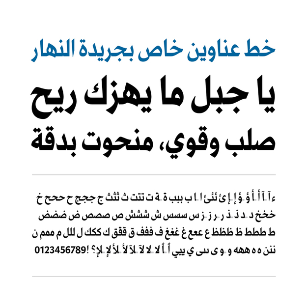
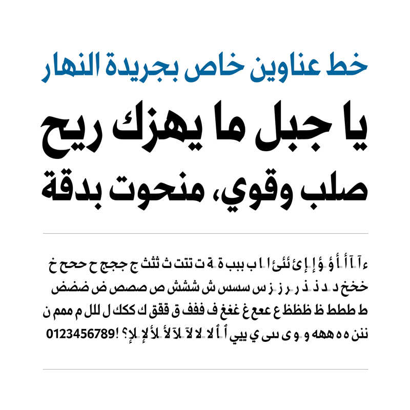
HSA: At Linotype you have been involved in several custom fonts projects, (for example, redesigning custom font family for an iconic newspaper as the Lebanese An Nahar), which of these do you feel very strongly about and why?
NC: The An-Nahar project is very special to me. For one, this is the newspaper I grew up reading. Second, I am very happy with the end result and am thrilled that my typefaces are now being read by a vast number of Lebanese people. Third and most important, I love what this project stands for. It’s not often that a typeface can embody a message as strong and as crucial as the struggle for the freedom of the press. It’s been a very inspiring project, and the story behind it has enabled me to draw letterforms that have more strength and force than anything I had drawn before.
HSA: You are the moment working on a PhD research with Prof. Gerard Unger at Leiden University, on the topic of legibility. Why did you choose to research this topic and why you think it is an important and unique investigation?
NC: It all started at Reading. My dissertation then was about script reform and simplification of Arabic. To put it shortly, the technical limitations that have forced the Arabic script to adopt simplified forms (as in Simplified Naskh) have now disappeared. However, Simplified Naskh is part of the typographic repertoire of Arabic and so one wonders: Do we continue to design that way and recommend such style? There is the individual preference of the designer of course, as well as the weight of tradition. But a key question remains: How does the complexity of the word shape affect reading? This is what inspired me to start the legibility studies and I am very excited about the results.
We know so little about reading Arabic and many of the reading theories revolve around reading Latin languages. It turns out that reading Arabic is in several ways different. For example, the brain activity and the mechanics of eye movement while reading Arabic are different from reading English or French. The way the characters connect to form words is a different feature too. There is this whole field of studies that needs to be explored and there are very few studies that have been done so far. Typefaces are meant to be read, and to design well we need to understand how reading happens.
HSA: Which of your fonts and projects have had (or may have) a considerable cultural influence on Arab readers and designers today and why?
NC: I can’t really tell… My guess is that it’s Frutiger Arabic. It’s the most popular of my designs and the first high profile typeface that I worked on. Some of the design solutions that I implemented in it have made their way into other people’s work. Things like spacing and character proportion, the structural mix between Kufi and Naskh, and the upward tilts before letters like the Beh (this is a Naskh feature that does not exist in Kufi) have become regular features in many new designs. I take it as a very big compliment.
HSA: What are your future aspirations and plans?
NC: More design, more research… I can’t tell which one I’m more excited about! I’d like to try out new flavors in design, maybe do more funky display typefaces… I’d like to continue with legibility and reading studies even after I finish the PhD. The Arab world feels like it’s really behind when it comes to academic research related to Arabic linguistics and it’s time to support theoretical assumptions by scientific research. Would be great if there could be governmental support and funding for such work.
HSA: Last but not least, what is your advice to young Arab type designers and where do you feel the Arabic type design field could be heading in the future?
NC: Study the calligraphic forms then look out the window and observe how people live. We need to understand how characters are built, because only then can we take things apart and really play around. The end result could be conventional or cutting edge modern. If it is built well, people will connect with it.
The Arabic type design field is blooming and we are still standing on the edge of it. There’s so much that still needs to happen, and more diversity is surely coming. There are many calligraphic styles other than Naskh and Kufi and I expect that explorations there will lead to many exciting new typographic styles. The future of Arabic type design starts today, and it has never looked more promising.
