Huda Smitshuijzen AbiFares: Can you tell us a little about your educational background and professional experience?
Lara Assouad: When I was young, I was fascinated with ancient Egypt and the hieroglyphs. I used to recopy them on everything from paper to fabric to leather. I think that was my entry point into graphic design, branding and eventually Arabic type. I studied Graphic Design at the American University of Beirut (BGD 1998). My first contact with Arabic calligraphy and type was with Professor Samir Sayegh who has continued to be my teacher and mentor throughout my career.
Six months spent in Cairo after leaving Beirut in 2000 confirmed my belief that any study of logos, branding, icons and typography should start with a pilgrimage to Egypt; the hieroglyphs magnificent examples of abstraction and symbolism executed with a precision only rivaled by our most advanced technology; the Ibn Tulun mosque for its ‘intricate’ simplicity and the quiet serenity and peace it exudes; the Islamic Art museum and its treasures of Quranic manuscripts and coins in Kufi in all its forms and variations. All three, for me, references in abstraction, minimalism and restraint.
When I started working, first in Lebanon at Leo Burnett (1998-2000) and then later on at Landor Associates in Dubai (2001-2005), I was immediately struck by the huge gap between Arabic typography and its Latin counterpart. At Landor, being an Arabic speaking designer, I was expected to know everything about everything in Arabic typography—which was far from the reality of things!
This pressing need for a ‘typographic’ Arabic I could work with as a designer and my existing fascination with symbols, glyphs and icons led to a deeper interest in Arabic typography with all its challenges and eventually a trip to France to spend a year at the Atelier Nationale de Recherche Typographique (2003-2004). There I studied the Arabic script, trying to draw parallels between it and Latin writing/typography. After ANRT, I returned to Landor only to quit less than a year later. I realized that my projects and ambitions could no longer be entertained within an office and decided it was time to start working on my own.
HSA: You have started your career working at Landor Associates where you were one of the first designers in their design office in Dubai. You have worked on several large branding projects there among the most innovative was the branding for the country of Jordan. How did this project and other similar projects lead you to get deeper into Arabic type design? Can you talk about these project.
LA: I started my career with a brief and marking detour into the advertising world at Leo Burnett Beirut working, among other projects, on creating promotional material for Kraft Jacobs Suchard for the GCC. There I was immediately faced with the basic question of 'what typeface do I use in Arabic to match the Latin selling line?' I needed creamy, blobby Arabic typefaces and there were none! The choice was so minimal that I often commissioned an Arabic lettering/calligraphy artist to create the Arabic selling lines to match the Latin typefaces used. This became more of an issue when I started working at Landor Associates. It is mandatory to have bilingual brandmarks (Arabic plus another language) in the Gulf countries. Because the choice of Arabic typefaces was limited to a few poorly executed and digitized calligraphic styles, the process invariably always started with researching the endless pool of Latin typefaces, which served as a good source of inspiration, and then eventually developing an Arabic to match it.
Which meant that Arab designers, designing for Arab clients, were articulating their initial design concepts and sketches to the client first in Latin and presenting the Arabic at later stages once a direction was approved in Latin.
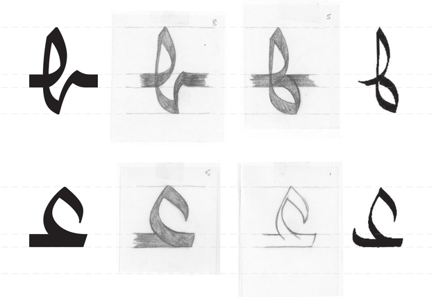
Without the proper training in Arabic type design, I did not believe that I could create Arabic wordmarks on my own. So I worked very closely with Professor Samir Sayegh on adapting Latin wordmarks we were working on into Arabic. He would send me hand drawn sketches based on traditional Arabic scripts or styles of his creation which he thought served as a good starting point for the project. I would then rework the proportions, line quality and stroke thickness, stroke endings and beginnings etc... to achieve a closer connection between the Arabic and Latin wordmarks.
We worked together on numerous projects sometimes developing an almost complete system/alphabet for clients such as Sabic petrochemicals (18 affiliate companies) and Al Tayer Group (12 sub-brands).
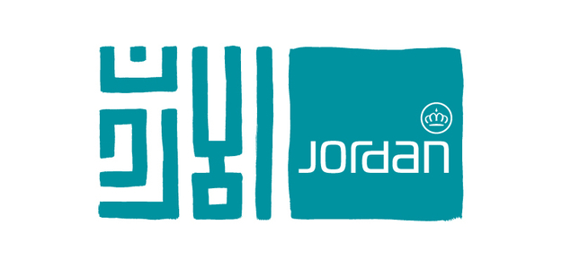
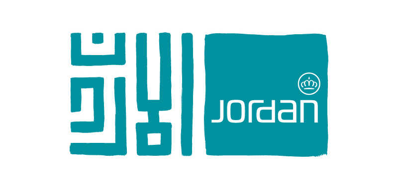
Among the projects I am most fond of at Landor was Brand Jordan. I was lucky to be involved in this project in every step of the process from strategy, to positioning, to creating a branding platform, and finally developing the identity. The final logo was a good rare case of starting with Arabic instead of Latin. The Arabic was based on square geometric Kufi hand painted with a brush to break the very rigid and traditional aspect of this kind of ornamental Arabic. (The basic grid was developed by Professor Sayegh). I later drew the Latin part of the brandmark to follow the same principle as the Arabic—monolinear and fitting within a square grid, without forcing it into the exact same mould as the Arabic. The idea was to express the same concept in both languages but in ways that served each language best.
For the Al Tayer Group identity and its 12 sub-brands, the aim was to create harmony between the two languages without necessarily rigidly enforcing the visual characteristics of one onto the other, but rather create affinities between the two scripts. In this case, the Arabic was an evolution of a script developed by Professor Sayegh and the Latin a slightly modified version of Rotis Semi Serif. The connection between the two languages was created through letter heights, proportions, and stroke thicknesses. However, the Arabic remained more anchored in lettering than type. You could still clearly see the stroke of the pen, which was a lot less obvious in Rotis.
HSA: For your postgraduate studies in type design at the Atelier National de Recherche Typographique in Nancy (France), you studied under several Swiss type design icons such as André Badinger and Hans Jürg Hunziker. Could you describe your education there and how did it affect or change your approach to designing typefaces (Arabic in particular)?
LA: What interested me most in ANRT was that unlike other very good type design programs, it was literally a research atelier. Each 'chercheur' had a specific project to research over the entire year. I chose to focus on understanding the Latin transition from script to type and explore ways to apply that process to Arabic. I took the Naskh script as my starting point and began analyzing it. I had very valuable support from Hans Jürg Hunziker who had already had a very interesting experience in Morocco teaching Arabic calligraphers there to create Arabic type based on Ruqaa. I learned the basics of type design, and rediscovered the Arabic script and its underlying structure. I spent the biggest part of the year pencil and tracing paper in hand, decoding and analyzing the inner workings of Naskh, which is to me the calligraphic equivalent of Times New Roman in our days. I came out of my year at ANRT with a basic skeleton for a Naskh 'typeface' that I continue to work on now.
HSA: You have participated in the first Typographic Matchmaking project of the Khatt Foundation (2005-2007) and worked in collaboration with Fred Smeijers on the Fresco Arabic font. What were the challenges in developing an Arabic match for Fresco and how did your collaboration with Fred Smeijers develop?
LA: My first encounter with Fresco was while working on the logo for Kitabat Arabic Calligraphy and Typography Conference in Dubai in 2005 with Krassen Kerstev a fellow type designer and AUD professor. We felt that the apparent hand drawn roots of Fresco could relate well to manuscript Kufi with its structured letters and comparable stroke angles.
I had long admired Fred Smeijers’ work, so for me it was an honor to be able to work with him and learn a little more about how he approached type design.
Besides all the obvious hurdles that all Arabic type designers face: the dancing x-height, the connected/disconnected letters, the curvilinear overall nature of the Arabic script vs. a stronger emphasis on verticals in the Latin script, our main challenges were distance (Fred and I met only once at the beginning of the project) and the obvious language barrier (Fred did not know the Arabic script at all). In order to resolve the language issues, we agreed that I would begin the work by researching all the Arabic scripts that we could use as starting point. I then painstakingly highlighted the entire alphabet with all its contextual variants out of each of the manuscripts that had been selected and used them to create a document which served as a historic backup and reference for Fred. This allowed him to confidently interpret my resulting hand drawn sketches into what became the first draft of Fresco Arabic.
As for the distance, I think it proved to be a good mediator as it allowed the two of us more time to consider each others’ work carefully and made us create clearer well commented visual feedback and documentation of all the steps of the project. In hindsight, having consequently worked on many more projects at a distance and over the internet, I still feel that my collaboration with Fred remains one of the smoothest and most fruitful of them all.
HSA: Fresco Arabic received the TDC (Type Directors Club, New York) award for excellence in type design in 2008. The font is planned to be released this year by OurType font foundry. Can you tell what and if there were any changes made to the typeface design and when it will be available for sale?
LA: Design-wise there haven't been any changes made to Fresco Arabic, however we are in the process of developing a light and extra bold which have proved to be a little challenging. We hope to be able to launch the complete Fresco Arabic family before the end of this year through the OurType website.
HSA: You have later developed several custom typefaces with both Latin and Arabic character sets. Can you tell a little about some of these projects, what were the most interesting ones and why, and how do they reflect the need in the Arab market for new fresh Arabic fonts. In short what were your clients looking for?
LA: I have been working on a few type commissions for corporations, unfortunately as they are not yet completed, I am unable to discuss them for the time being. However, alongside my typeface design work, I have also worked on many typographic 'adaptations' into Arabic in the past few years, which to me are mini exercises in style. Every wordmark comes with a specific set of characteristics and limitations. The challenge is to try to communicate the same brand values and characteristics with the Arabic lettering. On one hand, you have more freedom because you have only a limited set of letters to work with and can create something that works well with those letters alone without having to worry about other letter combinations. On the other hand, you have less freedom, because you are even more closely bound to the Latin type style than in a typeface design, as you have only few letters with which you can communicate the visual characteristics and values of the Latin brand.
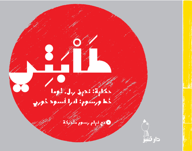
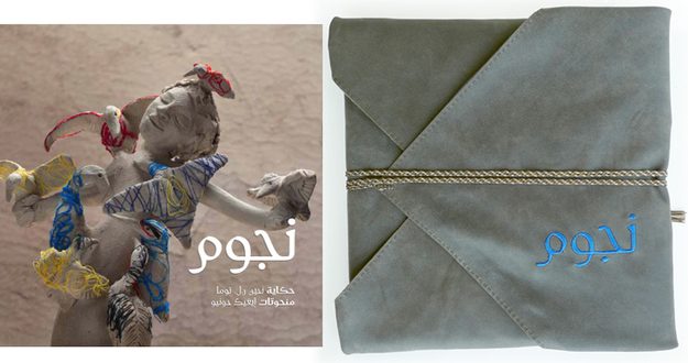
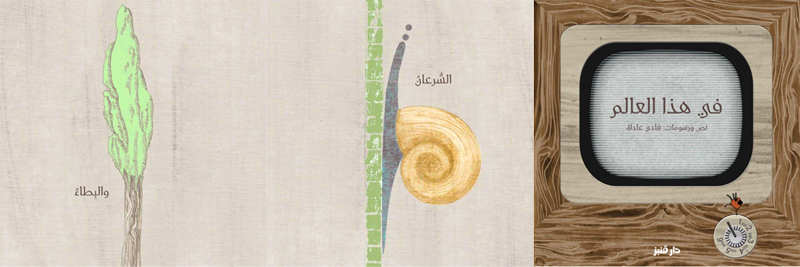
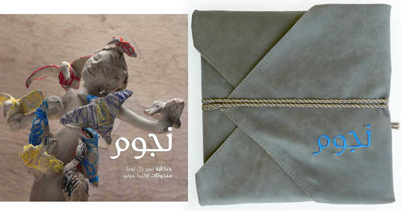
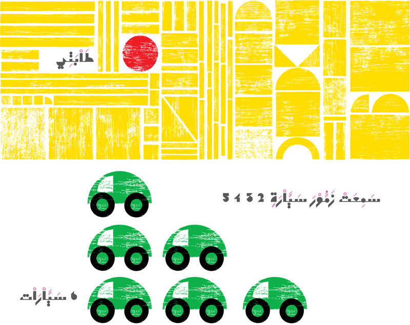
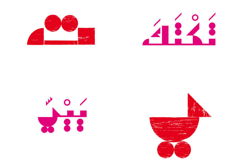
HSA: This year you won a second TDC award for your custom typeface Tabati developed for Dar Onboz for two children's books— Tabati and Aswat Al Abjadiyyah. Can you tell us more in detail about this unique modular typeface design and its innovative qualities? Why was it based on woodblock stamps and how did this define the final formal qualities of the typeface.
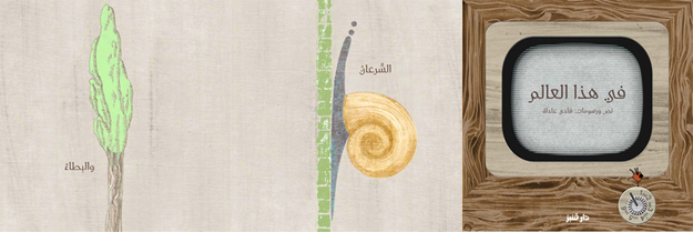
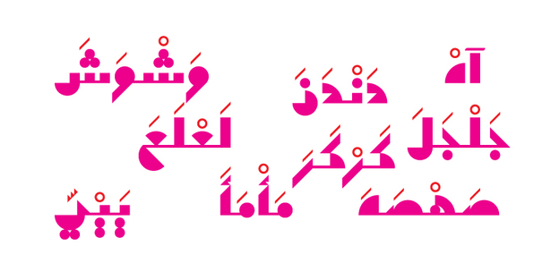
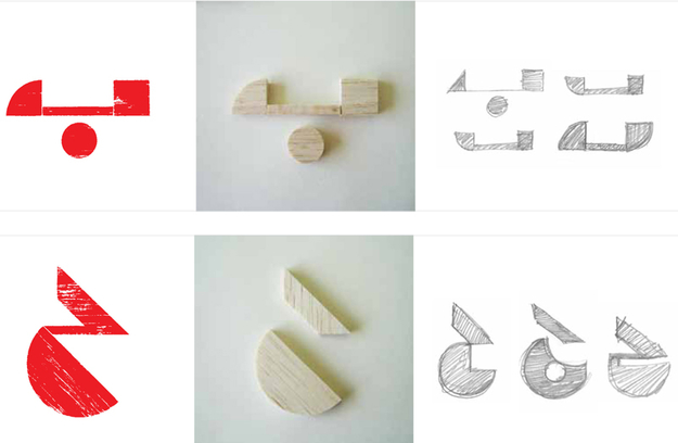
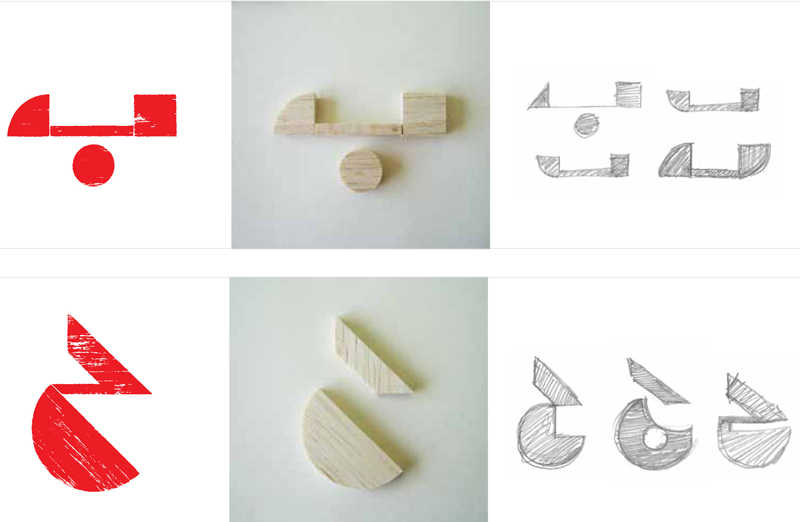
LA: Tabati, the font, started with a story written by Nadine R. L. Touma about a little red ball bored at home that decides to escape one day and go on a world-discovering journey. The story introduces, through the adventures of this little red ball, the young readers to a world populated with simple geometric shapes and primary colors. A circle could be the sun or a wheel; a rectangle could be a window, or a bus; a triangle could be a tree; a square could be a table or a rock... At first I was approached by Nadine to illustrate the story and design the book. The brief was: basic constructivist/ Bauhaus aesthetic. As I started cutting out circles and squares of wood and creating these illustrations I realized that we could also be telling the same story with the type. The challenge was how far could I strip this intricate and ornate script before it lost all readability?
Arabic writing could also be as simple and pure as three squares piled up on top of each other and a half circle to make a 'lam' or a circle and a rectangle to make a 'meem'. I wanted to prove—perhaps to myself before anyone else—that the Arabic script can be purist, minimalist and contemporary, and not always carry the burden of history, and calligraphic heritage—at least not on its 'face'! I wanted to present to a younger generation just discovering how to draw, read, and write, an Arabic that can lend itself to playfulness, an Arabic that relates to the world we live in, the world that surrounds us and not to a time long gone.
Both books: Tabati and Aswat al Abjadiyyah were part of the "Future of Tradition – Tradition of Future' at the Haus der Kunst museum in Munich and at Agial Art Gallery in Beirut (2010-2011).
HSA:Both of your award-winning typefaces the calligraphic Fresco (drawn with a pen) and the constructed Tabati (drawn with woodblock stamps) were developed first as hand-crafted lettering before getting digitized into a font. Do you believe this is an important way of working and how do you think this way of working influences the final design outcome? Do you also apply this process to your graphic design work?
LA: I have always felt that the mind–hand connection for me was a lot smoother and direct than mind–mouse–screen. I need to start by emptying my thoughts on a paper. I need to scribble, trace, retrace, start over, spread my sketches all around me, until I reach a result I am comfortable with.
Being able to manipulate a sketch by hand, especially with type, is essential for me to understand the way the strokes are articulated, how the curves are defined and make sure they still answer to the basic principles of writing in Arabic.
Even with a typeface as abstract as Tabati, the hand sketching and all the manual woodcutting block-printing work was essential to understand the physicality of the letter.
There is also something very constructive and somehow comforting about being able to look back at all your sketches and review your process. When you are working on a computer, unless you make a conscious effort of keeping copies of your steps, your sketches tend to evolve into your final artwork leaving no trail behind.
HSA: You have taught graphic and typographic design courses at several design programs in the United Arab Emirates. How did your teaching influence your work and vice versa? Where do you think that design education in the Arab World needs to go and what should design programs focus on?
LA: I have taught a few courses in Arabic typography and branding at the American University of Dubai during fall 2004 and spring 2005 and given an Arabic typography workshop at the American University of Sharjah in spring 2011.
I feel my experience in teaching is still too short for me to able to formulate a very well informed opinion about the matter. What I can say is that I thoroughly enjoyed this contact with students, and the infinite possibilities and potential of telling and retelling the same story again from scratch. Teaching made me question the validity of my knowledge, question my certitudes, and inevitably lead to more interesting solutions or ways of approaching a graphic or typographic design problem.
HSA: You are at the moment working as an independent graphic and type designer. What are your future aspirations and plans?
LA: Continue my Naskh project started at ANRT. Invent more pretexts to make more typefaces and more books with them. The perfect project of a lifetime for me would be a book created from A to Z: the story, typeface, illustrations, layout, paper, binding… Since I’ve started working on my own, I have been very lucky to be approached mostly with very interesting projects in Arabic type and graphic design. I hope it continues.
HSA: Which direction should the type design field take in the Middle East and North Africa? And what is your advice for the young/new generation of type designers in the region?
LA: Without sounding too righteous, I think if there is one single quality that type designers and designers in general should have a lot of, it would be integrity. The Arabic type design field is so open at the moment to all possibilities, there are no rules yet, at least not formulated in books and design programs. Which is why I feel it is important that we stay true to our concepts. Learn from the west but have enough integrity to create something that emanates from our own culture and language with all its beauty, richness and contradictions. Because then even if we get criticized for our design choices, if the principle is sound, we would still be making a worthy contribution to the ongoing debate and maybe eventually to the development of Arabic type design as a movement rich with different schools of thought.


