Huda Smitshuijzen AbiFares: What is your educational background and when did you start being interested in Arabic type design? Was it a person or work experience that inspired you?
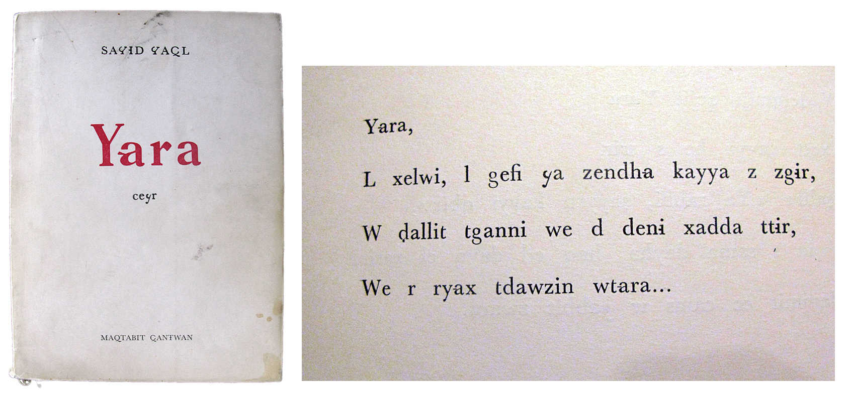
Yara Khoury: I studied graphic design at Notre Dame University in Lebanon, and then furthered my studies with a Masters in Art and Design at Middlesex University in London, in 2000. Throughout my studies, I was trained to treat typography first and foremost as the heart of any design problem/solution. Typographic design Icons like Said Akl's 'Lebanese alphabet' and Nasri Khattar's unified Arabic alphabet had an impact on the way I conceived letterforms. They inspired me to experiment with letterforms that have long been taken for granted and considered as default shapes that are not supposed to be tampered with. When I was still in school, a close friend of the family used to get me books from Said Akl's [the Lebanese poet] personal library written in the Lebanese alphabet—a modified Latin alphabet that includes Lebanese Phonology of 36 characters. Some of the books were a translation into Lebanese of the Shakespearian play "Romeo & Juliet" and a poetry book Akl had written Yara! I learned Akl's alphabet and soon enough I was reading out of print copies of his tabloid newspaper Loubnan.
I don't really foster at all the idea of losing our Arabic letterforms for the sake of modified Latin ones. It was simply at the time an eye-opener for me to the world of type and typography. Nasri Khattar here is of paramount influence too. I got hold of a folder that documents his nomination for the Nobel prize of 1986 and since then I was fascinated by his life-long passion for the reform of Arabic type. He was a true visionary.
All this eventually led me to focus my Masters study on creating a new phonetic alphabet to be used by Arab users for communicating over the internet. The 48-character alphabet is designed to compensate for the missing sounds Arabs use but cannot find in the Latin character set. I can consider this my first attempt at designing typefaces.
HSA: Al Mohtaraf was one of the first professional branding design studios in Beirut (and Saudi Arabia) that gave Arabic design a fresh and contemporary look in the 90s. When did you join them (can you be considered one of the founders?) and what is your position there at the moment.
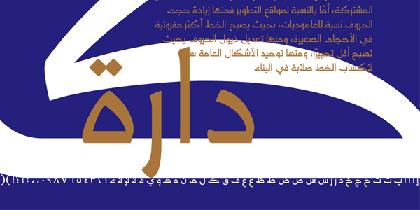
YK: I had joined Al Mohtaraf in the summer of 1997 and then left for two years to complete my studies abroad to come back in 2000 as senior designer. When I finally joined on a permanent basis, the company was more than 12 years old. It had already made contributions in a wide range of graphic design work, and became well known for its calligraphic calendars and typographic logos. Kameel Hawa and the existing team had also produced few typefaces, especially the custom typeface Dara and the house typeface Mohtaraf. But that period was a turning point, not for Al Mohtaraf but for the practice of graphic design in Beirut and consequently the Arab world. For the first time in Arab design history, the first waves of professionally trained fresh graduates from graphic design departments in Lebanese universities were joining the professional workforce. So actually my joining Al Mohtaraf marked the introduction of a more modern and professional graphic design practice into the company. From general typographic layout to logo design and type development I believe I have made a significant contribution in spreading those norms within the company's design effort.
So all in all it has been around 15 years since I have first worked with Kameel Hawa at Al Mohtaraf. Ever since, the studio grew into four units in each of Jeddah (headquarters), Riyadh, Khobar and Beirut.
We play a good jazz tune, Kameel and I. He plays the artistic sax and I play the rhythmic drums. In that sense yes I am one of the founding members in the second phase of Al Mohtaraf's history, and I am currently the design director.
HSA: You have started your career in type design at Al Mohtaraf and collaborating with the well-know Arab designer and visual artist Kameel Hawa. How did this collaboration evolve and how important was the influence of Kameel Hawa on your type design work?
YK: The first time I joined Mohtaraf Beirut Graphics as an intern in summer '96. I was still a BA student. The work that Kameel was involved in at the time, used Arabic as a default language for each project we had to work with. This was the complete opposite of my experience at university at the time. Arabic? Oh my! Maybe I could layout some pages and transfer that knowledge over to Arabic typographic projects but to design a logotype was a completely different ball game. Working with Kameel taught me that Arabic calligraphy is not a set of rigid rules but a set of infinite pliable forms that are like putty in the hands of a designer. Dots became a game, Alefs stretched too long up, shapes became counter shapes. In other words, what he did was every calligrapher's nightmare but every designer's dream! I still remember the struggles he used to have with our the calligrapher Ali Assi telling him to stretch that letter or make it much thicker and Ali would just move his head sideways saying: "ma biseer ya istaaz" (that's not possible my dear sir)!
In general, we at Al Mohtaraf try to experiment and break boundaries in each project we undertake. We try to rock the boat of the commercial graphics we see around us in the Arab world. In some ways, this is our signature. I even remember the title of the first profile I designed for Al Mohraraf: Trouble Making! Our work produces constant new explorations in the field of Arabic graphic design that creates a fresh wave or graphic style that is now Al Mohtaraf style. Working with Kameel Hawa is a constant unlearning experience, a challenging one and an unrelenting one. If I may add a consuming one too. It's a great honor!
HSA: The Midan font won the Linotype Arabic Typeface Design competition in 2006, and the TDC (New York Type Directors Club) award for excellence in type design in 2007, and is now published and marketed by Linotype. Can you describe your involvement in the design process and your collaboration with Kameel Hawa and other designers in your studio on this project.
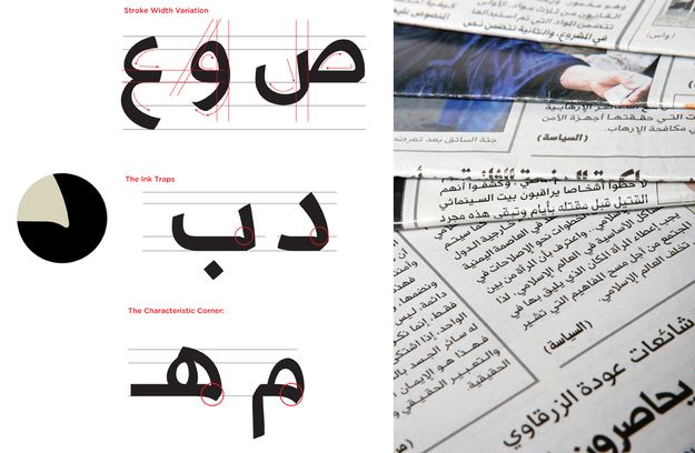
YK: We design many typefaces at Al Mohtaraf and one of the most successful ones has been Midan. It was designed for long text settings such as books and magazines. It is now in three weights which gives enough flexibility for designers to produce efficient hierarchies in their texts. Midan is designed by Kameel Hawa who worked on it closely with Al Mohtaraf's in-house type designer Mamoun Ahmad. I did work on it after that by cleaning it up, and finding a homogenous system for the way the strokes moved around, connected and ended. The collaboration was clearly a success bringing together the 3 different individual talents in a complimentary manner.
HSA: You have worked, in collaboration with others, on several custom typefaces for newspapers and corporations. Can you tell us more about this typeface and other seminal ones that have exemplified your work and set the work of Al Mohtaraf apart from other agencies practicing at the moment in the Arab World. Can you list a few key typefaces that marked a serious shift in your development as a type designer and talk about what makes them special?
YK: Well let me say again that in my graphic design 'upbringing', so to speak, I was made to take typography very seriously. And this seems to have opened for me the window to getting really hooked on looking thoroughly into the shapes of letters. When I joined the company in 1997, a few typefaces had been developed but in an amateurish way; more fanciful and artistic rather than professionally produced.
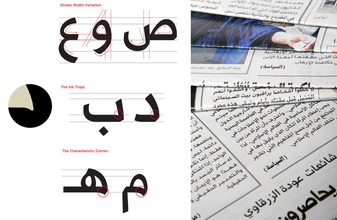
When serious opportunities for developing proper typefaces came along, I became fully involved putting emphasis on applying thorough principles of type design and development. I started getting more and more up-to-date on the advanced specialized software that became available to insure a truly sound and trouble-free development of each typeface. At one point when we were developing a six weight type to match the Latin Univers font for a bank affiliated to ABN Amro, our Beirut team came quite close to functioning like a type foundry. For several months we were fully occupied with the development and perfection process of several weights. I was working in close collaboration with Greta Khoury to finish the 5 weights involved. This was quite an experience. But the first opportunity to design an original Arabic typeface presented itself in a commission for designing a custom type family for AL Yawm newspaper. As a starting point, I took one of Kameel Hawa's preliminary drawings he had done for a typeface and worked on developing it for the newspaper in one weight first and then worked on another. Mamoum Ahmad in our Jeddah office had designed the rest of the weights. At the time, we didn't know about interpolation!
By and large, Al Mohtaraf due to its long history in calligraphic compositions, free hand and classical, as well as word drawing and design, had a rich soil for developing interesting letter shapes, that are either display or textfaces. And together we were trying to develop approaches in the original drawing of the letters that went beyond the widespread classic calligraphic approach. But over and above my participation in all this, was an additional role in refining the 'product', and getting it as close as possible to meet the most strict rules of proper type design. I even wrote the EULA's that Al Mohtaraf offers for clients!
We are currently studying the prospect of launching a serious type foundry.
HSA: You have participated in the Typographic Matchmaking in the City project of the Khatt Foundation (2009-2011) and worked in collaboration with Melle Hammer on the Kashida typeface? Can you describe this project and the collaboration with a Dutch designer? What were the challenges you faced during the process and how would you describe the end result and overall investigation?
YK: My first encounter with the Typographic Matchmaking projects was in 2007 when I was asked to translate the book in the Arabic language as it was full of type design details hard for a regular translator to work with. I painstakingly did that and was thus very familiar with the matchmaking process in all its details. I was more than ready to participate heads-on as a designer in the second typographic matchmaking project.
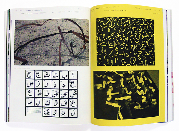
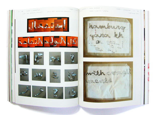
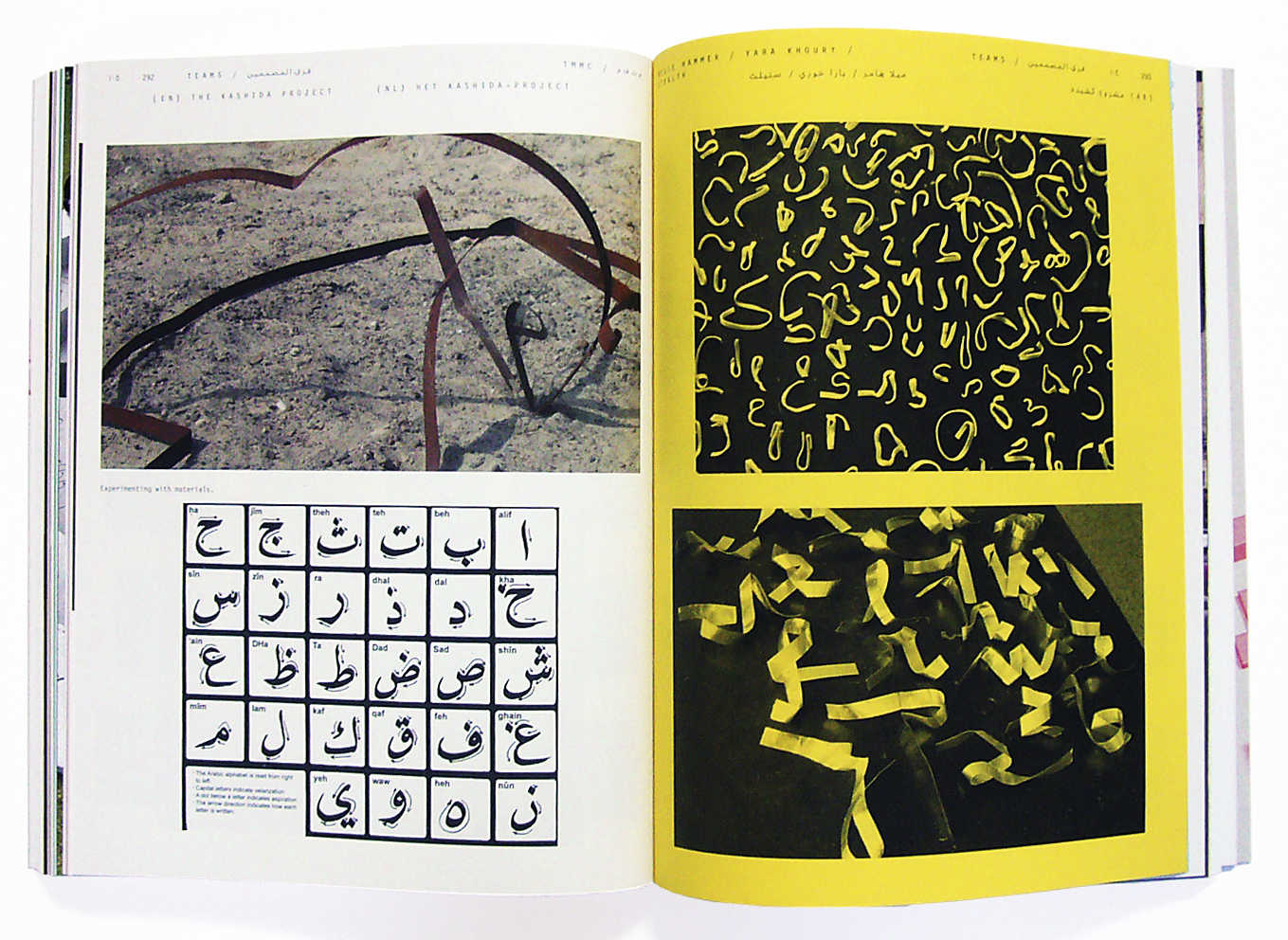
The Typographic Matchmaking in the City project brief required a 3D typeface for Arabic and Latin. Melle Hammer and I immediately realized the challenges of working with such different scripts. In our first meeting in Amsterdam we started comparing typographic rules and details between Arabic and Latin. We realized that a Kashida is somehow the equivalent of kerning in Latin typography. We isolated this idea and decided to start out with a single Kashida as an endless 3D stroke, folding and bending to create free-form letter shapes. We imagined a font that could only exist in 3D, a sculptural font that can manifest itself as a bridge between two cities or a playground for children using enlarged specimens of type that twist and turn in space.
The process for producing such a typeface needed some ground rules as we were working across continents (I in Beirut and he in Amsterdam):
– we would only sketch using the metal strips we had made specially for this (no more hand drawn sketches, which we started with, since they were producing 'unreal' shapes)
– we would use the same material, thickness and width to make sure that the strips react the same way when bent
– we can compare and borrow from each shapes and bends
– we defined a set of 'components' for the letterforms to create consistency within the diversity of alphabets
I can say that the Arabic 'bends and folds' were designed to a great extent to simulate the calligraphic motion of the hand when writing a letterform, maintaining a semantic structure so closely tied to the nib, ink, paper (as a plane), and the breath associated with each dive, dip and stroke. The letterforms were first designed in a very free-form, fluid, nonchalant motion... experimenting with the material, the folds and the infinite possibilities inherent in each letter, specially in 3-D. We realized that the final shape had to look equally interesting from all angles, rotated, upside down, flipped etc.
It was very hard to find existing examples of 3D letterforms other than the samples of extruded letters and the others made of collaged objects. However, the biggest hurdle proved to be the draftsmen and the production process. In order to be able to reproduce the letters in 3D, our bent metal strips had to get accurately digitized on a computer. We used several draftsmen and lost a lot of time when almost all of them failed to reproduce faithful details of each bend. We needed some sort of reverse engineering—to trace each curve and plane in 3D software—that was not available to us at the time.
We met three extra times in Amsterdam and Beirut to ensure that our bent strips shared a common visual denominator and later on to refine the digital drawings that Freedom of Creation in Amsterdam were drawing, and that Ramzi Zahhar in Beirut was later refining.
The end result is an exploration of the possibilities of truly 3D type.The Kashida fonts needs further development and refinement whether in the production process we used called 3D printing or in the final letterforms that we reached. I think each letter that was designed is a magnificent sculptural piece in its own right. We are very proud of the the end result which you can check online on www.kasheeda.com
HSA: Since you completed your postgraduate studies at Middlesex University in London, you have returned to Beirut and have been teaching since at Notre Dame University. Some of your students have gone on to become some of the well-trained and professional type designers (Pascal Zoghbi, Khajag Apelian, and Kristyan Sarkis, among others). What was the focus in your courses and how do you think you have influenced their decision to specialize in type design?
YK: The graphic design program at NDU is largely based on a mix of the Bauhaus, the Swiss international style, and the Basel School of Design. As the program was put forth in 1995 by visiting Professor Peter Rea, these influences by and large give great precedence to typography in their approach. The students are typically exposed to the masters such as Moholy-Nagy, Jan Tschichold, Joseph Muller Brockmann, Wolfgang Weingart and the like. Within it all, type is considered to be at the heart of the design process whether it is used in identities, books, magazines or websites. As Beirut is a trilingual environment if not a solely an Arab speaking one, it was imperative to introduce students to Arabic letterforms, its structures and its aesthetics. With very little resources, bibliographic references and choice of Arabic typefaces for the students to work with, it is a very tedious and aggravating task to deal with all this sparsity! And most students resist including the Arabic language in their projects and others face it heads on until they embrace it. The latter is the case with Pascal, Khajag and Krystian to name a few. They saw into the weak spot and felt a nagging urge to do something about it. They committed to studying type design at an MA level and built their profession around filling this gap. I need to note that Krystian is doing a phenomenal job with his latest work on the Colvert and Greta Arabic fonts. Simply fantastic!
Of course, my experience as a practitioner at Al Mohtaraf which is a highly typographic and calligraphic one also feeds into my experience as a teacher and vice versa. I don’t think one can survive without the neither on a theoretical nor on a practical level. My experience at Al Mohtaraf has exposed me to a myriad of bi-lingual projects (and more often trilingual) that enrich the work I do and thus the case studies I use as a teacher. I am sure in a way, the work we do at Al Mohtaraf is also a beacon of light to a lot of students who are looking for an alternative graphic approach that speaks to their audience. Moreover, to inspire and give students a boost of confidence, I usually invite Arabic calligraphers such as Ali Assi and Samir Haddad to give hands-on calligraphy workshops at the university. This sort of workshops give the students a taster of the magnificence and pliability of the Arabic letterforms.
HSA: From your years of experience as a teacher and professional designer, how do you think design education in the Middle East and North Africa should develop? What could be the focus or directions that need to be addressed to further improve the design standards in the region?
YK: Oh where can I start, too many ways, too many ideas…. Ultimately, I think we live in an ever more demanding Arab world that needs the best problem-solving strategies in graphics and communication design. The inherent challenge is in avoiding a stylistic and decorative visual without function or content. This can only be achieved by having the educational institution develop an intrinsic school of thought; one to build on, develop and update as time goes by. By school of thought I mean a "dogma", a set of principles and a higher aim to prepare students in "head, heart and hand" for what will come next. It should ideally prepare them for a commercial market that does not simply consume them but one in which they can make a difference. The explosion of media channels in the MENA region has created a fertile market for designers. But unfortunately and although some of those designers have been highly trained there isn't a critical mass that can make a real difference in new visual explorations specially developed for the Arab world and not merely a copycat of western visual formulas. In many ways, the visual commercial style around us simply duplicates western formulas in design with a local twist of varying degrees. This fast growth has consumed the upcoming designers in day to day activities and no time was available to create real schools of thoughts or movements..
On another level, I also believe that one has to be adaptable whilst maintaining the best principles that one can. At university, however, students should not be led by the common denominator of the design profession and the design they see around them, they should be led by the highest ideals that they can develop together. If I need to go in more detail I can easily claim that the web is a double-edged sword. I know that most educators would agree on that point. Adopting it as the only source of research by the students is proving beneficial at a very superficial level and futile at a higher one. It exposes the student to a tsunami of useless information without distinguishing the bad and ugly from the good. It reminds me of Alexander Pope's (1688-1744) saying: "A little learning is a dangerous thing".
HSA: Which of your fonts and projects has had (or may have) a considerable cultural influence on Arab readers and designers today and why?
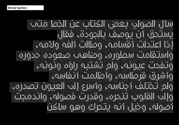
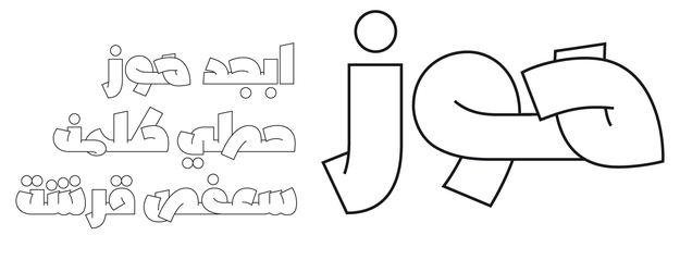
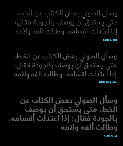
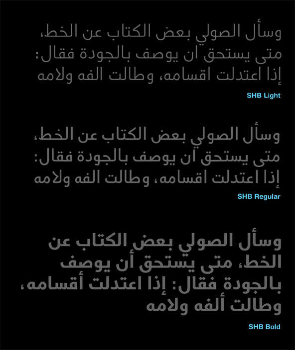
YK: I have designed several Arabic fonts but not enough to judge what could become an influence on Arab readers. In general, I still don't have enough work to judge what would be seminal typefaces that leave a mark. Of course, add to that the typefaces I design are usually custom-made for specific clients and not sold to the public. Which means, unfortunately, that the typefaces won't get used outside the corporate work they were created for. The direct feedback form the users is an aspect I always miss. I have designed typefaces for long texts such as the SHB, Alyawm and Shams type family, shorter display text such as Shams Titles and very experimental applications such as HB-Beiruti, Nasih and Kashida. The experimental typefaces are my favorite ones.
When I have a debate with peers on the mediocre quality of Arabic fonts we see around us (excluding the new wave that has been produced by professional Arab type designers), I always feel that it should be a laissez-faire affair. Let designers do what they need to do, in the way they know how to do it. The good stuff will manifest itself. The work gets sifted and the typefaces that are good enough will prove themselves with the test of time. I believe it is an escalating experience, a snowball effect… Each layer of Arabic typefaces added to the library of choices will make our eyes and judgement more acute. Then we will start building a layer of critical awareness to each typeface and what it can do. We will start documenting those typefaces and the way they are used. We will also start discussions, comparisons and debates about what is best for each situation. It is the best of times indeed for Arabic typography!
HSA: What are your future plans and aspirations? And what is your advice to the new young generations of Arab/Middle Eastern type designers?
YK: Having a foot in the graphic design world of books, magazines and identities always gives you an insight into the next typeface you need to design. The choice is still relatively limited that you always find yourself in need of that particular visual voice for a project that you just cannot find in the existing typefaces available on the market. I think it is an advantage to design the typeface that you need for your next project to come, but also a disadvantage because type design is such a time consuming endeavor!
In the immediate future, I wish to finish the typefaces I have already started with. They are all extremely experimental. I am very curious to go to the edge of what could be considered legible and question if it is at all that important. What I am saying here might negate the whole foundation of my education and my teaching principles but still someone has to do it. As an educator, I miss a lot of tools to show the students examples of Arabic typographic rules and/or experiments. We have virtually no reference books that discuss legibility, leading, kerning, type size etc. the basic fundamentals that each student should know.
For type designers I can say that other than mastering the technical aspects of type design and getting to know the calligraphic practices that govern Arabic letterforms, there is a strong intuitive side to designing typefaces that should not be neglected. At the heart of this instinct, is the personal movement of the hand. Follow your own hand movement and we will surely see new waves of typefaces never explored before.


